
OpenLayers Map
OpenLayers is an offline map widget. You can add various layers based on OpenLayers.
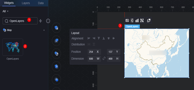
On the large screen design page, drag the OpenLayers map widget from Map to the blank area of the canvas, as shown in Figure 1.

Card
A card wraps a chart widget. A widget consists of card elements (card title, chart, card background, and card border) and chart elements.
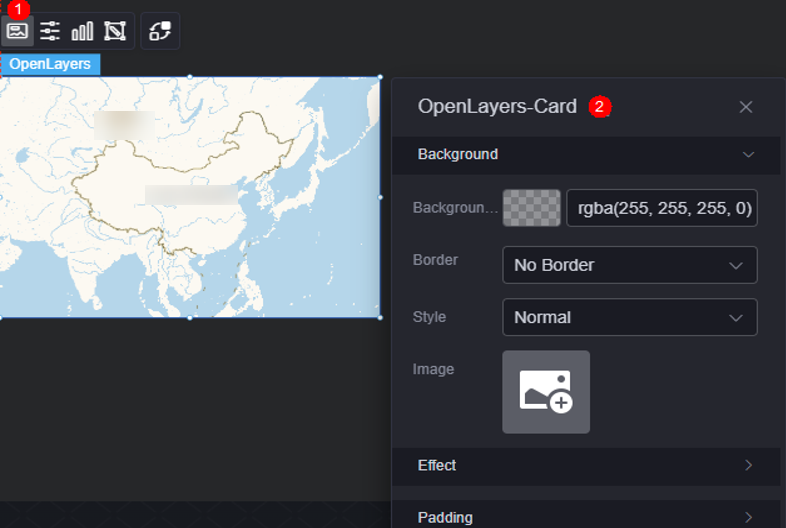
- Background
- Background color: Background color of the widget card.
- Border: Border of the widget card. Options: no border, full border, and corner border. For full border and corner border, you can set the line type and rounded corners of the outer border of the widget.
- Style: Image display style. The options are normal, center, stretch, and tiled.
- Choose image: Use a local image as the widget background. Directories and subdirectories can be added to facilitate image management by category. JPG, JPEG, PNG, or GIF images are recommended. The size of each image cannot exceed 50 MB.
- Special effect: Widget highlighted status. Displayed by default or on page load.
- Padding: Distance between the chart and the four sides (top, bottom, left, and right as shown in Figure 2) of the widget. The default value is 0, indicating that the chart stretches to fill the entire widget.
Configuration
You can set the basic information, map controls, and other settings for the map widget, such as whether to display the scale and enable zooming and dragging.
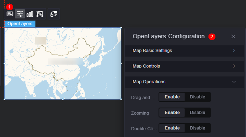
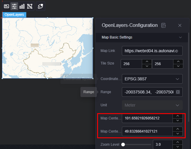
- Basic map configuration
- Map link: Enter the link of the map.
- Slice size: Size of the map tile.
- Coordinate system projection mode: Method for converting a geographic coordinate system to a planar coordinate system. You can select a value from the dropdown list or enter a value manually.
- Scope: Geographical scope covered by the base map.
- Unit: Automatically determined based on the selected coordinate system projection mode and cannot be configured.
- Map center longitude: Longitude of the map center.
- Map center latitude: Latitude of the map center.
- Zoom level: Map zoom level (range: 2 to 26).
- Zoom range: Map's zoom range (2 to 26).
- Map controls
- Zoom: Once enabled, the zoom control is displayed on the map.
- Scale: Once enabled, a scale control is added in the lower left corner of the map.
- Map control
- Drag: Whether the map can be dragged.
- Zoom: Whether the map can be zoomed in or out.
- Double-click to zoom in: Whether the map can be zoomed in by double-clicking. Required when the zoom function is enabled.
Graphic
A graphic is a specific graphical expression element that visualizes data in a widget, for example, a slice in a pie chart, a bar in a bar chart, a line or a kink point in a line chart.
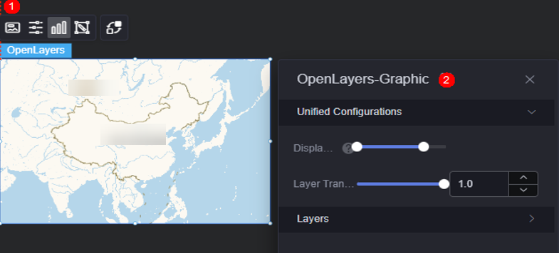
- Unified configuration
- Display range: Display range of a layer. When the map zoom level is within the range, the corresponding layer is displayed.
- Layer transparency: Transparency of a layer.
- Layer: Add a layer to create an icon, label, flying line, basic heatmap, plane, or line layer.
Figure 6 Creating an icon layer
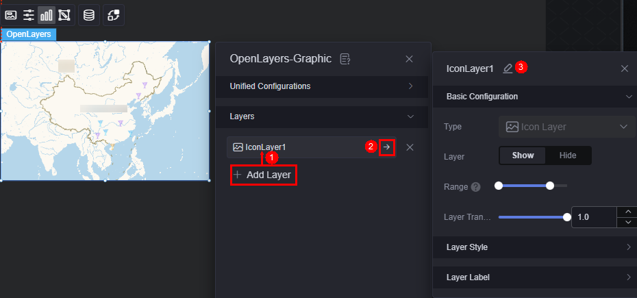
- Basic configuration
- Type: The value is fixed at icon layer.
- Layer: Whether to display a layer.
- Display range: Display range of a layer. When the map zoom level is within the range, the corresponding layer is displayed.
- Layer transparency: Transparency of a layer.
- Layer style
- Display type: You can set the display type of the icon. The icon can be displayed evenly or by range.
- Icon image: When the display type is set to evenly display, the system evenly divides the icon values from the minimum value to the maximum value based on the number of icon images. If the icon values fall into different ranges, the corresponding icons are displayed. When the display type is set to range display, you can set different ranges. When the icon value falls within the corresponding range, the corresponding color is displayed. Icons beyond the range are not displayed.
- Image width: Width of the image. If the value is empty, the width is displayed based on the image ratio. If both the width and height are empty, the original image size is used.
- Legend height: Height of the legend. If the value is empty, the height is displayed based on the image ratio. If both the width and height are empty, the original image size is used.
- Image aspect ratio: Ratio of the image's width to its height.
- Top/Bottom offset: Vertical adjustment of the icon relative to its coordinates.
- Left/Right offset: Horizontal adjustment of the icon relative to its coordinates.
- Layer label
- Label: Whether to enable the icon label.
- Label hover: Once enabled, the label is displayed when the mouse pointer is hovered over the icon. Once disabled, the label is always displayed.
- Series name: Whether a label displays a series name, which corresponds to the label field in the static data.
- Series name body: Font, size, and color of a series name. This parameter is configurable when the label hover function is enabled.
- Value: Whether the label displays a value, which corresponds to the value field in the static data.
- Value font: Font of the value. This parameter is configurable when the label hover function is enabled.
- Value display: Whether to display the maximum value and minimum value. Once enabled, the background color and font color of the label corresponding to the maximum and minimum values change.
Figure 7 Creating a label layer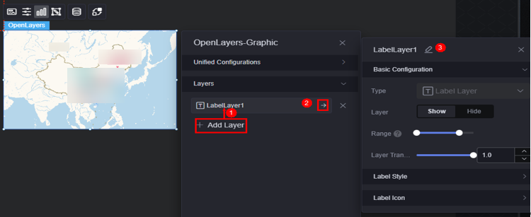
- Basic configuration
- Type: The value is fixed at label layer.
- Layer: Whether to display a layer.
- Display range: Display range of a layer. When the map zoom level is within the range, the corresponding layer is displayed.
- Layer transparency: Transparency of a layer.
- Label style
- Text color: Color of the label text.
- Series name: Whether a label displays a series name, which corresponds to the label field in the static data.
- Characters displayed per series: Number of characters displayed in each series. For example, if the value is set to 2, only two characters are displayed and extra characters are displayed as Province A....
- Series name body: Font, size, and color of a series name.
- Value: Whether the label displays a value, which corresponds to the value field in the static data.
- Characters displayed per value: Number of characters displayed in each value.
- Value font: font, size, and color of the value.
- Display type: Display type of the label background. The value can be equal or range.
- Color setting: When the display type is set to equal display, the label values are evenly distributed from the minimum value to the maximum value based on the number of colors. The values in different ranges are displayed in the corresponding background color. When the display type is set to range display, you can set different ranges. When the label value falls within the corresponding range, the corresponding background color is displayed. Icons outside the range are not displayed.
- Top/Bottom offset: Vertical adjustment of the label relative to its coordinates.
- Left/Right offset: Horizontal adjustment of the label relative to its coordinates.
- Label icon
- Label icon: Whether to display the label icon.
- Display type: Display type of the label icon. The label icon can be displayed evenly or by range.
- Icon image: When the display type is set to equal display, the system evenly divides the label value from the minimum value to the maximum value based on the number of icon images. If the label value falls into different ranges, the corresponding icon is displayed. When the display type is set to range display, you can set different ranges. When the label value falls within the corresponding range, the corresponding icon is displayed. Icons outside the range are not displayed.
- Image width: Width of the image. If the value is empty, the width is displayed based on the image ratio. If both the width and height are empty, the original image size is used.
- Legend height: Height of the legend. If the value is empty, the height is displayed based on the image ratio. If both the width and height are empty, the original image size is used.
- Top/Bottom offset: Vertical adjustment of the icon relative to its coordinates.
- Left/Right offset: Horizontal adjustment of the icon relative to its coordinates.
Figure 8 Creating a flying line layer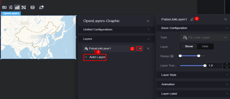
- Basic configuration
- Type: The value is fixed at flying line layer.
- Layer: Whether to display a layer.
- Display range: Display range of a layer. When the map zoom level is within the range, the corresponding layer is displayed.
- Layer transparency: Transparency of a layer.
- Layer style
- Display type: You can set the display type of a flying line. The icon can be displayed evenly or by range.
- Color setting: The flying line values from the minimum value to the maximum value are evenly distributed based on the number of colors. The values in different ranges are displayed in different colors. Displayed only when the display type is set to even display.
- Fill color: When the flying line value falls within the corresponding range, the corresponding color value is displayed. The flying line that is not in the range is not displayed. Displayed only when the display type is set to range display.
- Selected color: Color of the selected layer.
- Width: Width of the start point of the flying line.
- Animation effect
- Pulse effect: Whether to enable the pulse effect of the flying line.
- Pulse point length: Pulse length. Displayed after the pulse effect is enabled.
- Pulse point speed: Set the pulse speed. Displayed after the pulse effect is enabled.
- Pulse point color: Color of the pulse point. Displayed after the pulse effect is enabled.
- Layer label
- Label hover: Whether to display the label when the mouse pointer is hovered over the flying line.
- Series name: Whether a label displays a series name.
- Series name content: Specify the series name content.
- Series name font: Font, color, and size of the series name.
- Value: Whether the label displays a value, which corresponds to the value field in the static data.
- Value font: Font, color, and size of the value.
- Value display: Whether to display the maximum value and minimum value. Once enabled, the background color and font color of the label corresponding to the maximum and minimum values change.
Figure 9 Creating a basic heat map layer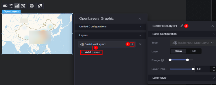
- Basic configuration
- Type: The value is fixed at basic heat map layer.
- Layer: Whether to display a layer.
- Display range: Display range of a layer. When the map zoom level is within the range, the corresponding layer is displayed.
- Layer transparency: Transparency of a layer.
- Layer style
- Color settings: Set the color of the layer. You can add a color.
- Maximum value: maximum value of the heatmap value. The default value is the maximum value in the data. You can also customize the value to control the display effect of the hottest area of the heatmap.
- Minimum value: minimum value of the heatmap value. The default value is the minimum value in the data. You can also customize the value to control the display effect of the coldest area of the heatmap.
- Radius: Aggregation radius of the heat map.
- Blur radius: Control the blur effect of the heatmap during rendering.
Figure 10 Creating a line layer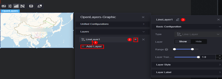
- Basic configuration
- Type: The value is fixed at line layer.
- Layer: Whether to display a layer.
- Display range: Display range of a layer. When the map zoom level is within the range, the corresponding layer is displayed.
- Layer transparency: Transparency of a layer.
- Layer style
- Display type: Choose how icons are displayed: Monochrome or by category.
When icons are displayed by category, the rules for configuring line color IDs are as follows:
- Single-line: Directly configure the corresponding line ID.
- Multiple lines: Separate line IDs with commas (,).
- If no line ID is set, the line color defaults to the single-color type.
- If multiple colors are assigned to a line ID, the color set at the bottom takes the highest priority.
- Line color: Color of the line. Displayed only when the display type is set to monochrome.
- Color settings: Set the color of the line ID as required. Displayed only when icons are displayed by category.
- Line width type: Options include unified width and category width.
- Line width: Width of the line in a specified layer. Displayed only when line width type is unified.
- Line width: Set the line width as required. Displayed only when line width type is set by category.
- Line style: Solid line, long dashed line, short dashed line, and dotted line are supported.
- Display type: Choose how icons are displayed: Monochrome or by category.
- Layer label
- Label hovering: Once enabled, labels are displayed when the cursor hovers over a layer.
- Label font: Font, size, and color of the label.
Figure 11 Creating a plane layer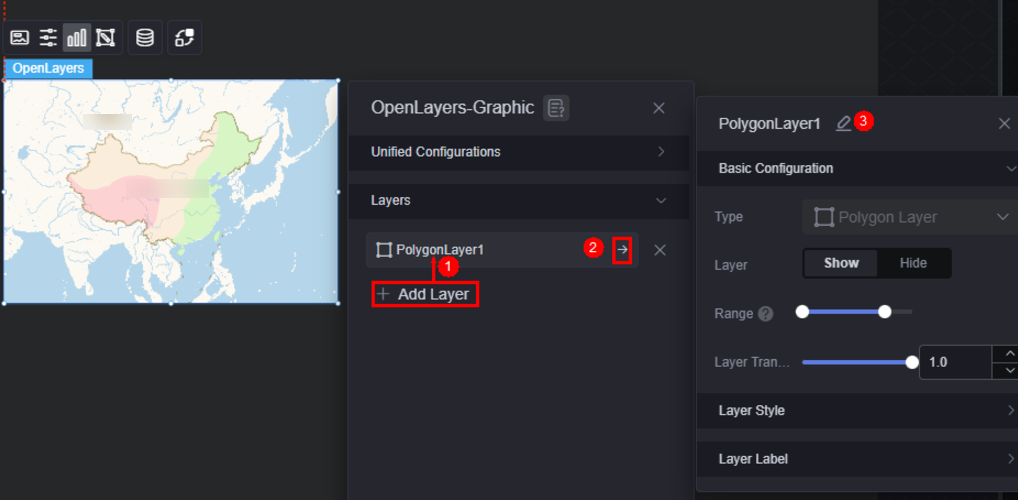
- Basic configuration
- Type: The value is fixed at plane layer.
- Layer: Whether to display a layer.
- Display range: Display range of a layer. When the map zoom level is within the range, the corresponding layer is displayed.
- Layer transparency: Transparency of a layer.
- Layer style
- Display type: Choose how icons are displayed: Monochrome or by category.
- Plane color: Color of the plane in the layer. Displayed only when the display type is set to monochrome.
- Selected color: Color of the selected layer.
- Border: Whether to display the border of the layer.
- Border style: Options include dotted line, solid line, etc. Required when the border is displayed.
- Dotted line parameter: Set the parameters for dotted lines in the format [solid length, dotted line length] or [solid length, dotted line length, solid length, dotted line length]. Displayed only when the border style is dotted line.
- Stroke color: Border color. Required when the border is displayed.
- Stroke width: Width of the border. Required when the border is displayed.
- Color settings: Set the color of the plane ID as required. Displayed only when icons are displayed by category.
- Layer label
- Label hovering: Once enabled, labels are displayed when the cursor hovers over a layer.
- Label font: Font, size, and color of the label.
- Basic configuration
Camera Editing
Drag, scale, and rotate (3D view only) the widget to the desired position in the pop-up window and save the settings. The corresponding configuration items of the widget are changed accordingly.
Interaction
In the interaction settings, you can configure interactions between the map widget and other widgets or pages. For details, see Interaction Configuration.
Feedback
Was this page helpful?
Provide feedbackThank you very much for your feedback. We will continue working to improve the documentation.See the reply and handling status in My Cloud VOC.
For any further questions, feel free to contact us through the chatbot.
Chatbot


