
Map
The map widget allows users to view two-dimensional maps. Amap, Baidu Map, Map World, and custom maps are supported.
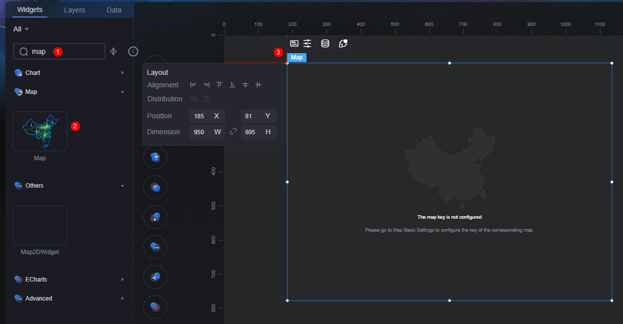
On the large screen design page, drag the map widget from Map to the blank area of the canvas, as shown in Figure 1.

Card
A card wraps a chart widget. A widget consists of card elements (card title, chart, card background, and card border) and chart elements.
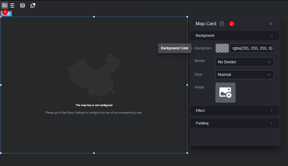
- Background
- Background color: Background color of the widget card.
- Border: Border of the widget card. Options: no border, full border, and corner border. For full border and corner border, you can set the line type and rounded corners of the outer border of the widget.
- Style: Image display style. The options are normal, center, stretch, and tiled.
- Choose image: Use a local image as the widget background. Directories and subdirectories can be added to facilitate image management by category. JPG, JPEG, PNG, or GIF images are recommended. The size of each image cannot exceed 50 MB.
- Special effect: Widget highlighted status. Displayed by default or on page load.
- Padding: distance between the chart and the four sides (top, bottom, left, and right as shown in Figure 2) of the widget. The default value is 0, indicating that the chart stretches to fill the entire widget.
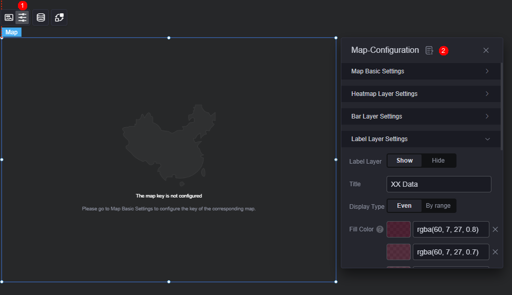
Configuration
Configure the basic map, heat layer, bar layer, and label layer in map configuration.
- Basic map configuration
- Map type: Third-party map service providers, such as Tianditu, Amap, and Baidu Map.
- Map key: Third-party map keys. Apply for the key from the corresponding official website.
- Custom map: Customize a map by configuring the GeoJson data link or providing GeoJson data.
- Map center longitude: Longitude of the map center.
- Map center latitude: Latitude of the map center.
- Map zoom level: Range from 4 to 19.
- Map style: Basic map style template.
- Heatmap layer configuration
- Show heatmap layer: Whether to display the heatmap layer.
- Data title: Data title of the heatmap layer.
- Display type: Options include even display or interval display.
Even display: Data is shown in ascending order with colors from light to dark.
Interval display: Shows only data within specified ranges, with colors based on the data range.
- Fill color: Color of the heatmap layer. Even display: Data is shown in ascending order with colors from light to dark. Interval display: Color is based on the data range.
- Stroke style: Style of province or municipality borders, such as dotted or dashed lines.
- Stroke width: Width of province or municipality borders, in pixels.
- Stroke color: Color of province or municipality borders.
- Bar chart layer configuration
- Show bar chart layer: Whether to display the bar chart layer.
- Display type: Choose how data is shown on the bar layer. Options include even display or interval display.
Even display: Data is shown in ascending order with colors from light to dark.
Interval display: Shows data within specified ranges (e.g., 0–10) with colors based on the data range.
- Fill color: Color of the column. Even display: Data is shown in ascending order with colors from light to dark. Interval display: Color is based on the data range.
- Column width: Width of the column, in pixels.
- Column length ratio: Ratio of the column height (for the maximum data value) to the map's one-latitude line distance. Value range: 0 to 10.
- Show label: Whether to display label text on the bar. If shown, you can customize the font, size, and color of the label text.
- Label layer configuration
- Show label layer: Whether to display the label layer.
- Data title: Data title of the label layer.
- Display type: Choose how data is shown on a label. Options include even display or interval display.
Even display: Data is shown in ascending order with colors from light to dark.
Interval display: Shows only data within specified ranges, with colors based on the data range.
- Fill color: Color of the range where the label data is located. Even display: Data is shown in ascending order with colors from light to dark. Interval display: Color is based on the data range.
- Value font: Font, color, and size of the label value.
- Value suffix: Suffix of the label value, for example, %.
- Content font: Font, color, and size of the label content.
- Content background color: Background color of the label content.
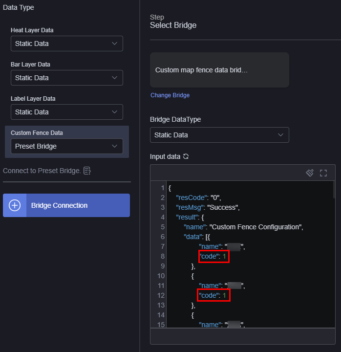
Data
In the data settings, you can set the data source of a map widget. For more information, see Data Access.
- Custom fence data: Data for custom fences on the map. Matching province/municipality codes indicate the same fence area. When previewing or publishing, clicking a fence area drills down to that area. If the connector is not configured, it drills down to an independent province or municipality.
Figure 5 Custom fence data
- Heatmap layer data: Data bridge/dataset for the heatmap layer. The color of the heatmap layer changes based on the value of the province/municipality.
- Bar chart layer data: Data bridge/dataset for the bar chart layer. Bar color and height changes based on province/municipality values.
- Label layer data: Data bridge/dataset for the label layer, displaying province/municipality data as labels.
Interaction
In the interaction settings, you can configure interactions between the map widget and other widgets or pages. For details, see Interaction Configuration.
Feedback
Was this page helpful?
Provide feedbackThank you very much for your feedback. We will continue working to improve the documentation.See the reply and handling status in My Cloud VOC.
For any further questions, feel free to contact us through the chatbot.
Chatbot


