
Amap
Amap is a type of map widget that allows dynamic customization of base maps, styles, and supports both 2D and 3D views. It also features icons and flying lines, meeting the mapping needs in GIS and Intelligent Operation Center (IOC) scenarios.
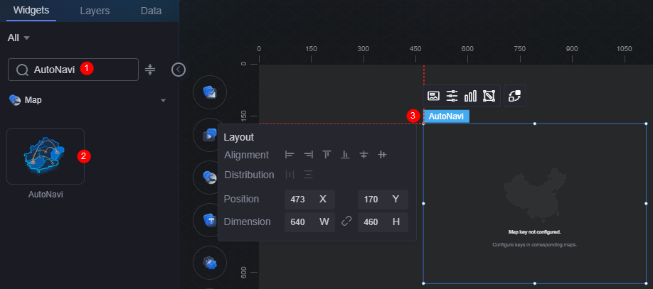
On the large screen design page, drag the Amap widget from Map to the blank area of the canvas, as shown in Figure 1.

Card
A card wraps a chart widget. A widget consists of card elements (card title, chart, card background, and card border) and chart elements.
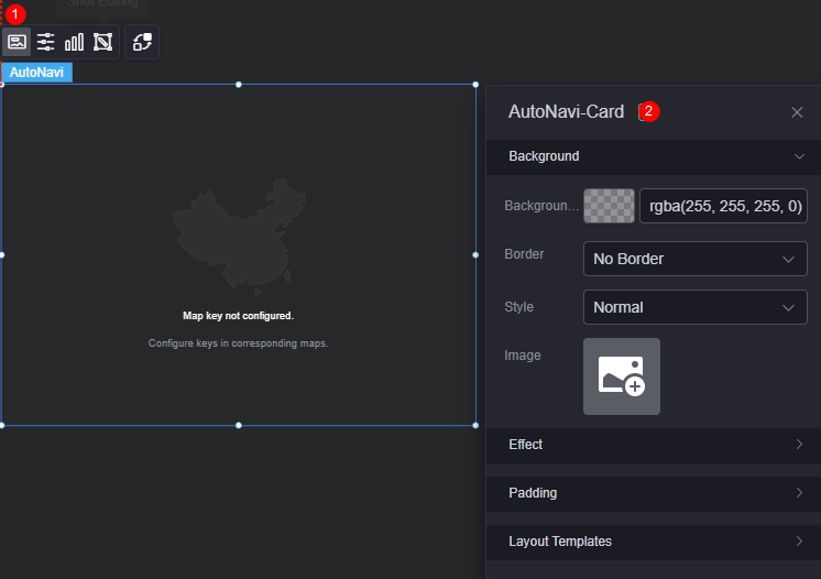
- Background
- Background color: Background color of the widget card.
- Border: Border of the widget card. Options: no border, full border, and corner border. For full border and corner border, you can set the line type and rounded corners of the outer border of the widget.
- Style: Image display style. The options are normal, center, stretch, and tiled.
- Choose image: Use a local image as the widget background. Directories and subdirectories can be added to facilitate image management by category. JPG, JPEG, PNG, or GIF images are recommended. The size of each image cannot exceed 50 MB.
- Special effect: Widget highlighted status. Displayed by default or on page load.
- Padding: distance between the chart and the four sides (top, bottom, left, and right as shown in Figure 2) of the widget. The default value is 0, indicating that the chart stretches to fill the entire widget.
- Layout template > map style: Select a map style from the drop-down list box, for example, control + label layer, default style, or map administrative region + icon layer.
Configuration
You can set the basic information, map style, and map controls.
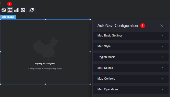
- Basic map configuration
- Map key: Enter the service key of the map.
- Security key: If your map key is applied for after December 2, 2021, it must be used together with a security key.
- Map center: Type of map center. Options include custom or administrative region.
- Administrative region code: Set an administrative region or its code. Required when the map center is set to an administrative region.
- Map center longitude: Longitude of the map center. Required when the map center is set to custom.
- Map center latitude: Latitude of the map center. Required when the map center is set to custom.
- Zoom level: Zoom level of the map. Required when the map center is set to custom.
- Zoom range: Map's zoom range (2 to 26).
- Zoom in: Whether to zoom in. The map scope doubles and is for static display only.
- POI display: Whether to enable POI display. If POI display is disabled, not all map texts and POI information are displayed.
- Map style
- Base map style: Style of the base map. Standard maps and satellite maps are supported.
- Display elements: Map features to show, including regions, roads, buildings, and markers. Required when the base map style is set to standard map.
- Display road network: Whether to display the road network. Required when the base map style is set to satellite map.
- Real-time road condition: Whether to display the real-time road condition.
- View mode: Map view options include 2D and 3D.
- Tilt angle: Tilt angle of the map. Required when the view mode is set to 3D.
- Map style: Options include standard and custom templates.
- Standard template: Standard map style template. Amap provides you with 11 templates.
- Custom map: Customize a map.
- Area mask
- Region mask: Whether to display the mask in the region. Once enabled, only the layers and overlays in the region are displayed.
- Mask boundary: Method of obtaining mask boundary information. You can directly set this parameter to administrative region or GeoJSON.
- Administrative region code: Set an administrative region or its code. Required when the mask boundary is set to administrative region.
- Select data: Upload a GeoJSON file to set the boundary information of the mask. Required when the mask boundary is set to GeoJSON.
- Mask border: Color and size of the mask border.
- Map administrative region
- Administrative region: Whether to highlight the administrative region.
- Administrative region scope: You can set the administrative region scope directly or in geojson format.
- Administrative region code: Set an administrative region or its code. Required when the administrative region scope is set to administrative region.
- Select level: Set the drill-down scope for the highlighted administrative region. Options include province, city, and district levels. The selected level must be lower than the configured administrative region. For example, if the administrative region code is set to City A, the selected level must be a city or district within it. Required when the administrative region scope is set to administrative region.
- Select data: Upload a GeoJSON file to set the administrative region scope. This parameter is configurable when the administrative region scope is set to geojson.
- Layer Color: Color of the highlighted administrative region.
- Administrative region border: Border color of a highlighted administrative region.
- Map controls
- Zoom: Once enabled, a zoom control is added to the lower right corner of the map.
Figure 5 Enabling the zoom function
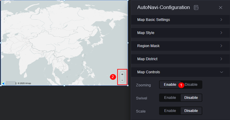
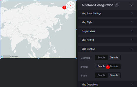
- Rotation: Once enabled, a rotation control is added to the upper right corner of the map.
Figure 6 Enabling the rotation effect
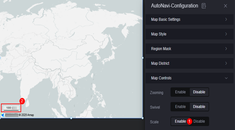
- Scale: Once enabled, a scale control is added in the lower left corner of the map.
Figure 7 Enabling the scale effect
- Zoom: Once enabled, a zoom control is added to the lower right corner of the map.
- Map control
- Drag: Whether the map can be dragged.
- Zoom: Whether the map can be zoomed in or out.
- Double-click to zoom in: Whether the map can be zoomed in by double-clicking. Required when the zoom function is enabled.
- Rotation: Whether the map can be rotated.
Graphic
A graphic is a specific graphical expression element that visualizes data in a widget, for example, a slice in a pie chart, a bar in a bar chart, a line or a kink point in a line chart.
- Unified configuration
- Display range: You can set the display range of layers in a unified manner. When the map zoom level is within the range, the corresponding layer is displayed.
- Layer transparency: You can set the transparency of layers in a unified manner.
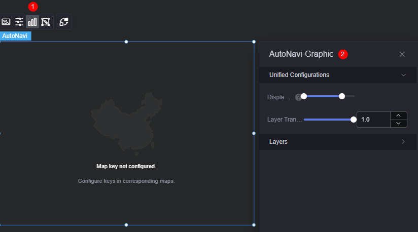
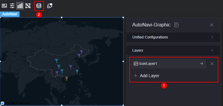
- Layer: Click the add button to add a layer. You can create layers for icons, labels, bar charts, flying lines, basic heat maps, or region heat maps.
Figure 9 New layer
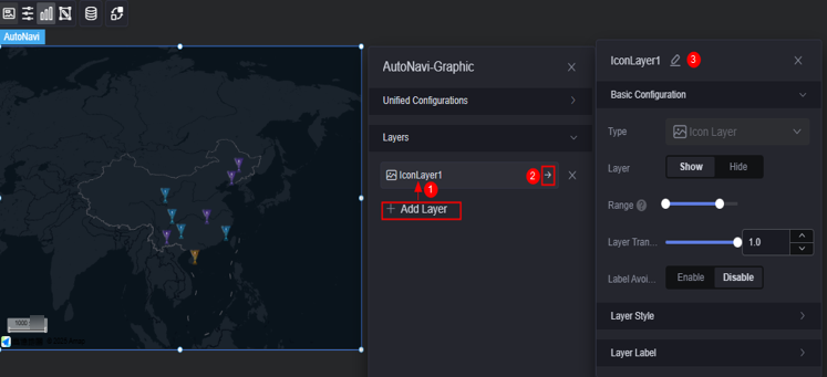
- Basic configuration
- Type: The value is fixed at icon layer.
- Layer: Whether to display a layer.
- Display range: Display range of a layer. When the map zoom level is within the range, the corresponding layer is displayed.
- Layer transparency: Transparency of a layer.
- Label avoidance: Once enabled, overlapping icons on the map will be avoided.
- Layer style
- Display type: You can set the display type of the icon. The icon can be displayed evenly or by range.
- Icon image: When the display type is set to evenly display, the system evenly divides the icon values from the minimum value to the maximum value based on the number of icon images. If the icon values fall into different ranges, the corresponding icons are displayed. When the display type is set to range display, you can set different ranges. When the icon value falls within the corresponding range, the corresponding color is displayed. Icons beyond the range are not displayed.
- Hover zoom in: Whether to enable the function of zooming in the icon when the mouse pointer is hovered. If the floating method and label avoidance are enabled at the same time, the display effect will be affected.
- Image width: Width of the image.
- Legend height: Height of the legend.
- Top/Bottom offset: Vertical adjustment of the icon relative to its coordinates.
- Left/Right offset: Horizontal adjustment of the icon relative to its coordinates.
- Layer label
- Label: Whether to enable the icon label.
- Label hover: Once enabled, the label is displayed when the mouse pointer is hovered over the icon. Once disabled, the label is always displayed.
- Series name: indicates whether a label displays a series name, which corresponds to the label field in the static data.
- Series name body: Font, size, and color of a series name. This parameter is configurable when the label hover function is enabled.
- Value: indicates whether the label displays a value, which corresponds to the value field in the static data.
- Value font: font of the value. This parameter is configurable when the label hover function is enabled.
- Text size: text size of the label that is always displayed. This parameter is configurable when the label hover function is disabled.
- Text color: text color of the label that is always displayed. This parameter is configurable when the label hover function is disabled.
- Value display: indicates whether to display the maximum value and minimum value. Once enabled, the background color and font color of the label corresponding to the maximum and minimum values change.
Figure 10 Creating a label layer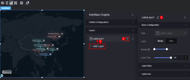
- Basic configuration
- Type: The value is fixed at label layer.
- Layer: displays or hides a layer.
- Display range: specifies the display range of a layer. When the map zoom level is within the range, the corresponding layer is displayed.
- Layer transparency: transparency of a layer.
- Label style
- Maximum width: maximum width of a label.
- Overflow text: display style when the text overflows. The text can be omitted or wrapped.
- Text alignment: alignment mode of the text, for example, left, center, and right.
- Series name: indicates whether a label displays a series name, which corresponds to the label field in the static data.
- Series name body: Font, size, and color of a series name.
- Value: indicates whether the label displays a value, which corresponds to the value field in the static data.
- Value font: font, size, and color of the value.
- Background style: background style of the label. The color and image are supported.
- Display type: specifies the display type of the label background. The value can be equal or range.
- Color setting: When the display type is set to equal display, the label values are evenly distributed from the minimum value to the maximum value based on the number of colors. The values in different ranges are displayed in the corresponding background color. When the display type is set to range display, you can set different ranges. When the label value falls within the corresponding range, the corresponding background color is displayed. Icons outside the range are not displayed.
- Filling mode: indicates the filling mode of the icon. The options are normal, center, stretch, and peace. This parameter is configurable when the background style is set to image.
- Background image: When the display type is set to even display, the label values are evenly distributed from the minimum value to the maximum value based on the number of background colors. If the label values fall into different ranges, the corresponding background images are displayed. When the display type is set to range display, you can set different ranges. When the label value falls within the corresponding range, the corresponding background image is displayed. Icons outside the range are not displayed.
- Selected color: font color of the label when the mouse pointer is hovered over the label. It is also the color of the highlighted label in an interaction action.
- Top/Button offset: top/button offset of the label based on the longitude and latitude of the point.
- Left/Right offset: left/right offset of the label based on the longitude and latitude of the point.
- Label icon
- Label icon: indicates whether to display the label icon.
- Display type: indicates the display type of the label icon. The label icon can be displayed evenly or by range.
- Filling mode: indicates the filling mode of the icon. The options are normal, center, stretch, and peace.
- Icon image: When the display type is set to equal display, the system evenly divides the label value from the minimum value to the maximum value based on the number of icon images. If the label value falls into different ranges, the corresponding icon is displayed. When the display type is set to range display, you can set different ranges. When the label value falls within the corresponding range, the corresponding icon is displayed. Icons outside the range are not displayed.
- Image width: width of the image.
- Legend height: height of the legend.
- Top/Button offset: top/button offset of the icon based on the longitude and latitude of the point.
- Left/Right offset: left/right offset of the icon based on the longitude and latitude of the point.
Figure 11 Creating a bar chart layer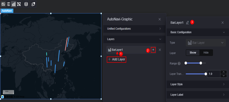
- Basic configuration
- Type: The value is fixed at bar chart layer.
- Layer: displays or hides a layer.
- Display range: specifies the display range of a layer. When the map zoom level is within the range, the corresponding layer is displayed.
- Layer transparency: transparency of a layer.
- Layer style
- Display type: You can set the display type of the icon. The icon can be displayed evenly or by range.
- Color setting: Values from the minimum value to the maximum value are evenly distributed based on the number of colors. Values in different ranges are displayed in different colors. This parameter is configurable only when the display type is set to even display.
- Fill color: The fill color is based on the range. When the value falls within the corresponding range, the corresponding color is displayed. The value beyond the range is not displayed. This parameter is configurable only when the display type is set to range display.
- Selected color: color of the highlighted bar in the interaction action when the mouse pointer is hovered or clicked.
- Edges: number of edges of a bar chart. The more edges, the closer to the cylindrical shape. If you want to make a cylinder effect, you can set this parameter to a large value, for example, 32.
- Unit: unit of the layer, which can be pixel or meter.
- Radius: radius of the prism.
- Height range: height of the prism.
- Layer label
- Label: indicates whether to enable the icon label.
- Label hover: Once enabled, the label is displayed when the mouse pointer is hovered over the icon. Once disabled, the label is always displayed.
- Series name: indicates whether a label displays a series name, which corresponds to the label field in the static data.
- Series name body: Font, size, and color of a series name. This parameter is configurable when the label hover function is enabled.
- Value: indicates whether the label displays a value, which corresponds to the value field in the static data.
- Value font: font, size, and color of the value. This parameter is configurable when the label hover function is enabled.
- Value display: indicates whether to display the maximum value and minimum value. Once enabled, the background color and font color of the label corresponding to the maximum and minimum values change.
Figure 12 Creating a flying line layer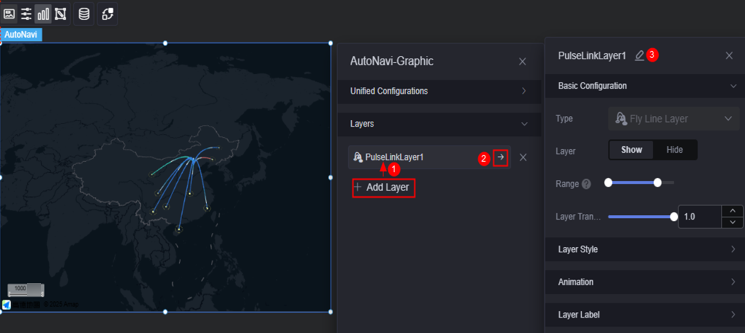
- Basic configuration
- Type: The value is fixed at flying line layer.
- Layer: displays or hides a layer.
- Display range: specifies the display range of a layer. When the map zoom level is within the range, the corresponding layer is displayed.
- Layer transparency: transparency of a layer.
- Layer style
- Color style: color of the flying line. The monochrome and gradient colors are supported.
- Display type: You can set the display type of a flying line. The icon can be displayed evenly or by range.
- Color setting: The flying line values from the minimum value to the maximum value are evenly distributed based on the number of colors. The values in different ranges are displayed in different colors. This parameter is configurable only when the display type is set to even display.
- Fill color: When the flying line value falls within the corresponding range, the corresponding color value is displayed. The flying line that is not in the range is not displayed. This parameter is configurable only when the display type is set to range display.
- Selected color: color of the flying line when the mouse pointer is hovered. It is also the color of the highlighted flying line in an interaction action.
- Flying line radian: Sets the radian of the flying line. This parameter takes effect only in 3D mode.
- Arc top position: Sets the arc top position, which indicates the highest point of the arc top at the distance from the start point.
- Start width: width of the start point of the flying line.
- Start width: width of the start point of the flying line.
- Animation effect
- Pulse effect: whether to enable the pulse effect of the flying line.
- Pulse point length: Pulse length. This configuration item is displayed after the pulse effect is enabled.
- Pulse point speed: Set the pulse speed. This configuration item is displayed after the pulse effect is enabled.
- Head color: Head color of the pulse. This configuration item is displayed after the pulse effect is enabled.
- Tail color: Tail color of the pulse. This configuration item is displayed after the pulse effect is enabled.
- Bubble effect: Whether to enable the bubble effect at the flying line end point.
- Bubble style: Color of the bubble, which can be blue, yellow, green, or red. This configuration item is displayed after the bubble effect is enabled.
- Bubble radius: Radius of the bubble. This configuration item is displayed after the bubble effect is enabled.
- Animation speed: Animation speed of the bubble. This configuration item is displayed after the bubble effect is enabled.
- Layer label
- Label hover: Whether to display the label when the mouse pointer is hovered over the flying line.
- Series name: Whether a label displays a series name.
- Series name content: Specify the series name content.
- Series name font: Font, color, and size of the series name.
- Value: indicates whether the label displays a value, which corresponds to the value field in the static data.
- Value font: Font, color, and size of the value.
- Value display: Whether to display the maximum value and minimum value. Once enabled, the background color and font color of the label corresponding to the maximum and minimum values change.
Figure 13 Creating a basic heat map layer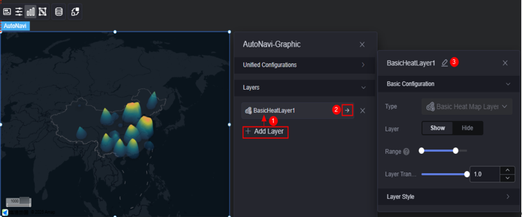
- Basic configuration
- Type: The value is fixed at basic heat map layer.
- Layer: Displays or hides a layer.
- Display range: specifies the display range of a layer. When the map zoom level is within the range, the corresponding layer is displayed.
- Layer transparency: transparency of a layer.
- Layer style
- Color settings: Set the color of the layer. You can add a color.
- Maximum value: maximum value of the heatmap value. The default value is the maximum value in the data. You can also customize the value to control the display effect of the hottest area of the heatmap.
- Minimum value: minimum value of the heatmap value. The default value is the minimum value in the data. You can also customize the value to control the display effect of the coldest area of the heatmap.
- Unit: heat map unit. Pixel and meter are supported.
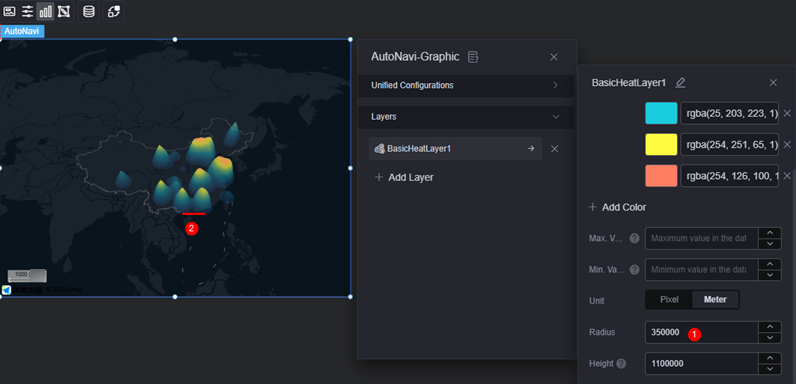
- Radius: aggregation radius of the heat map.
Figure 14 Setting the radius
- Height: highest heat map point.
Figure 15 Setting the height
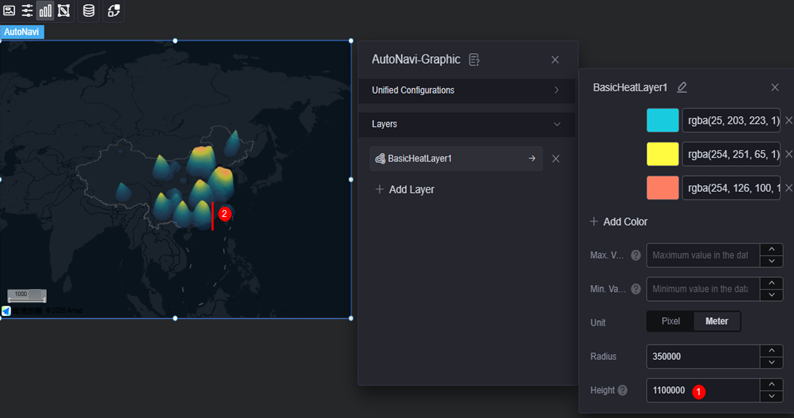
Figure 16 Creating a region heat map layer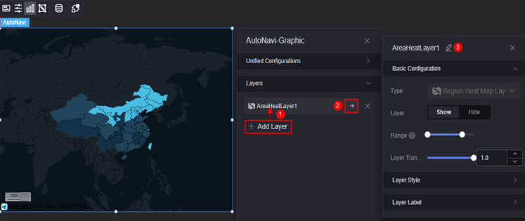
- Basic configuration
- Type: The value is fixed at the regional heatmap layer.
- Layer: Displays or hides a layer.
- Display range: specifies the display range of a layer. When the map zoom level is within the range, the corresponding layer is displayed.
- Layer transparency: transparency of a layer.
- Layer style
- Display type: You can set the display type of the icon. The icon can be displayed evenly or by range.
- Color setting: Values from the minimum value to the maximum value are evenly distributed based on the number of colors. Values in different ranges are displayed in different colors. This parameter is configurable only when the display type is set to even display.
- Fill color: The fill color is based on the range. When the value falls within the corresponding range, the corresponding color is displayed. The value beyond the range is not displayed. This parameter is configurable only when the display type is set to range display.
- Selected color: Set the color of the click and hover operations, which is also the color of the highlighted area in the interaction action.
- Area border: Set the color and border size of the administrative border.
- Layer label
- Label: indicates whether to enable the icon label.
- Label hover: Once enabled, the label is displayed when the mouse pointer is hovered over the icon. Once disabled, the label is always displayed.
- Series name: indicates whether a label displays a series name, which corresponds to the label field in the static data.
- Series name body: Font, size, and color of a series name. This parameter is configurable when the label hover function is enabled.
- Value: indicates whether the label displays a value, which corresponds to the value field in the static data.
- Value font: font, size, and color of the value. This parameter is configurable when the label hover function is enabled.
- Value display: Whether to display the maximum value and minimum value. Once enabled, the background color and font color of the label corresponding to the maximum and minimum values change.
- Basic configuration
Camera Editing
Drag, scale, and rotate (3D view only) the widget to the desired position in the pop-up window and save the settings. The corresponding configuration items of the widget are changed accordingly.
Data
In the data area, set the data source of the Amap widget. For details, see Data Access. Data configuration items are displayed only after a layer is added.
Interaction
In the interaction settings, you can configure interactions between this widget and other widgets or pages. For details, see Interaction Configuration.
Feedback
Was this page helpful?
Provide feedbackThank you very much for your feedback. We will continue working to improve the documentation.See the reply and handling status in My Cloud VOC.
For any further questions, feel free to contact us through the chatbot.
Chatbot


