
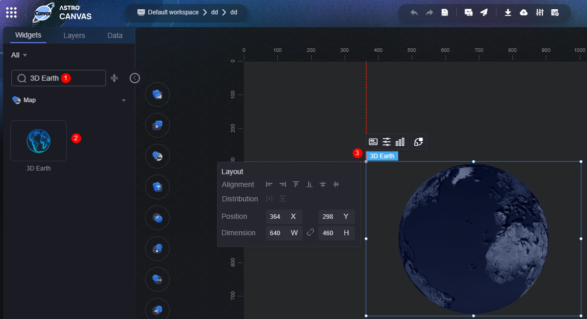
3D Earth
This widget renders the Earth model in 3D space and supports adding layers via ECharts-GL.
On the large screen design page, drag the 3D Earth widget from Map to the blank area of the canvas, as shown in Figure 1.

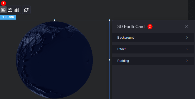
Card
A card wraps a chart widget. A widget consists of card elements (card title, chart, card background, and card border) and chart elements.
|
Parameter |
Description |
|---|---|
|
Background |
|
|
Effect |
Whether the widget is highlighted. The widget can be displayed by default or when the page is displayed. |
|
Padding |
Distance between the chart in the widget and the four sides (top, bottom, left, and right) of the widget (see Figure 2). The default value is 0, indicating that the chart spreads across the widget. |
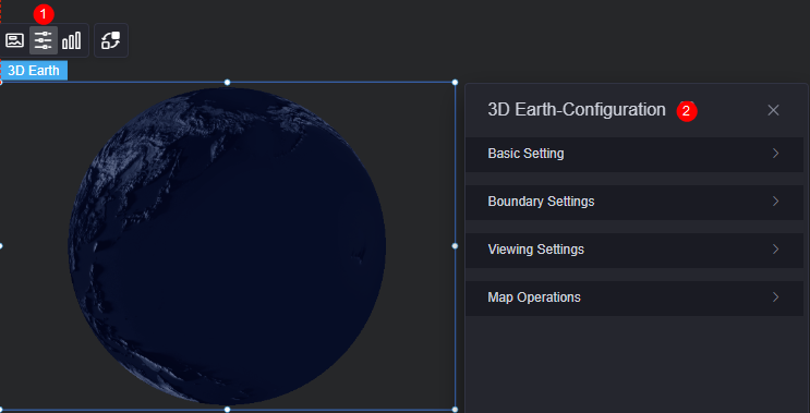
Configuration
In the configuration, you can set the basic settings, boundary, view angle, and map controls of the widget. For example, you can choose whether to display the atmosphere and whether to enable zooming and dragging.
|
Parameter |
Description |
|---|---|
|
Basic Setting |
|
|
Boundary Settings |
|
|
Viewing Settings |
|
|
Map Operations |
|
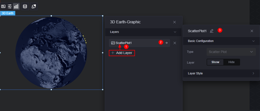
Graphic
A graphic is a specific graphical expression element that visualizes data in a widget, for example, a slice in a pie chart, a bar in a bar chart, a line or a kink point in a line chart.
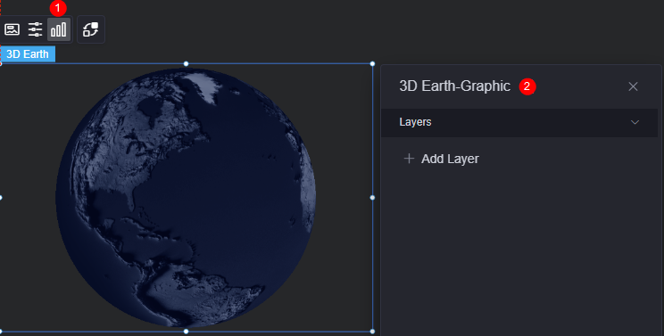
Layers: Click Add Layer to create a scatter chart.
|
Parameter |
Description |
|---|---|
|
Basic Configuration |
|
|
Layer Style |
|
Data
In the data settings, you can set the data source of the 3D Earth widget. For more information, see Data Access.
Interaction
In the interaction settings, you can configure interactions between the background widget and other widgets or pages. For details, see Interaction Configuration.
Feedback
Was this page helpful?
Provide feedbackThank you very much for your feedback. We will continue working to improve the documentation.See the reply and handling status in My Cloud VOC.
For any further questions, feel free to contact us through the chatbot.
Chatbot


