Example Typical Scenario
Scenario
If the data you need to analyze cannot be directly obtained from the data table and requires processing based on raw data, you can create an indicator.
This use case uses the sales data of a certain product in various provinces to demonstrate the usage of indicators. By utilizing the province dimension and sales metric, we can create indicators to obtain information such as average_sales_of_each_province, sales_ranking_of_each_province, national_average_sales, and average_sales_areas_per_province_above_national_average. These indicators can then be presented in a dashboard.
Procedure

Prerequisites
- A project has been created by referring to Creating a Project.
- A data source has been created by referring to Connecting to a Data Source.
- A dataset has been created by referring to Creating a Dataset.
Step 1: Create an Indicator
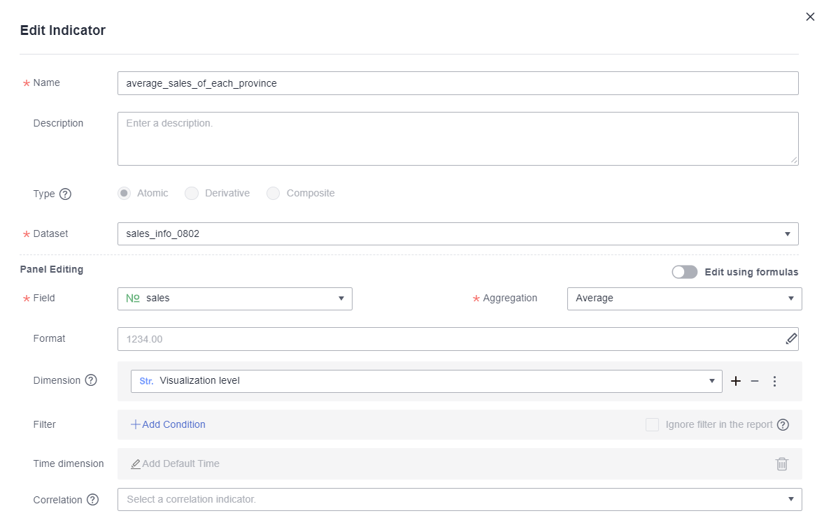
- Atomic indicators: using the average sales figures for each province and the national average sales figures for all provinces as examples.
- Click Create Indicator in the upper right corner.
- Edit basic information about an atomic indicator.
Figure 2 average_sales_of_each_province
 Figure 3 national_average_sales

- Dimension selection: If Dimension is set to Visualization level, all dimensions are associated by default.
- Dimension settings: Click
 next the dimension box. The Dimension Option dialog box is displayed.
- Relationship with Report Filter: If you select Ignore — ignores the filtering conditions based on the selected level and its related entities, the indicator will not be filtered in the report filter. For example, if you select Ignore — ignores the filtering conditions based on the selected level and its related entities for the province dimension of the national_average_sales indicator and drag province to the Filter area on the Field tab of a table created on the Dashboard page, average sales figures for all provinces will not be filtered.
- Aggregate This Field: If you select No, the field will not be aggregated. For example, when calculating the average sales figures for all provinces, you need to set this parameter to No for the province dimension. Otherwise, the province field will be aggregated, and the calculation results will be the average sales figures for each province.
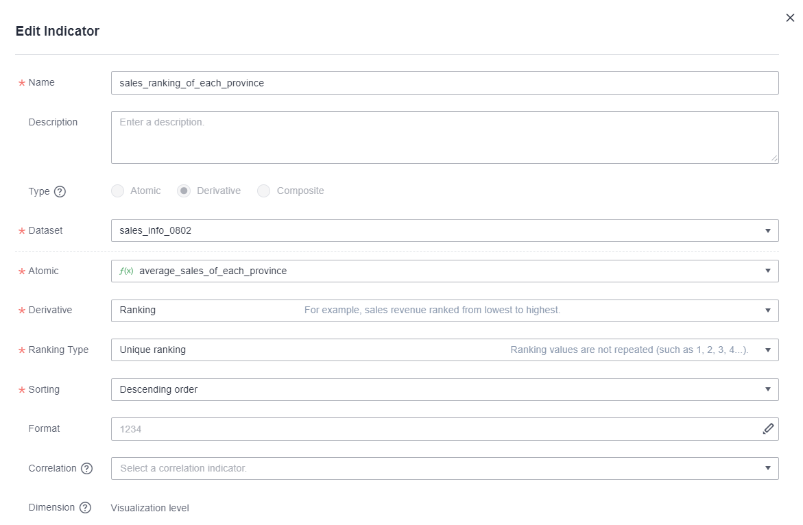
- Derivative indicator: using the ranking of sales by province as an example.
- Click Create Indicator in the upper right corner.
- Edit basic information about the derivative indicator.
Figure 4 sales_ranking_of_each_province

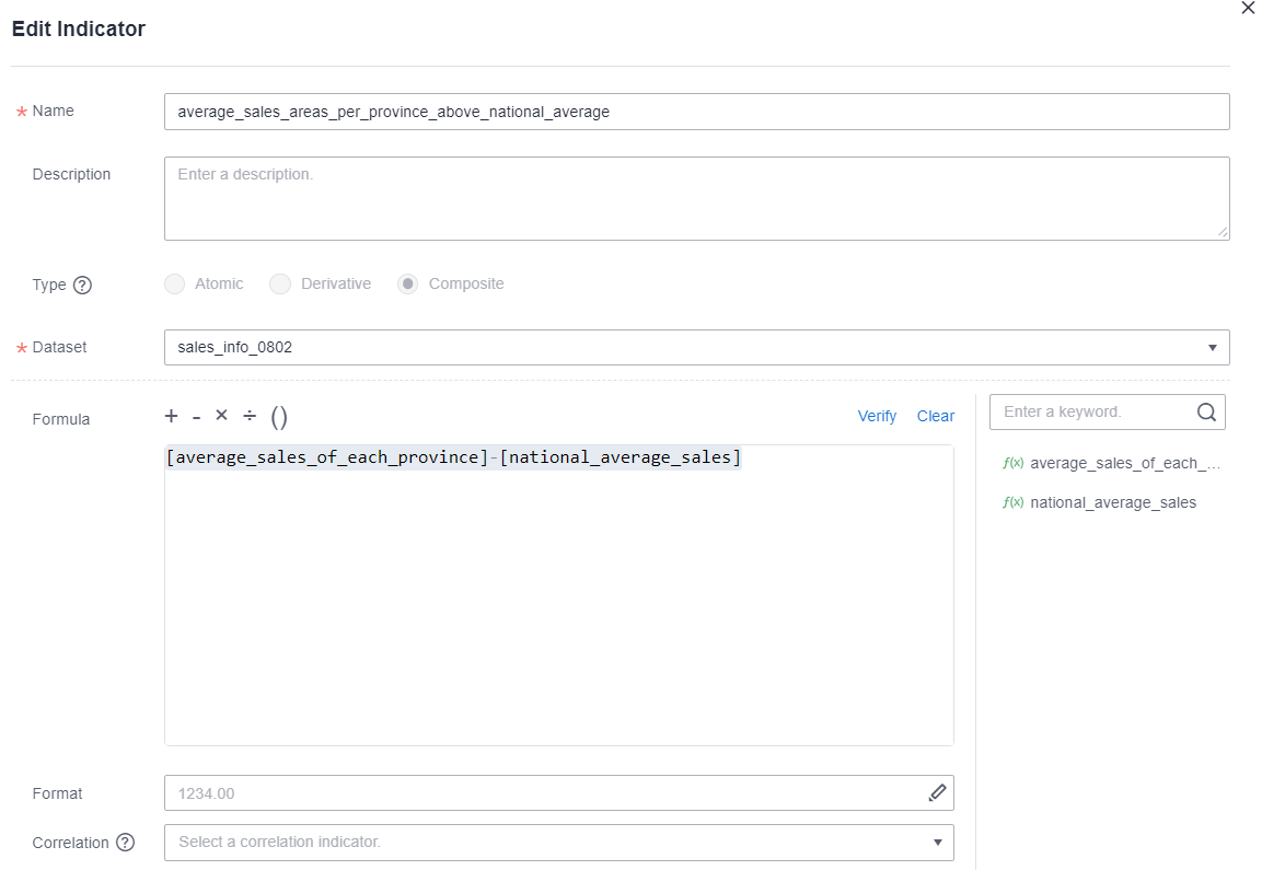
- Composite indicator: using whether the average sales figures for each province higher than the national average as an example. This indicator is obtained by calculating the difference between the average sales figures for each province and the national average. If the value is positive, it means that the average sales figures for each province are higher than the national average.
- Click Create Indicator in the upper right corner.
- Edit basic information about the composite indicator.
Figure 5 average_sales_areas_per_province_above_national_average

Step 2: Create a Dashboard to View Data
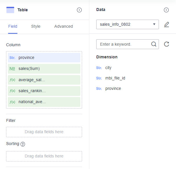
- Create a table in the dashboard. For details, see Creating a Dashboard.
- Select a dataset from the Data column drop-down list on the right. Double-click or drag province, sales, average_sales_of_each_province, sales_ranking_of_each_province, national_average_sales, and average_sales_areas_per_province_above_national_average to the Column area on the Field tab of the table.
Figure 6 Adding dimensions

- Click Update. The updated data is presented in the table.
Figure 7 Sales figures comparison

Feedback
Was this page helpful?
Provide feedbackThank you very much for your feedback. We will continue working to improve the documentation.See the reply and handling status in My Cloud VOC.
For any further questions, feel free to contact us through the chatbot.
Chatbot


