
Creating Interactions
The interactions component is used to add interactions to data reports.
Prerequisites
- You have subscribed to DataArts Insight.
- A project for managing data sources has been created. For details, see Creating a Project.
- You have obtained data. For details, see Creating a Data Source.
- You have prepared the required dataset. For details, see Creating a Dataset Through Visual Configuration.
Procedure
- Log in to the DataArts Insight console.
- Click
 in the upper left corner of the management console to select a region. Then, select an enterprise project in the upper right corner.
 - On the top menu of the console, click Project. On the displayed My Projects page, click the name of the desired project.
- In the navigation pane on the left, choose Data Analytics > Large Screen. On the displayed page, click Create Screen in the upper right corner.
- In the displayed dialog box, select a project and click Confirm.
- Click the Interactions icon in the navigation pane to switch to the interactions component page.
- Drag an interactions component to the canvas.
- In the right pane, set related parameters for the interactions component.
Interactions Component Types
|
Type |
Description |
Data Element |
|---|---|---|
|
Full Screen |
Used to control the full-screen display of the screen. |
None |
|
iFrame |
Used to add the iFrame content to the screen. |
Link |
|
Search |
Used to add a search box to the screen. |
Control variables |
|
Single-Select Dropdown List |
Used to select one option from multiple data options in a drop-down list. |
Options/Dimensions and control variables |
|
Tabs |
Used to display multiple screens as tab pages. |
Control variables |
|
Multi-Option Drop-Down List |
Used to select several options from multiple data options in a drop-down list. |
Options/Dimensions and control variables |
Fields
- iFrame: Enter a link by yourself.
- Single-Select Dropdown List/Multi-Option Drop-Down List:
- In the Data area on the right, select a dataset, and double-click or drag required dimension and metric fields to the corresponding areas on the Fields tab.
- Set a filter.
- Find the data field you need in the dimension and metric lists within the data column.
- Click
 next to the field you wish to filter and you will be directed to the filter settings page.
 - Click OK.
Table 2 Filter parameters Type
Parameter
Description
string
Condition
Filter Mode: The options are Condition and Enumeration.
Condition Type: The options are And condition and Or condition.
Filter Condition: The options are Exact match, Contain, Start with, End with, Not match, Not contain, Null, and Not null.
Enumeration
Query Mode: The options are Single-select and multi-select.
Filter Condition: The options are >, ≥, <, ≤, =, ≠, Null, and Not null.
Metric
Condition Type
The options are And condition and Or condition.
Filter Condition
The options are >, ≥, <, ≤, =, ≠, Null, and Not null. You can select Before aggregation and After aggregation for data.
NOTE:If you select Before aggregation, data is filtered before aggregation. If you select After aggregation, data is filtered after aggregation. For aggregation concepts, see Creating a Dataset.
You can click Create Filter Condition to set multiple filter criteria.
Date
Range value
Select a time range for filtering.
Single value
Set a single time for filtering.
Condition
You can select And condition or Or condition as the condition type and select filter condition like >, ≥, <, ≤, and =.
You can click Create Filter Condition to set multiple filter criteria.
- Set sorting.
- Drag and drop required data fields from the Dimension and Metric (Indicator) areas under Data to the Sorting area.
- Click
 next to a field in the Sorting area and select a sorting mode. The sorting modes are Ascending, Descending, and Custom.
 - To cancel sorting, click
 next to the sorting field.
- Set the maximum number of query results.
Enter the maximum number of records that can be returned in the text box. The default value is 1000.
- Set automatic refresh.
The auto refresh interval supports the following options: no refresh, 1 minute, 5 minutes, 15 minutes, and 30 minutes.
Styles
- Size/Position
- W: width of the target, in pixels.
- H: height of the target, in pixels.
- X: position of the target on the canvas, in pixels.
- Y: position of the target on the canvas, in pixels.
- Opacity: Adjust the transparency of the target on the canvas using a slider or by manually entering a percentage. A higher percentage means lower transparency.
Figure 1 Size/Position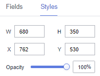
- Full Screen
- Global Style
- Full Screen: You can enter an image URL or upload a local image.
- Exit Full Screen: You can enter an image URL or upload a local image.
- Background Color: Set the background color of the full screen.
- Round Corner: Set the round corner of the full screen.
- Display Mode: Select Always or Mouse hover.
- Global Style
- Search
- Styles
- Tooltips: Set the text, font size, and color.
- Font Size: Set the font size for search.
- Font Weight: Set the font weight for search.
- Font Color: Set the font color for search.
- Background Color: Set the background color for search.
- Search Button Color: Set the color of the search button.
- Border: Set the width, color, and type of the border. The border type can be Solid, Dotted, or Dashed.
- Styles
- Single-Select Dropdown List
- Styles
- Background Color: Set the background color of the single-select drop-down list.
- Border: Set the width, rounded corners, color, and type of the border.
- Arrow: Set the color, size, and right margin of the arrow.
- Font Style: Set the font size, font weight, font color, card corner angle, and background color.
- Result Box Style
- Maximum Height: Set the maximum height of the single-select drop-down list.
- Font Size: Set the font size of the single-select drop-down list.
- Font Weight: Set the font weight of the single-select drop-down list.
- Font Color: Set the font color of the single-select drop-down list.
- Hover Option Color: Set the color of a hover option in the single-select drop-down list.
- Selected Option Color: Set the color of a selected option in the single-select drop-down list.
- Background Color: Set the background color of the single-select drop-down list.
- Select Configuration: If you select Allow Deselect, the single-select drop-down list allows users to cancel the selection, and the tooltip text can be set. If you do not select Allow Deselect, the single-select drop-down list does not allow users to cancel the selection, and the tooltip text cannot be set.
If no initial value is set and Select Configuration is not selected, the data in the first row of the bound field is entered by default. If the bound dataset has no data, the drop-down list displays no data available.
- Initial Value: You can set an initial value for the single-select drop-down list. The value can be Fixed or Dynamically obtained.
- Fixed: When Initial Value is set to Fixed, you can set the initial field of the single-select drop-down list.
- If you do not set the initial field and allow deselection, the initial value is not set.
- If you do not set the initial field and do not allow deselection, the data in the first row of the bound field is entered by default.
- Dynamically obtained: When Initial Value is set to Dynamically obtained, you can set the field index of the single-select drop-down list.
- If you enter an index value, the initial value will be obtained dynamically. If you enter 0, the first row of data will be selected by default. If the index value exceeds the data range, the last row of data will be selected.
- Negative numbers are not allowed.
- Fixed: When Initial Value is set to Fixed, you can set the initial field of the single-select drop-down list.
- Styles
- Multi-Option Drop-Down List
- Styles
- Background Color: Set the background color of the multi-option drop-down list.
- Border: Set the width, rounded corners, color, and type of the border.
- Arrow: Set the color, size, and right margin of the arrow.
- Card Style: Set the font size, font weight, font color, card corner angle, and background color.
- Result Box Style
Maximum Height: Set the maximum height of the multi-option drop-down list.
- Initial Settings
- Initial Value: You can set an initial value for the multi-option drop-down list. The value can be Fixed or Dynamically obtained.
- Fixed: When Initial Value is set to Fixed, you can set the initial field of the multi-option drop-down list. Separate multiple fields by semicolons (;).
- Dynamically obtained: When Initial Value is set to Dynamically obtained, you can set the field index of the multi-option drop-down list. Separate multiple indexes by semicolons (;).
The index value is used to dynamically obtain the initial value. If the index value is 0, the data in the first row is selected by default. If the index value exceeds the data range, the last row of data will be selected.
Deduplication of index values: If two duplicate index values are entered, a single index value is used as the initial value. If multiple index values are entered and exceed the actual data range, the fields in the data range are displayed based on the index value rule.
- Tooltip Text: Set the tooltip text for options in the drop-down list.
- Text Size: Customize the size.
- Initial Value: You can set an initial value for the multi-option drop-down list. The value can be Fixed or Dynamically obtained.
- Styles
- Tabs
- Global Style
- Font: Set the font for tabs.
- Rows: Set the number of rows in the tabs. The value cannot be smaller than 1.
- Border Width: Set the border width of the tabs. The value cannot be smaller than 0.
- Select Type: Set the type of the tabs.
- Tab Configuration: Set the content and values of the tabs.
- Label Configuration
- Font Size: Set the font size. The value ranges from 10 to 100.
- Font Color: Set the label color.
- Font Weight: Set the font weight. The value can be Normal, Bold, Bolder, or Lighter.
- Background Color: Set the background color of the labels.
- Corner Radius: Set the rounded corner radius of labels. The value ranges from 0 to 50.
- Selected Text Color/Selected Background Color/Hover Border Color: Customize the color.
- Single-Select Carousel
- Carousel Switch: Select or deselect the check box to enable or disable carousel.
- Carousel Interval: Set the carousel interval. The value cannot be smaller than 3000.
- Global Style
Interactions
- Interaction Definition
- Click Interactions.
- Choose Interactions > Interaction Definition > Edit interaction event. The interaction editing page is displayed.
Figure 2 Edit interaction

- You can set events.
- Click Add Action to add an action. Actions can be changed between hidden and visible states, with different action values displayed depending on the selected widget.
- Click OK to complete the setting of the interaction event.

- Data filtering operators are categorized by string, number, and date types.
- String operators support exact matches, inequalities, inclusions, exclusions, prefixes, suffixes, and checks for emptiness.
- Number operators allow for equality, inequality, range comparisons, and checks for emptiness.
- Date operators support equality and range comparisons.
- Interactions support the use of SQL placeholders to bind datasets dynamically.
- To enable global parameter effects, edit the SQL statements within the associated dataset and add dynamic parameters.
- Go to the component editing page and click Interactions to set related parameters.
- Data filtering operators are categorized by string, number, and date types.
- Control Variables
- Click Interactions. Expand Control Variables and click Add Variable.
Figure 3 Add Variable
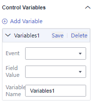
- Select the event, field value, and variable name, and click Save.
- Click Interactions. Expand Control Variables and click Add Variable.
Feedback
Was this page helpful?
Provide feedbackThank you very much for your feedback. We will continue working to improve the documentation.See the reply and handling status in My Cloud VOC.
For any further questions, feel free to contact us through the chatbot.
Chatbot


