
Help Center/
DataArts Insight/
User Guide/
Creating a Large Screen/
Large Screen Components/
Adding Materials
Updated on 2025-05-20 GMT+08:00
Adding Materials
The materials component is used to add materials to data reports.
Prerequisites
- You have subscribed to DataArts Insight.
- A project for managing data sources has been created. For details, see Creating a Project.
Procedure
- Log in to the DataArts Insight console.
- Click
 in the upper left corner of the management console to select a region. Then, select an enterprise project in the upper right corner.
 - On the top menu of the console, click Project. On the displayed My Projects page, click the name of the desired project.
- In the navigation pane on the left, choose Data Analytics > Large Screen. On the displayed page, click Create Screen in the upper right corner.
- In the displayed dialog box, select a project and click Confirm.
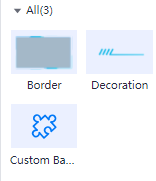
- Click the Materials icon in the navigation pane to switch to the materials component page.
Figure 1 Materials
- Drag a materials component to the canvas.
- Configure styles for the materials on the right of the page.
- Click Save and Publish or Save in the upper right corner of the page.
Styles
- Size/Position
- W: width of the target, in pixels.
- H: height of the target, in pixels.
- X: position of the target on the canvas, in pixels.
- Y: position of the target on the canvas, in pixels.
- Opacity: Adjust the transparency of the target on the canvas using a slider or by manually entering a percentage. A higher percentage means lower transparency.
Figure 2 Size/Position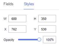
- Border styles
- Fill
- Style: Various styles are provided for borders.
- Custom
- Image: You can set an image URL or upload a local image.
- Border Width: You can set the top, right, bottom, and left boarders to adjust the display style. The value ranges from 0 to 500.
- border-slice: You can set the top, right, bottom, and left boarders to adjust the display style. The value ranges from 0 to 500.
- Fill
- Decoration styles
- Scale Mode: The value can be Retain original image size, Proportional scaling, Cropping and Scaling, and Stretch scaling.
- Style: Various styles are provided for decorations.
- Custom Background Component
- Effect
- Background Color: Set the background color of the custom background component.
- Feathering: Set feathering for the custom background component. The value ranges from 0 to 100.
Figure 3 No feathering effect
 Figure 4 Feathering effect
- Blurriness: Set blurriness for the custom background component. The value ranges from 0 to 100.
- Brightness: Set brightness for the custom background component. The value ranges from 0 to 200.
- Hue Rotation: Set hue rotation for the custom background component. The value ranges from 0 to 360.
- Opacity: Set opacity for the custom background component. The value ranges from 0 to 100.
- Borderline Options
- Style: Select the solid line, dotted line, or dotted line.
- Width: Set the width of borderlines. The value cannot be smaller than 0.
- Color: Set the color of borderlines.
- Round Corner
- Upper Left Corner: Set the upper left corner of the rounded corner. The value cannot be smaller than 0.
- Upper Right Corner: Set the upper right corner of the rounded corner. The value cannot be smaller than 0.
- Lower Right Corner: Set the lower right corner of the rounded corner. The value cannot be smaller than 0.
- Lower Left Corner: Set the lower left corner of the rounded corner. The value cannot be smaller than 0.
Figure 5 All rounded corners being 0
 Figure 6 All rounded corners being 90
- Fill
- Use materials: Add preset background images to facilitate highly frequent reuse of background images.
- Custom background
- Image: You can add an image URL or upload a local image.
- Scale Mode: The value can be Retain original image size, Proportional scaling, Cropping and Scaling, and Stretch scaling.
- Image Position: The value can be Align Center, Align Left, Align Right, Top alignment, or Bottom alignment.
- Effect
Interactions
- Click Interactions. Expand Interaction Definition and click Edit interaction event. The Edit interaction page is displayed. You can add the custom background component.
Figure 7 Edit interaction

- Set Event to Click.
- Click Add Action to add an action. Actions can be changed between hidden and visible states, with different action values displayed depending on the selected widget.
- Click OK to complete the setting of the interaction event.

- Data filtering operators are categorized by string, number, and date types.
- String operators support exact matches, inequalities, inclusions, exclusions, prefixes, suffixes, and checks for emptiness.
- Number operators allow for equality, inequality, range comparisons, and checks for emptiness.
- Date operators support equality and range comparisons.
- Interactions support the use of SQL placeholders to bind datasets dynamically.
- To enable global parameter effects, edit the SQL statements within the associated dataset and add dynamic parameters.
- Go to the component editing page and click Interactions to set related parameters.
- Data filtering operators are categorized by string, number, and date types.
Parent topic: Large Screen Components
Feedback
Was this page helpful?
Provide feedbackThank you very much for your feedback. We will continue working to improve the documentation.See the reply and handling status in My Cloud VOC.
The system is busy. Please try again later.
For any further questions, feel free to contact us through the chatbot.
Chatbot


