
Creating a Text
The text component enhances the data report page by providing descriptive text in a textual format.
Prerequisites
- You have subscribed to DataArts Insight.
- A project for managing data sources has been created. For details, see Creating a Project.
- You have obtained data. For details, see Creating a Data Source.
- You have prepared the required dataset. For details, see Creating a Dataset Through Visual Configuration.
Procedure
- Log in to the DataArts Insight console.
- Click
 in the upper left corner of the management console to select a region. Then, select an enterprise project in the upper right corner.
 - On the top menu of the console, click Project. On the displayed My Projects page, click the name of the desired project.
- In the navigation pane on the left, choose Data Analytics > Large Screen. On the displayed page, click Create Screen in the upper right corner.
- In the displayed dialog box, select a project and click Confirm.
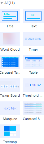
- Hover over the fourth icon (which means texts) in the navigation pane to switch to the text component page.
Figure 1 Text component page
- Drag or double-click a text template to the canvas area.
- In the right pane, set related parameters for the target text.
Title: Expand Text Style in the right pane and enter a title in the text box under Text Settings and enter the link to be redirected in the Redirect text box.
Text: Enter a text in the text box under Text Content on the Fields page.
Word Cloud: On the Fields page, drag and drop the required category axis/dimension and axis value/metric to add them to the Class Axis/Dimension, Axis Value/Metric, and Filter areas.
Timer: You do not need to set it.
Carousel Table: On the Fields page, drag and drop the required category axis/dimension and axis value/metric to add them to the Table Columns/Dimensions or Metrics, Filter, and Sorting areas.
Ticker Board: On the Fields page, drag and drop the required axis value/metric to add it to the Numeric/Metric and Filter areas.
Marquee: On the Fields page, enter a text in the Text Content text box. After the setting is successful, the rolling effect is automatically displayed.
Carousel Bar Chart: On the Fields page, drag and drop the required axis value/metric to add it to the Class Axis/Dimension, Axis Value/Metric, and Filter areas.
- Once the large screen fields and style are configured, click Save and Publish or Save in the upper right corner of the page.
Parameter Description
|
Component |
Description |
Parameter |
|---|---|---|
|
Title |
Title, which is used together with other components. |
None |
|
Text |
Text, which describes the components. |
Text |
|
Word Cloud |
A visual representation of text data, where words are displayed in a cloud-like, colorful graph. |
Class Axis/Dimension |
|
Timer |
The timer synchronizes with standard time to display the current time. |
None |
|
Carousel Table |
Data is presented in a rotating table format, with rows and columns. |
Table Columns/Dimensions or Metrics |
|
Table |
Data is displayed in a table, with rows and columns. |
Table Columns/Dimensions or Metrics |
|
Ticker Board |
The ticker board allows customization of the title, number, prefix, and suffix styles. Flippers are typically used in conjunction with other components to visually represent real-time data changes. |
Axis Value/Metric |
|
Threshold Board |
Similar to the ticker board, the threshold board allows for style customization and is used to display real-time data changes in visual applications. |
Axis Value/Metric |
|
Marquee |
The marquee offers options to customize text content, color, and animation effects. Overflow text can be displayed as a scrolling animation within the component. |
Text Content |
|
Carousel Bar Chart |
A table-like component that visualizes data through bar lengths proportional to their values and supports scrolling text animation and multi-page content display. |
Category Axis/Dimension and Axis Value/Metric |
|
Treemap |
The treemap diagram is suitable for representing hierarchical data, the treemap diagram provides an intuitive comparison of data at the same level and makes efficient use of space to show proportions. |
Color Block Label/Dimension and Color Block Size/Metric |
Feedback
Was this page helpful?
Provide feedbackThank you very much for your feedback. We will continue working to improve the documentation.See the reply and handling status in My Cloud VOC.
For any further questions, feel free to contact us through the chatbot.
Chatbot


