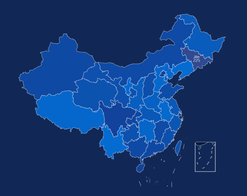
China Map
This section describes the parameters of a China map.
Notes and Constraints
- You can only drag one field to the Province area, which is mandatory.
- You can only drag one field to the Numeric area.
- You can only drag a maximum of five fields to the Tooltip/Metric area.
Prerequisites
- A project has been created by referring to Creating a Project.
- A data source has been connected by referring to Creating a Data Source.
- A dataset has been created by referring to Creating a Dataset.
- A large screen has been created by referring to Creating a Large Screen.
Procedure
- Click the Maps icon in the left navigation pane to switch to the map component page.
- Click or drag a map component to the canvas.
- In the data configuration area on the right, select a dataset.
- Set parameters on the Fields, Styles, and Interactions tabs.
- Click Update. The system automatically updates the chart.
Figure 1 Example of a China map

- Click Save or Save and Publish in the upper right corner of the page to save the large screen.
- In the displayed Save Screen dialog box, enter the large screen name and click OK.
Fields
- In the Data area on the right, select a dataset, and double-click or drag required dimension and metric fields to the corresponding areas on the Fields tab.
- Set the maximum number of query results.
Enter the maximum number of records that can be returned in the text box. The default value is 1000.
- Set automatic refresh.
The auto refresh interval supports the following options: no refresh, 1 minute, 5 minutes, 15 minutes, and 30 minutes.
Styles
Set the parameters for creating a China map based on Table 1.
|
Parameter |
Description |
|---|---|
|
Size/Position |
Set the width (W) and height (H) of the chart, in pixels. Set the position of the target on the canvas, in pixels. Adjust the transparency of the chart on the canvas, with a higher proportion resulting in lower transparency. |
|
Global Style |
Map Center: Adjust the position of the map center in the layer by setting Top and Left. Zoom Range: Set the zoom ratio of the map center in the layer. The value ranges from 0.1 to 50. |
|
Filling Settings |
Transparency: Set the filling transparency. The value ranges from 0 to 1. Borderline Options: Set the color and width of the borderline. |
|
Visual Mapping |
By configuring visual mapping, data on the map can be divided into different color intervals, making it easy to visualize the distribution of the data.
|
|
Label |
Select the checkbox (
 ) to show labels. ) to show labels.
Set Font, Color, Font Size, and Font Weight. |
|
Selected Style |
Set the fill and font colors of the selected area using the mouse. |
|
Tooltip |
When the check box is selected ( Set the tooltip's padding, background color, border color, border width, text, font weight, and custom size. After completing the settings, click Preview in the upper right corner of the page to view. The corresponding tooltip is displayed when the mouse hovers over a specific area. |
|
Zoom Settings |
Set whether to enable zooming. |
|
Panning Settings |
Set whether to enable panning. |
Interactions
- Link
On the Interactions tab, choose Advanced > Link. In the Chart Linkage Configuration dialog box that appears, set parameters by referring to Table 2. For details, see Example linkage.
- Filter
- Click Filter. The Filter tab is displayed.
- Click
 next to Fields to Bound. The associated field box is displayed.
 - Click
 , select the field to be bound, select the associated chart, and click OK.
- Shown/Hidden
- Click Show/Hidden. The Shown/Hidden tab is displayed.
- Select the associated chart and click OK.
Table 2 Chart linkage configuration parameters Parameter
Description
Filter
- Fields to Bound: Select the fields to be bound.
- Associated Charts: Set linked associated charts. You can select charts from the same dataset or different datasets.
Shown/Hidden
Select the required fields first and then select the charts to be associated with them. You can select all charts on the large screen.
- Click Show/Hidden. The Shown/Hidden tab is displayed.
- Select the associated chart.
- Filter
Feedback
Was this page helpful?
Provide feedbackThank you very much for your feedback. We will continue working to improve the documentation.See the reply and handling status in My Cloud VOC.
For any further questions, feel free to contact us through the chatbot.
Chatbot


