
Funnel Chart
The funnel chart is a type of bar chart that vividly displays data sorting changes by using a funnel consisting of trapezoid shapes.
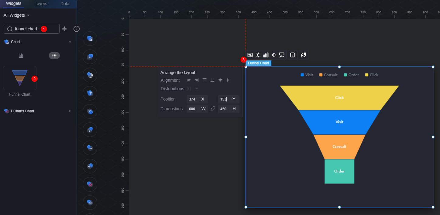
On the large screen design page, drag the funnel chart widget from All > Chart to the blank area of the canvas, as shown in Figure 1.

Card
A card wraps a chart widget. A widget consists of card elements (card title, chart, card background, and card border) and chart elements.
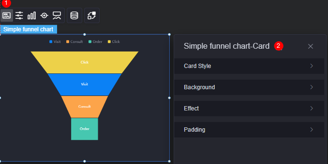
- Card style: You can select a card style based on your service requirements. You can click the clear style button to clear the configured style.
- Background
- Background color: Background color of the widget card.
- Border: Border of the widget card, which can be no, full, and corner. For full border and corner border, you can set the line type and rounded corners of the outer border of the widget.
- Style: Image display style. The options are normal, center, stretch, and tiled.
- Choose image: Use a local image as the widget background. Directories and subdirectories can be added to facilitate image management by category. JPG, JPEG, PNG, and GIF images are recommended. Each image cannot exceed 50 MB.
- Special effect: Widget highlighted status. Displayed by default or on page load.
- Padding: Distance between the chart and the four sides (top, bottom, left, and right as shown in Figure 2) of the widget. The default value is 0, indicating that the chart stretches to fill the entire widget.
Configuration
In the configuration settings, you can specify whether to display the widget title and legend.
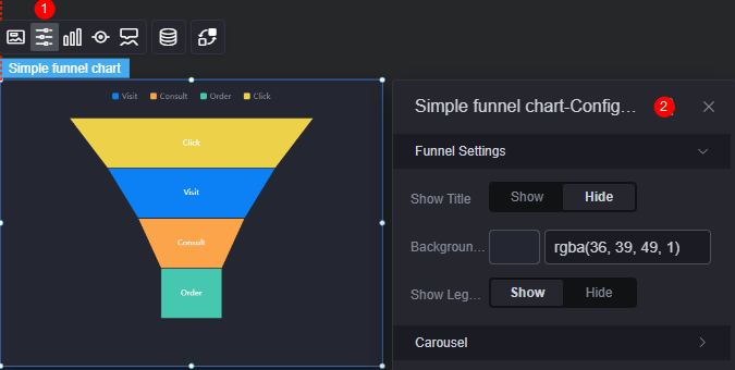
- Funnel settings
- Show title: Whether to display the widget title. After this function is enabled, you can set the title color, content, and position.
- Background color: Background color of the widget.
- Show legend: Whether to display the legend. After this function is enabled, you can set the legend position.
- Swiper: Whether to enable the swiper effect.
- Interval: Swiper interval of the chart. The value cannot be greater than 24 seconds.
- Swiper order: The swiper order of the chart. The options are from top to bottom and from bottom to top.
Graphic
A graphic is a specific graphical expression element that visualizes data in a widget, for example, a slice in a pie chart, a bar in a bar chart, a line or a kink point in a line chart.
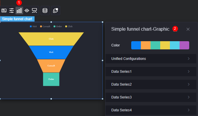
- Color: Color of the graphic.
- Unified configuration
- Block height(%): Height of the funnel chart in percentage.
- Label font: Font, color, and size of labels in data blocks.
- Data Series
- Series name: Default series name in the raw data. You can change the series name by configuring the display name.
- Display name: Display name of the series in the chart.
- Progress bar color: Color of the data block.
- Label font: Label font, text size, and text color.
Legend
A legend shows the dimensions in a multi-dimensional visualized graphic expression.
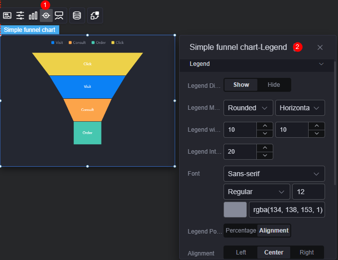
- Legend display: Whether to display the legend. The legend text content comes from the value of label in the data model.
- Legend marker: Shape of legend icons.
- Legend width and height: Width and height of legends.
- Legend interval: Space between legends.
- Font: Font, font color, and font size of legends.
- Legend position (left): Position of legends.
- Alignment: Alignment mode of legends, for example, left, center, or right.
- Legend top margin: Distance from the legend to the top of the funnel chart widget.
- Legend type: If there are many legends, you can choose to display them in scrolling or normal mode.
- Page up button: Color of the page up button.
- The page turning button is not activated: Color of the page up button in unavailable state.
- Custom legend setting: After this function is enabled, you can adjust the display length of the legend name. By default, "Off" is selected, indicating that the entire legend name is displayed.
Tooltip
Tooltip (floating prompt) displays metrics of specific dimension nodes in a visualized chart widget.
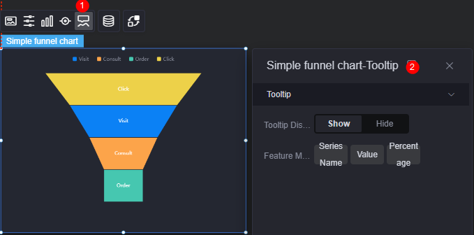
- Tooltip display: After this function is enabled, the information is displayed when you place the cursor on a specific series during chart preview.
- Feature marker: Content format of the tooltip box, such as series name, data value, and percentage.
Data
In the data settings, you can set the data source of the funnel chart widget. For more information, see Data Access.
Interaction
In the interaction settings, you can configure the interaction between the funnel chart widget and other widgets or pages. For details, see Interaction Configuration.
Feedback
Was this page helpful?
Provide feedbackThank you very much for your feedback. We will continue working to improve the documentation.See the reply and handling status in My Cloud VOC.
For any further questions, feel free to contact us through the chatbot.
Chatbot


