
General Configuration
Configuration Item Description
|
Parameter |
Type |
Mandatory |
Example |
Description |
|---|---|---|---|---|
|
type |
String |
Yes |
type: "input" |
Configuration item type. |
|
value |
String |
No |
value: "defaultValue" |
Default value. |
|
name |
String |
Yes |
name: "commProps.myString" |
The value of this field is bidirectionally bound to the value of commProps.myString in advanceEditvm. |
|
label |
Object |
No |
label: {"zh_CN": "Chinese label", "en_US": "En label"} |
Label of a configuration item, which needs to be internationalized. |
|
tip |
Object |
No |
tip: {zh_CN: "Chinese tip," en_US: "English tip"} |
Tip icon. When a configuration item is complex, you can add some tip content. |
|
noToolTip |
Boolean |
No |
noToolTip: false |
Whether the tag has el-tooltip. The default value is false. |
|
disabled |
Function | Boolean |
No |
disabled: true or (data, field, vm) => boolean |
Whether to disable the function. You can customize the function to determine whether to disable the function based on the values of other options. If true is returned, the function is disabled. |
|
showFunc |
Function |
No |
showFunc: function(vm) { return vm.commProps.showTitle; } |
Whether to display the configuration item. You can customize the function to determine whether to display the configuration item based on the values of other options. If true is returned, the function definition is displayed. |
|
events |
Object |
No |
events: { change: function(vm, value) { } } |
Callback function of the event triggered by configuration item modification. Currently, only the change event is supported. |
Description of the Input Parameter vm
The disabled, showFunc, and events configuration items of the widget have the input parameter vm, which is the widget instance.
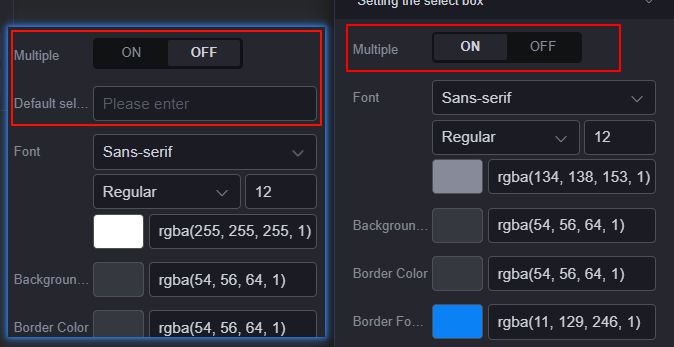
Configuration Example
The following is a common configuration example. The global_SelectWidget widget is used as an example. Figure 1 shows the configuration effect. In this example, global_SelectWidget is the drop-down list widget preset in Huawei Cloud Astro Canvas and can be obtained from My Assets > Widgets.
{
      type: 'tab',
      name: 'multiple',
      parentName: 'selectConfObj',
      label: { zh_CN: 'Multiple', en_US: 'Multiple' },
      value: false,
         options: [
           {
             label: { zh_CN: 'ON', en_US: 'ON' },
             value: true,
           },
          {
            label: { zh_CN: 'OFF', en_US: 'OFF' },
            value: false,
          },
        ],
      events: {
        change: function (vm, value) {
          if (value) {
            vm.selectConfObj.fontColor = vm.selectConfObj.multiSelectFontColor;
            vm.selectConfObj.selectValue = [];
          } else {
           vm.selectConfObj.fontColor = vm.selectConfObj.singleSelectFontColor;
           vm.selectConfObj.selectValue = '';
          }
        },
      },
  },
Feedback
Was this page helpful?
Provide feedbackThank you very much for your feedback. We will continue working to improve the documentation.See the reply and handling status in My Cloud VOC.
For any further questions, feel free to contact us through the chatbot.
Chatbot


