
Configuration Item Overview
This section describes the widget configuration items supported by Huawei Cloud Astro Canvas. You can define the widget type and configuration using the type field defined in the {widget}.editor.js file.
|
Category |
Type |
Description |
|---|---|---|
|
Input box |
Single-line text box |
|
|
Multi-line text box |
||
|
Number |
Counter |
|
|
Slider |
||
|
Exchange |
Tab |
|
|
Switch |
||
|
Single-choice |
||
|
Multi-choice |
||
|
Color |
Color picker |
|
|
Date and time |
Time picker |
|
|
Drop-down list |
Drop-down selection |
|
|
Loop |
Loop |
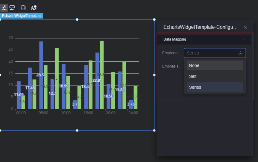
config Configuration Example
The following is an example of the config configuration. The configuration effect is shown in Figure 1.
{
      migrateFrom: 'advancedSettings',
      headerTitle: { zh_CN: 'Data Mapping', en_US: 'Data Mapping' },
      belong: 'configuration',
      config: [
        {
          type: 'select',
          name: 'commonProps.emphasisFocus',
          label: { zh_CN: ''Emphasis Focus', en_US: 'Emphasis Focus' },
          value: 'series',
          options: [
            {
              label: { zh_CN: 'None', en_US: 'None' },
              value: 'none',
            },
            {
              label: { zh_CN: 'Self', en_US: 'Self' },
              value: 'self',
            },
            {
              label: { zh_CN: 'Series', en_US: 'Series' },
              value: 'series',
            },
          ],
        },
        {
          type: 'tab',
          name: 'commonProps.showLabel',
          label: { zh_CN: 'Emphasis Focus', en_US: 'Emphasis Focus' },
          value: true,
          options: [
            {
              label: { zh_CN: 'Show', en_US: 'Show' },
              value: true,
            },
            {
              label: { zh_CN: 'Hide', en_US: 'Hide' },
              value: false,
            },
          ],
        },
      ],
    },
Feedback
Was this page helpful?
Provide feedbackThank you very much for your feedback. We will continue working to improve the documentation.See the reply and handling status in My Cloud VOC.
For any further questions, feel free to contact us through the chatbot.
Chatbot


