
list
Configuration Item Description
|
Parameter |
Type |
Mandatory |
Example |
Description |
|---|---|---|---|---|
|
type |
String |
Yes |
type: "list" |
Configuration item type. |
|
name |
String |
Yes |
name:"intervalColors" |
Name of a bidirectional binding list. |
|
label |
Object |
No |
label: {"zh_CN": "Chinese label", "en_US": "English Label"} |
Label of a configuration item, which needs to be internationalized. |
|
listFixed |
Boolean |
No |
listFixed: true |
The number of records in a list is fixed. The add and delete functions are not displayed. The default value is true. |
|
labelOnce |
Boolean |
No |
labelOnce: true |
The label is displayed only once in the first item of the list.
|
|
showIndex |
Boolean |
No |
showIndex: true |
Number of records displayed at the end of a label.
|
|
displayMode |
String |
No |
displayMode: "box"displayMode: "simple" |
Displayed in a drop-down list box or in tile mode.
|
|
events |
Object |
Yes |
events: { addItemFunc: function (vm, index) { return { size: 1, color: 'rgba(11,129,246,1)'} }, itemDelCallBack: function (values) { if (values && values.length) { values[values.length - 1].size = 1; } }, }, |
Adds or deletes an item in the list. By default, the addItemFunc and itemDelCallBack functions should be added. If the value of noAdd is true, you do not need to add it. |
|
childItems |
Array |
Yes |
childItems: [{ type: "colorpicker", name: "color", value: "rgba(11,129,246,1)", width: 26, showInput: false,}, { type: "input-number", name: "number", prop: "number", label: " Serial number" originFrom: "advanceEditvm", value: "123", width: 74, labelWidth: 20,}] |
Basic configuration items contained in each item in the list. In the basic configuration items, you can add width to adjust the proportion in a line. For example, if the width of three options is 20, 30, and 30, the three configuration items are displayed in a line. If the width is 20, 30, or 70, the first two options are in the same line, and the third option occupies 70% of the second row. If the width is not added or the width proportion is 100, the width occupies a separate line. labelWidth is added to the basic configuration items. If a label is available, you can enter a number to control the label width (unit: pixel). |
|
tip |
Object |
No |
tip: { zh_CN: "Number of data rows displayed in the current ranking page.", en_US: "Number of data rows displayed in the current ranking page.", } |
The info message is displayed next to label. |
|
allowNone |
Boolean |
No |
allowNone: true, |
Indicates whether to allow deletion to none. The default value is false, indicating that deletion is not allowed to none. |
|
helpLink |
String |
No |
helpLink: "http://..." |
Use the help icon. |
Event
|
Event Name |
Method In Configuration Item |
Description |
Callback Parameter |
|---|---|---|---|
|
change |
change |
Triggered when the value changes. |
(value, data, field) |
|
addItemFunc |
addAssembleType |
Triggered when you click Add. |
(vm) |
|
itemDelCallBack |
delAssembleType |
Triggered when you click Delete. |
(value) |
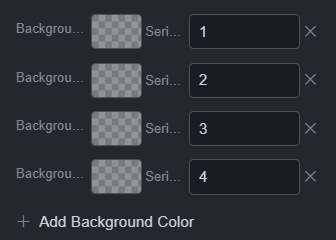
Configuration Example
{
    type: "list",
    name: "commProps.rowCusBg",
    displayMode: "simple",
    labelOnce: true,
    allowNone: true,
    label: { zh_CN: "Background Color", en_US: "Background Color" },
    helpLink:
    "https://***.html",
    childItems: [
        {
            type: "colorpicker",
            name: "color",
            originFrom: "advanceEditvm",
            value: "",
            width: 26,
            showInput: false,
        },
        {
            type: "string",
            name: "row",
            originFrom: "advanceEditvm",
            label: { zh_CN: "Serial Number", en_US: "Serial Number" },
            value: "",
            width: 74,
        },
    ],
},
Feedback
Was this page helpful?
Provide feedbackThank you very much for your feedback. We will continue working to improve the documentation.See the reply and handling status in My Cloud VOC.
For any further questions, feel free to contact us through the chatbot.
Chatbot


