Help Center/ Huawei Cloud Astro Zero/ User Guide (Low-Code)/ Frontend Development/ Advanced Pages/ Setting Properties of Preset Widgets on Advanced Pages/ Setting Properties of the Custom Frame Widget
Updated on 2025-08-15 GMT+08:00
Setting Properties of the Custom Frame Widget
This widget adds a mask layer or background to a page.
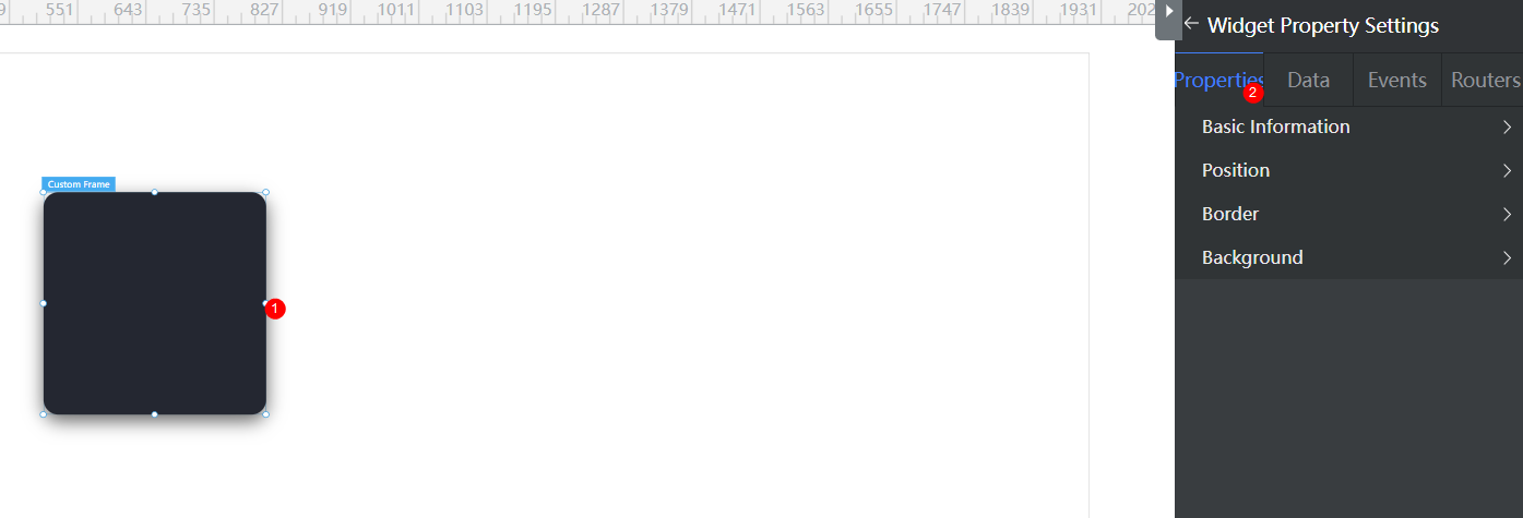
Figure 1 Setting the properties of the custom frame widget


Basic
- Widget Label: Label of a widget, which is displayed on the advanced page.
- Widget Name: Name of a widget, which is the unique identifier of the widget on the page.
Position
- Left: Left margin of the widget in the canvas. Unit: px.
- Top: Top margin of the widget in the canvas. Unit: px.
- Layout Width: Width of the widget. Unit: px.
- Layout Height: Height of the widget. Unit: px.
- Stacking Order: Order of the widget among others. The default value is 1. The widget with the largest value is on the top. If you want to move a widget to the bottom of a stack, set the parameter to 0.
- Auto Height: whether the widget height changes with the width.
- open: If this option is selected, the page adaptation function is displayed in the lower part.
- Page Adapter: Select open to enable height adaptation for the widget. This property enables the position of other widgets below the page to be automatically adjusted based on the height of the widget. One page supports only one widget.
Border
Border of the widget. Options: Full and Corner.
- Full border
- Style: Style of the widget border. Options: Solid, Dotted, Dashed, and Double.
- Width: Border width, in pixels.
- Color: color of the widget border.
- Radius: radian of the four corners of the widget border, in pixels.
- Corner
- Width: Border width, in pixels.
- Length: Border length, in pixels.
- Color: color of the widget border.
- Radius: radian of the four corners of the widget border, in pixels.
- Padding: Spacing between the widget border and the chart, in pixels.
Background
- Style: Background style. Options: Normal, Center, and Stretch.
- Image URL: Add images for this widget. The image can be in JPG, JPEG, PNG, or GIF format, and the image size cannot exceed 50 MB. The suggested image size is 800 x 800.
- Color: Background color of the widget.
Advanced Settings
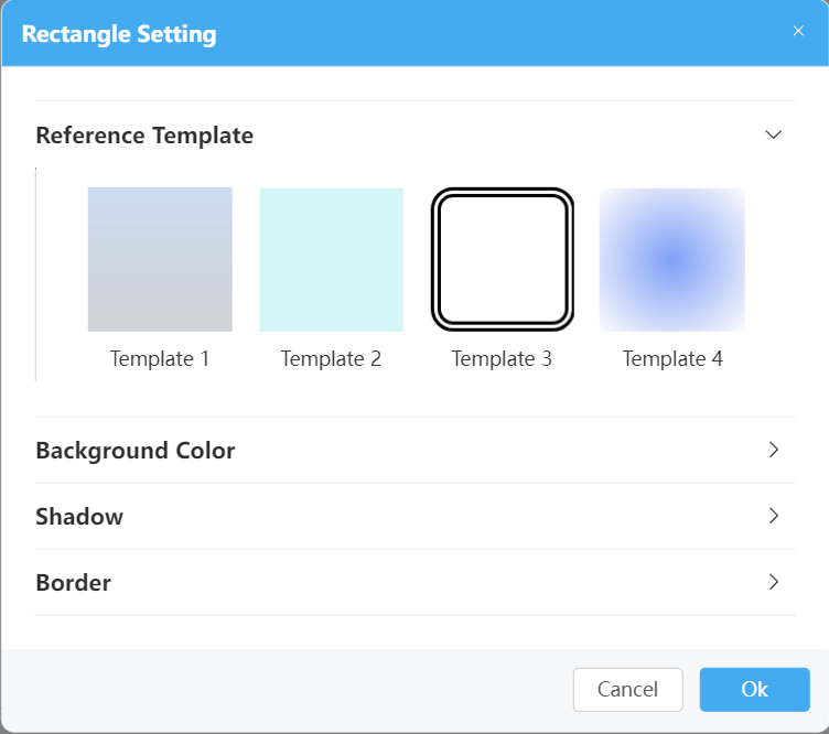
Right-click the custom frame widget and choose Setting from the shortcut menu to configure the reference template, background color, shadow setting, and border setting parameters.
Figure 2 Setting page


- Reference Template: By default, the system provides four templates. You can click a template to switch the style.
- Background Color: Background color configuration, including whether to display the background color, to display a monochromatic color, or to display gradient colors.
- Shadow: Shadow configuration. You can configure the inner shadow, outer shadow, or customized shadow.
- Border: Border configuration, including the thickness, color, type, and round corner.
Feedback
Was this page helpful?
Provide feedbackThank you very much for your feedback. We will continue working to improve the documentation.See the reply and handling status in My Cloud VOC.
The system is busy. Please try again later.
For any further questions, feel free to contact us through the chatbot.
Chatbot


