Help Center/Huawei Cloud Astro Zero/User Guide (Low-Code)/Frontend Development/Advanced Pages/Setting Properties of Preset Widgets on Advanced Pages/Setting Properties of the Text Editor Widget
Updated on 2025-08-15 GMT+08:00
Setting Properties of the Text Editor Widget
The text editor is a type of text widget. It displays text in multiple lines.
Figure 1 Basic


Basic
- Widget Label: Label of a widget, which is displayed on the advanced page.
- Widget Name: Name of a widget, which is the unique identifier of the widget on the page.
Position
- Left: Left margin of the widget in the canvas. Unit: px.
- Top: Top margin of the widget in the canvas. Unit: px.
- Layout Width: Width of the widget. Unit: px.
- Layout Height: Height of the widget. Unit: px.
- Stacking Order: Order of the widget among others. The default value is 1. The widget with the largest value is on the top. If you want to move a widget to the bottom of a stack, set the parameter to 0.
- Auto Height: whether the widget height changes with the width.
- open: If this option is selected, the page adaptation function is displayed in the lower part.
- Page Adapter: Select open to enable height adaptation for the widget. This property enables the position of other widgets below the page to be automatically adjusted based on the height of the widget. One page supports only one widget.
Border
Border of the widget. Options: Full and Corner.
- Full border
- Style: Style of the widget border. Options: Solid, Dotted, Dashed, and Double.
- Width: Border width, in pixels.
- Color: color of the widget border.
- Radius: radian of the four corners of the widget border, in pixels.
- Corner
- Width: Border width, in pixels.
- Length: Border length, in pixels.
- Color: color of the widget border.
- Radius: radian of the four corners of the widget border, in pixels.
- Padding: Spacing between the widget border and the chart, in pixels.
Background
- Style: Background style. Options: Normal, Center, and Stretch.
- Image URL: Add images for this widget. The image can be in JPG, JPEG, PNG, or GIF format, and the image size cannot exceed 50 MB. The suggested image size is 800 x 800.
- Color: Background color of the widget.
Custom Configuration List
Custom config list displays the custom properties of a widget.
Text Settings
- Text Content: Enter the text content in the text box.
- Font: Font of the input text.
- Font Weight: Font width of the input text. Options: Normal, Lighter, Bolder, and Bold.
- Font Size: Font size of the input text, such as extra small, medium, and large.
- Font Color: Font color of the input text.
- Text Decoration: Add underscores, strikethroughs, and hyphens to the text.
Paragraph Settings
- Content Alignment: If the text content is in multiple lines, it can be centered, left, right, or both ends.
- Text Position: If the text content is in one line, it can be centered, left, or right.
- Text Spacing: Set the row height.
- Line Height: Distance between text lines.
- First Line Indent: Indentation of the first line. Default value: 0
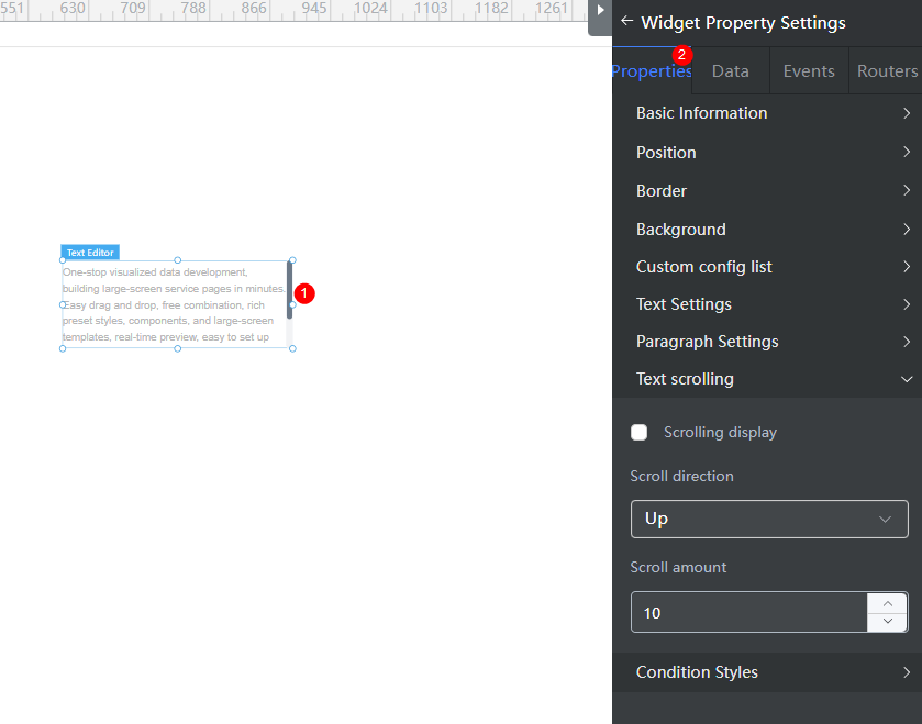
Text Scrolling
- Scroll display: Displays the text in scrolling mode.
- Scrolling direction: Options: Up, Down, Left, and Right.
- Scrolling amount: Scrolling speed of the text.
Feedback
Was this page helpful?
Provide feedbackThank you very much for your feedback. We will continue working to improve the documentation.See the reply and handling status in My Cloud VOC.
The system is busy. Please try again later.
For any further questions, feel free to contact us through the chatbot.
Chatbot


