
Help Center/ Huawei Cloud Astro Zero/ User Guide (Low-Code)/ Frontend Development/ Advanced Pages/ Setting Properties of Preset Widgets on Advanced Pages/ Setting Properties of the Image Widget
Updated on 2026-01-05 GMT+08:00
Setting Properties of the Image Widget
Image is a type of media widget that displays image data.
Figure 1 Setting properties of the image widget

Basic
- Widget Label: Label of a widget, which is displayed on the advanced page.
- Widget Name: Name of a widget, which is the unique identifier of the widget on the page.
Position
- Left: Left margin of the widget in the canvas. Unit: px.
- Top: Top margin of the widget in the canvas. Unit: px.
- Layout Width: Width of the widget. Unit: px.
- Layout Height: Height of the widget. Unit: px.
- Stacking Order: Order of the widget among others. The default value is 1. The widget with the largest value is on the top. If you want to move a widget to the bottom of a stack, set the parameter to 0.
- Auto Height: whether the widget height changes with the width.
- open: If this option is selected, the page adaptation function is displayed in the lower part.
- Page Adapter: Select open to enable height adaptation for the widget. This property enables the position of other widgets below the page to be automatically adjusted based on the height of the widget. One page supports only one widget.
Border
Border of the widget. Options: Full and Corner.
- Full border
- Style: Style of the widget border. Options: Solid, Dotted, Dashed, and Double.
- Width: Border width, in pixels.
- Color: color of the widget border.
- Radius: radian of the four corners of the widget border, in pixels.
- Corner
- Width: Border width, in pixels.
- Length: Border length, in pixels.
- Color: color of the widget border.
- Radius: radian of the four corners of the widget border, in pixels.
- Padding: Spacing between the widget border and the chart, in pixels.
Background
- Style: Background style. Options: Normal, Center, and Stretch.
- Image URL: Add images for this widget. The image can be in JPG, JPEG, PNG, or GIF format, and the image size cannot exceed 50 MB. The suggested image size is 800 x 800.
- Color: Background color of the widget.
Custom Configuration List
Custom config list displays the custom properties of a widget.
Image Settings
In the image address text box, enter the image address to display the image.
Connector Setting
- Use Connector: Whether to obtain images from a connector.
- Choose Connector Type: Select a connector with the storage function. OBS, MINIO, and object storage brokers are supported.
- Choose Connector: Select a connector instance.
- Choose Bucket: Select the bucket of the connector.
- Use Relative Image URL: Use the relative path of the image.
Link
In Link URL, enter the target address to which the image is redirected.
Advanced Settings
In Setting, you can set the image filling type.
Figure 2 Setting
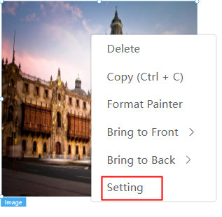
Figure 3 Image setting page

- Click Choose. On the My Pictures tab page, move the cursor to a folder and click
 to create a folder or click
  to delete a folder. Click the button to upload an image in JPG, JPEG, PNG, or GIF format. The size of each image cannot exceed 1 MB. The recommended image size is 800 x 800 pixels. On the Network Pictures tab page, you can enter the image address to obtain the image.
 - If you select Fill, the image does not retain the original scale and is stretched to the entire container.
- If you select Contain, the original size of the image is retained, and a blank space may be left in the container.
- If you select Cover, either the width or height must be the same as that of the container. In this case, certain part of the image may be invisible.
- If you select None, the original image scale and size are retained.
Feedback
Was this page helpful?
Provide feedbackThank you very much for your feedback. We will continue working to improve the documentation.See the reply and handling status in My Cloud VOC.
The system is busy. Please try again later.
For any further questions, feel free to contact us through the chatbot.
Chatbot


