Setting Properties of the Bar Chart Widget
Bar charts display the overall data using bars.

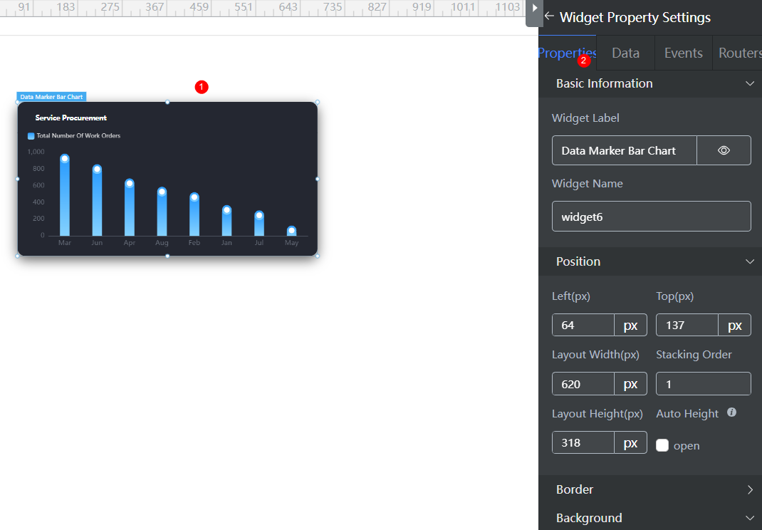
Basic
- Widget Label: Label of a widget, which is displayed on the advanced page.
- Widget Name: Name of a widget, which is the unique identifier of the widget on the page.
Position
- Left: Left margin of the widget in the canvas. Unit: px.
- Top: Top margin of the widget in the canvas. Unit: px.
- Layout Width: Width of the widget. Unit: px.
- Layout Height: Height of the widget. Unit: px.
- Stacking Order: Order of the widget among others. The default value is 1. The widget with the largest value is on the top. If you want to move a widget to the bottom of a stack, set the parameter to 0.
- Auto Height: whether the widget height changes with the width.
- open: If this option is selected, the page adaptation function is displayed in the lower part.
- Page Adapter: Select open to enable height adaptation for the widget. This property enables the position of other widgets below the page to be automatically adjusted based on the height of the widget. One page supports only one widget.
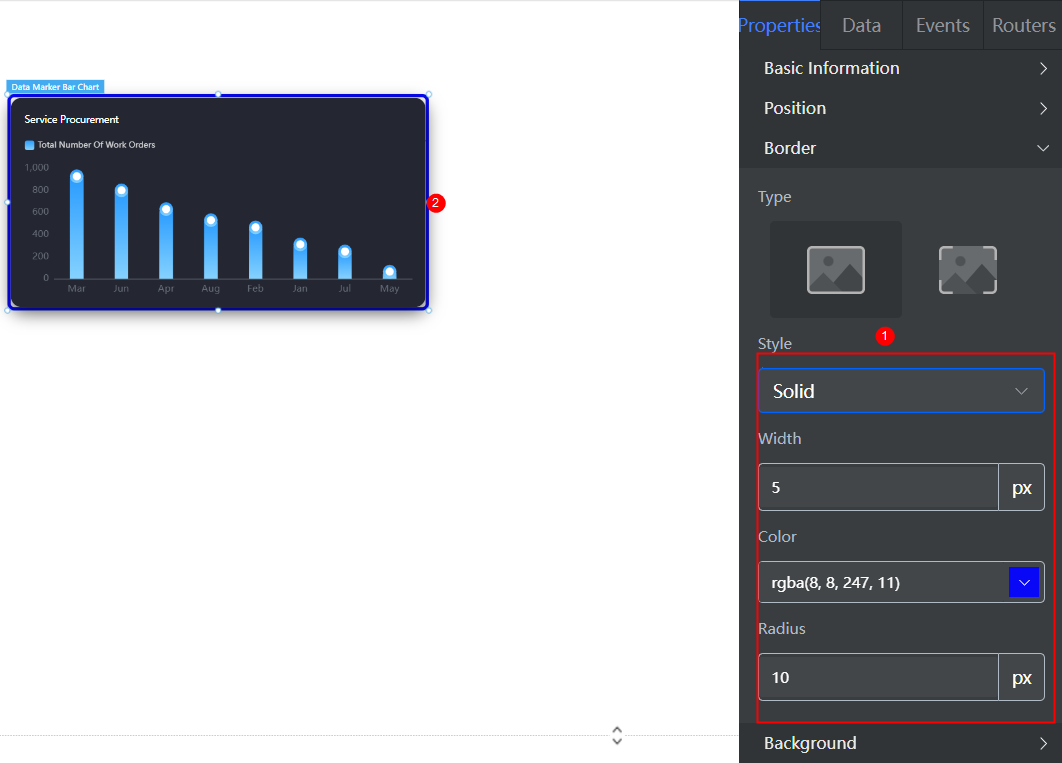
Border
Border of the widget. Options: Full and Corner.


- Full border
- Style: Style of the widget border. Options: Solid, Dotted, Dashed, and Double.
- Width: Border width, in pixels.
- Color: color of the widget border.
- Radius: radian of the four corners of the widget border, in pixels.
- Corner
- Width: Border width, in pixels.
- Length: Border length, in pixels.
- Color: color of the widget border.
- Radius: radian of the four corners of the widget border, in pixels.
- Padding: Spacing between the widget border and the chart, in pixels.
Background
- Style: Background style. Options: Normal, Center, and Stretch.
- Image URL: URL of the background image.
- Color: Background color.
Advanced Settings
Right-click the basic bar chart widget and choose Setting from the shortcut menu to configure the title and legend of the bar chart.
- Reference Color Template: By default, the system provides two templates. You can click a template to switch the style.
- Default: Data is sorted and displayed.
- Blue Gradient Non-sorting
You can select a template to reset or set configuration items to obtain the desired effect.
- Data Series: Configure the color, width, border, and value of each data series. Click + to add a data series. For details about how to set the data series, see Configuring a Data Series.
- General Histogram Color: You can select Monochrome or Gradient to change the color of the bar chart.
- Custom Bar Color: You can customize the bar color.
- Column Chart Width: Width of the bar, in pixel. The default value is 20.
- Column Rounded Borders: Rounded corner of the bar border. 0 indicates right angle, and 100 indicates round corner.
- Numerical Display: Whether to display values next to the bar. Once enabled, you can set the value display position and color.
- Unified Data Configuration: Data configuration, including whether to highlight data, whether to sort data, whether to switch the bar to ladder waterfall chart, and whether to use horizontal bars (vertical display by default). For details about the configuration effect, click the configuration item to view the widget style change.
- Aperture Mark: This parameter is displayed only for a single data series, indicating whether to mark the aperture. After this function is enabled, the aperture and value are displayed above the bar.
- Data Sorting: This parameter is displayed only for a single data series, indicating whether to sort the data in the column bar.
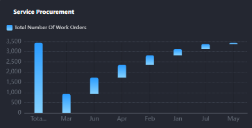
- Ladder Waterfall Display: This parameter is displayed only when a single data series is selected and data sorting is enabled. It indicates whether to display the data in the column bar in ladder waterfall mode. A waterfall chart is often used to analyze the business performance and explain the change process from one number to another. For example, evaluate company profits, compare product benefits, highlight project budget changes, analyze inventory or sales over a period of time, and display product value changes over a period of time. Figure 4 Ladder waterfall effect

- Horizontal Bar Effect: Whether to enable the horizontal bar display effect.
- Stacked Display (multi-data Series Effect): This parameter is displayed only when there are multiple data series. It specifies whether to display multiple data series in stack mode.
- X Axis: X axis configuration.
- Axis Name Setting: You can set the text content, text color, font size, spacing between the name and axis, and name rotation.
- Axis Setting: You can set whether to display the axis, whether to display the scale, whether to reverse the axis data, and the axis color and axis text color.
- Gridlines: Whether to display the axis grid lines, and their type and color.
- Extra-column Spacing: Whether to display the spacing outside the bar.
- Column Spacing: Whether to display the spacing between columns. (The spacing between columns can be set only when there are multiple data series.)
- Label Display: Whether to wrap too many characters and whether to omit too many characters. The value of the X-axis label comes from the value of the dataX field in the data model.
- Tick label Interval: Whether to display scale labels at intervals. If this function is disabled, all labels are displayed.
- Tick label Rotation Angle: Rotation angle of the scale label.
- Y Axis: Y axis configuration.
- Axis Name Setting: You can set the text content, text color, font size, spacing between the name and axis, and name rotation.
- Minimum Interval Of Coordinate Axis: For example, if the interval is 500, the Y axis is 0, 500, 1000, and 1500, which are separated by 500 in sequence.
- Axis Setting: You can set whether to display the axis, whether to display the scale, whether to reverse the axis data, and the axis color and axis text color.
- Column shadow: whether to display the column shadow, shadow color, and whether to display data.
- Gridlines: Whether to display the axis grid lines, and their type and color.
- Axis Max: Maximum threshold of the axis.
- Tick label Rotation Angle: Rotation angle of the scale label.
- Title: Set the widget title, including the text content, text position, background color, text color, and font size.
- Legend: Set the legend, including the small legend icon, left margin, and top margin. The legend text content comes from the value of title in the dataValue data model.
- Common Setting > Total Display: After this function is enabled, the total data volume is displayed.
- Background: Set the background color and round corners of the chart. 0 indicates right angle, and 100 indicates round corner.
Configuring a Data Series
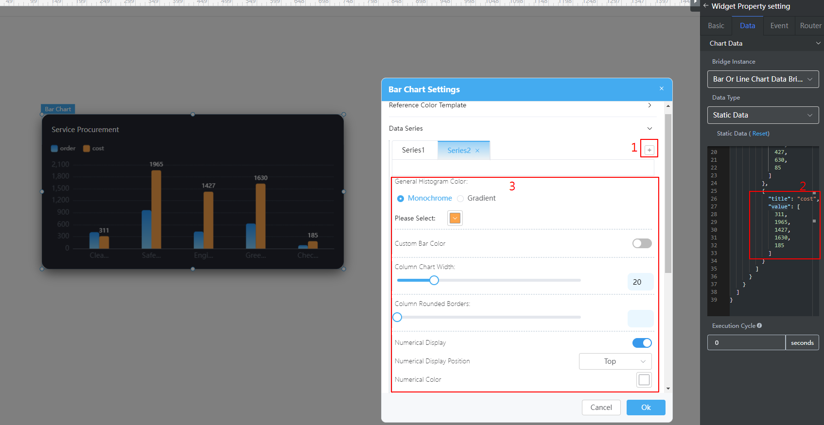
- Right-click the basic bar chart widget and choose Setting from the shortcut menu.
- Expand Data Series and click + to add a data series. Figure 5 Configuring a data series

- On the Data tab page on the right, configure data of the data series. For example, add the following code in bold to the static data preset in the system to configure the data of the new data series. You can also use the dynamic data to call the background API URL to return the following structure model data.
{ "resCode": "0", "resMsg": "Success", "result": [{ "order": { "dataX": [ "Cleaning", "Security management", "Project", "Greening", "Disinfection", "Special" ], "dataValue": [{ "title": "Total tickets", "value": [ 411, 965, 427, 630, 85, 800 ] }, { "title": "Fee", "value": [ 500, 1065, 327, 730, 185, 1000 ] } ] } }] } - Configure the column color, column width, column border fillet, and value display of the added data series. The value displayed in the column chart corresponds to the value in the preceding static data.
- Click Ok.
Feedback
Was this page helpful?
Provide feedbackThank you very much for your feedback. We will continue working to improve the documentation.See the reply and handling status in My Cloud VOC.
For any further questions, feel free to contact us through the chatbot.
Chatbot


