
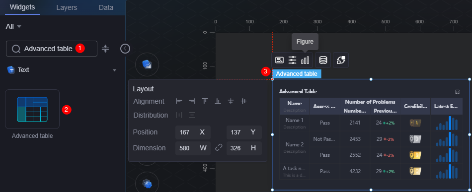
Advanced Table
The advanced table is a type of text widget. It clearly displays data in a table on visualized applications.
On the large screen design page, drag the advanced table widget from the All > Text area to the blank area of the canvas, as shown in Figure 1.

Card
A card wraps a chart widget. A widget consists of card elements (card title, chart, card background, and card border) and chart elements.
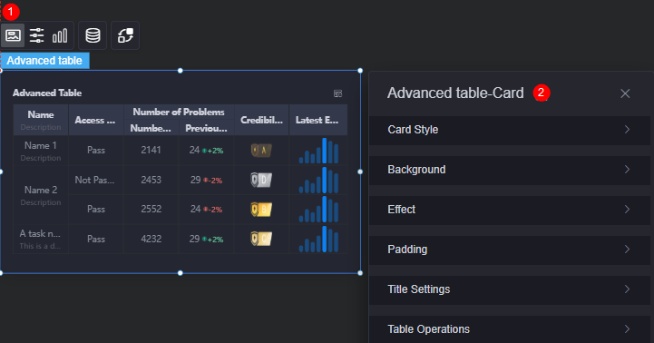
- Card style: You can select a card style based on your service requirements. You can click the clear style button to clear the configured style.
- Background
- Background color: Background color of the widget card.
- Border: Border of the widget card. Options: no border, full border, and corner border. For full border and corner border, you can set the line type and rounded corners of the outer border of the widget.
- Style: Image display style. The options are normal, center, stretch, and tiled.
- Choose image: Use a local image as the widget background. Directories and subdirectories can be added to facilitate image management by category. JPG, JPEG, PNG, or GIF images are recommended. The size of each image cannot exceed 50 MB.
- Special effect: Widget highlighted status. Displayed by default or on page load.
- Padding: Distance between the chart and the four sides (top, bottom, left, and right as shown in Figure 2) of the widget. The default value is 0, indicating that the chart stretches to fill the entire widget.
- Title settings
- Title: Whether to display the widget title.
- Title content: Content of the title.
- Title row height: Row height of the title, in pixels.
- Background color: Background color of the title.
- Text position: Position (center, left, right, or custom) of the text in the title.
- Font: Font, size, and color of the title.
- Table operations
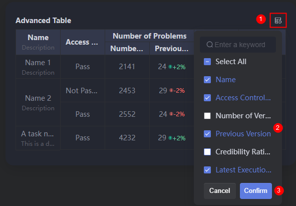
- Show/Hide column: Whether the columns to be displayed or hidden in the runtime environment. After enabling the show/hide column function, you can set the hover display, icon color, and icon selected color.
Figure 4 Column display effect
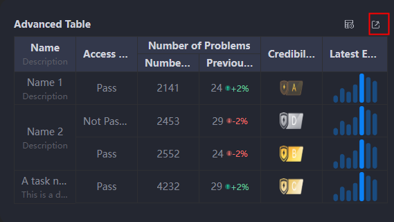
- Table export: Whether to enable the table export function. After enabling table export, you can set the hover display, icon color, and icon selected color.
Figure 5 Table export enabled
- Hover display: Once enabled, the corresponding button is displayed only when you move the cursor to the table widget.
- Icon color: Icon color of the button.
- Selected icon color: Color of the selected button icon.
- Show/Hide column: Whether the columns to be displayed or hidden in the runtime environment. After enabling the show/hide column function, you can set the hover display, icon color, and icon selected color.
Configuration
You can set the global style, table header, row, and serial number of the widget.
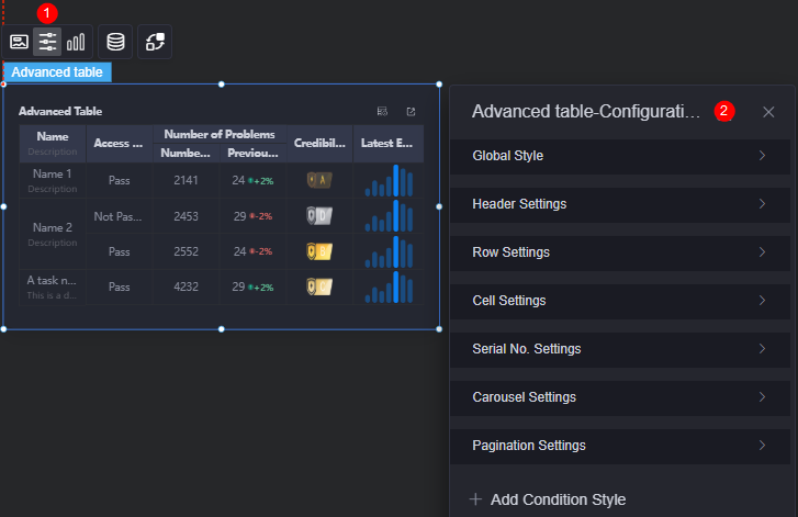
- Global style
- Background color: Background color of the table.
- Number of rows in the table: Number of rows displayed in the current table.
- Border: Border style of the table.
- Title settings
- Overflow text: Display style of extra-long text in the table, for example, ellipsis (...) and line break.
- Table header alignment: Alignment mode of the table header, for example, left, center, and right. The changes apply to table headers of all columns at the same time.
- Header row height ratio (%): Header row height of the table in percentage.
- Table header background color: Background color of the table header, which applies to all columns at the same time.
- Table header font: Header font, which applies to all columns at the same time.
- Border: Border style of the table header.
- Row configuration
- Odd row background color: Background color of odd rows.
- Even row background color: Background color of even rows.
- Cell
- Overflow text: Display style of extra-long text in the table, for example, ellipsis (...), line break, and scroll.
- Content alignment: Alignment mode of content in the cells, for example, left, center, and right. The mode applies to content in all columns at the same time.
- Content font: Font of cell content, which applies to all columns at the same time.
- Border: Border style of the cells.
- Serial number: Serial number for the table.
- Serial number: Whether to use the serial number in the table. By default, no serial number is used.
- Serial name: Name of the serial number.
- Column width ratio: Column width ratio of the serial number in the table.
- Background color: Background color of the serial number.
- Radius: Radius of the serial number.
- Rounded corners: Round corner of the serial number. The value 0 indicates right angle.
- Font: Font, size, and color of the serial number.
- Carousel
- Carousel: Whether to enable the carousel function. Once enabled, the carousel speed can be set.
- Carousel speed: Set the carousel speed.
- Pagination
- Background pagination: Up to 500 rows can be accessed. If the number of rows exceeds the limit, all data cannot be dynamically obtained in the original mode. In this case, you can use the background pagination function to display the table on multiple pages. For details about the example of background pagination, see Using the Background Pagination Function of Advanced Tables.
- Row height: Row height of the pages, in pixels.
- Page size: Number of records displayed on each page. Multiple records are separated with commas (,).
- Text position: Position of text displayed on each page. The text can be displayed on the left, right, or center.
- Background color: Background color of each page.
- Font: Font, size, and color of each page.
- Check box color: Color of the border when a page is selected, including the border of each page or item, the border of the current page, and the border of the page to be displayed.
- Page box width: Width of the page box, in pixels.
- Background color of the drop-down list box: Background color of the drop-down list box.
- Font color of the drop-down list box: Font color of the drop-down list box.
- Background color of the selected state in the drop-down list box: Background color of the drop-down list box when selected.
- Color of the selected font in the drop-down list box: Font color of the drop-down list box when selected.
- Background color of the drop-down list box when the mouse is hovered: Background color of the drop-down list box when you hover over it.
- Font color of the drop-down list box when the mouse is hovered: Font color of the drop-down list box when you hover over it.
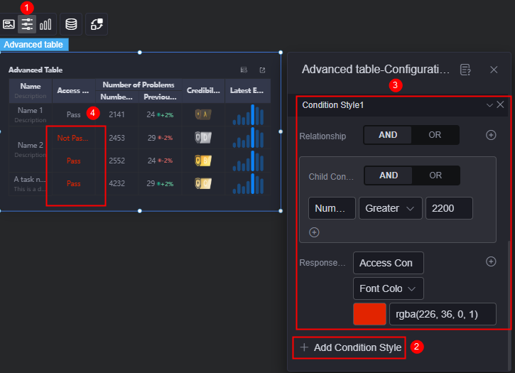
- Add condition style: Add a condition style. As shown in Figure 7, the setting indicates that the Access Control Result column will be displayed in red if the Number of Problems column meets the condition (greater than 2,200), or in the normal color in other conditions.
Graphic
A graphic is a specific graphical expression element that visualizes data in a widget, for example, a slice in a pie chart, a bar in a bar chart, a line or a kink point in a line chart.
- Unified configuration
- Icon selection color: Icon color when background sorting or filtering is selected.
Figure 9 Icon color after selection
- Column adaptation: Once enabled, columns in the table will automatically adjust based on content.
- Fixed columns: Set the styles of the first and last columns. After column adaptation is enabled, the fixed column style cannot be set.
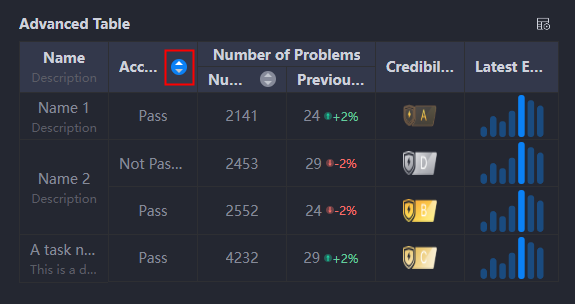
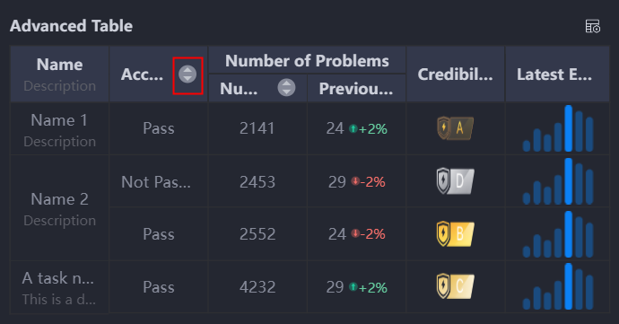
- Background sorting: Whether to enable the background sorting function. Once enabled, the icon shown below will appear when previewing the table and is used for sorting data. For details about the example of using the background sorting function, see Using the Background Sorting Function of Advanced Tables.
Figure 10 Sorting data in the background
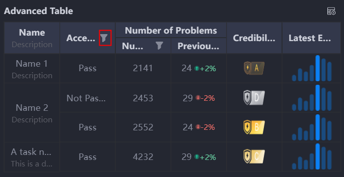
- Background filtering: Whether to enable the background filtering function. Once enabled, the icon shown below will appear when previewing the table and is used for filtering data. For details about the example of using the background sorting function, see Using the Background Filtering Function of Advanced Tables.
Figure 11 Filtering data in the background
- Icon selection color: Icon color when background sorting or filtering is selected.
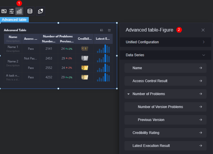
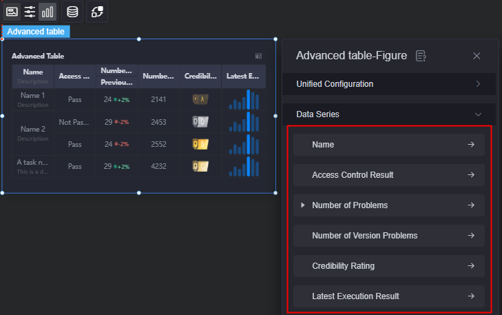
- Data series: An array that contains multiple series. You can use one or more series to configure cyclic rendering.
Figure 12 Data series
You can drag a series to form a hierarchy with other series. A maximum of three levels are supported.
Figure 13 Creating a level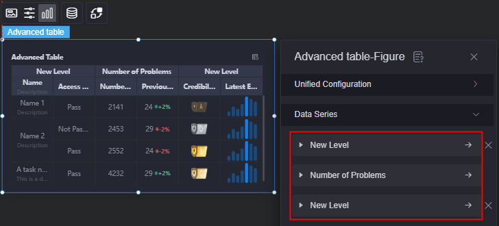
- Original data name: Default series name in the raw data. You can modify the name by setting column name. The text content comes from values of the data model, such as the name and access control result.
- Type: Data type, including single-line text, multi-line text, number, trend, image, mini bar chart, mini line chart, and mini progress bar. The displayed parameters vary according to the data type. The actual parameters displayed on the page are used. When the mini bar chart or mini line chart is selected, they can be zoomed in.
Figure 14 Enabling the mini bar chart zoom-in function
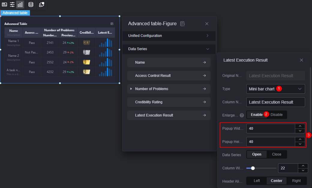 Figure 15 Previewing zoom-in effect
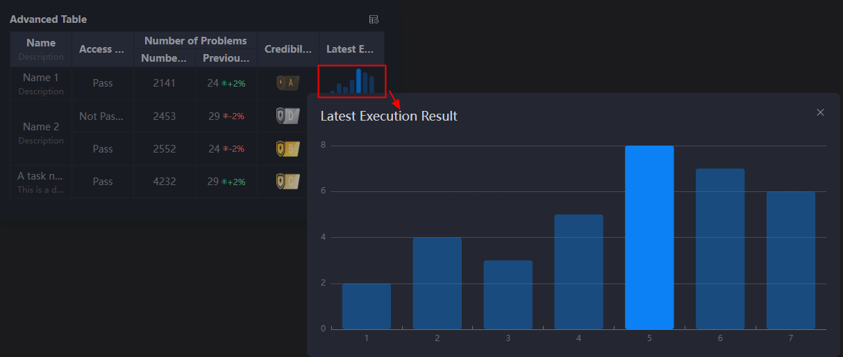
- Column name: Display name of the data series in the chart.
- Data series: Whether to display data series in the chart. For example, if you enable the name series, the name column will be displayed in the chart. Otherwise, the column will be hidden.
- Merge similar: Once enabled, consecutive cells with the same content in each column will be merged.
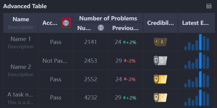
- Background sorting: Whether to enable the background sorting function. Once enabled, the icon shown below will appear when previewing the table and is used for sorting data.
Figure 16 Enabling the background sorting function
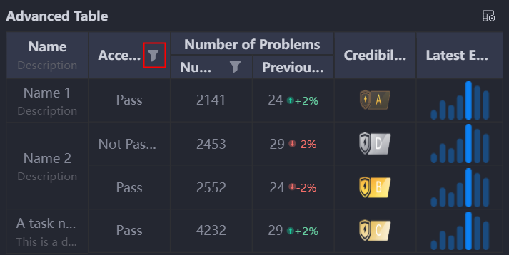
- Background filtering: Whether to enable the background filtering function. Once enabled, the icon shown below will appear when previewing the table and is used for filtering data.
Figure 17 Enabling the background filtering function
- Column width ratio (%): Ratio of the corresponding series in the chart.
- Table header alignment: Alignment mode of the table header, for example, left and center.
- Table header background color: Background color of the table header.
- Table header font: Font, color, and size of the table header.
- Content alignment: Alignment mode of the table content, for example, left and center.
- Content font: Font, color, and size of the table content.
Data
In the data settings, you can set the data source of the advanced table widget. For more information, see Data Access.
Interaction
In the interaction settings, you can configure interactions between the advanced table widget and other widgets or pages. For details, see Interaction Configuration.
Feedback
Was this page helpful?
Provide feedbackThank you very much for your feedback. We will continue working to improve the documentation.See the reply and handling status in My Cloud VOC.
For any further questions, feel free to contact us through the chatbot.
Chatbot


