
Time Selector
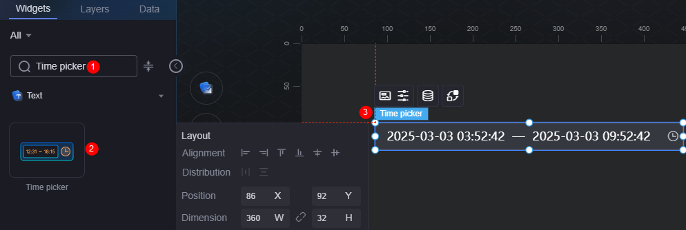
The time selector is a type of text widget used to select time.
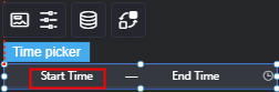
On the large screen design page, drag the time selector widget from All > Text to the blank area of the canvas, as shown in Figure 1.

Card
A card wraps a chart widget. A widget consists of card elements (card title, chart, card background, and card border) and chart elements.
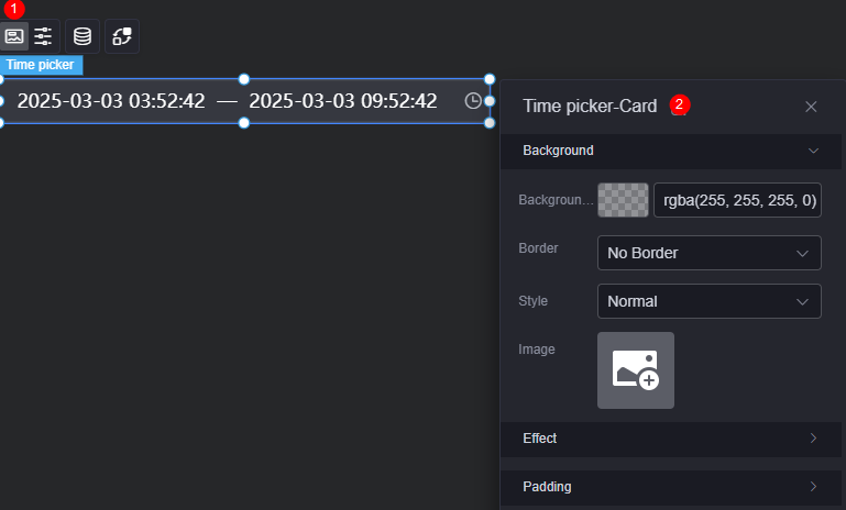
- Background
- Background color: Background color of the widget card.
- Border: Border of the widget card. Options: no border, full border, and corner border. For full border and corner border, you can set the line type and rounded corners of the outer border of the widget.
- Style: Image display style. The options are normal, center, stretch, and tiled.
- Choose image: Use a local image as the widget background. Directories and subdirectories can be added to facilitate image management by category. JPG, JPEG, PNG, or GIF images are recommended. The size of each image cannot exceed 50 MB.
- Special effect: Widget highlighted status. Displayed by default or on page load.
- Padding: Distance between the chart and the four sides (top, bottom, left, and right as shown in Figure 2) of the widget. The default value is 0, indicating that the chart stretches to fill the entire widget.
Configuration
You can set the time selector type, text box, and font color of the pop-up box.
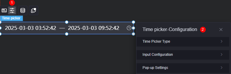
- Time selector type
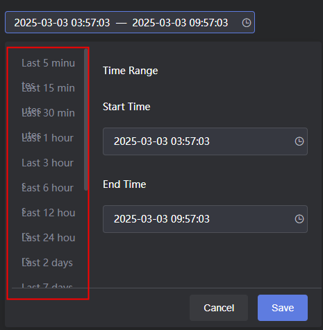
- Selector type: Time range and instantaneous are supported.
- Shortcut time: Display is enabled by default. Displayed only when the selector type is set to time range.
Figure 5 Display the shortcut time effect.
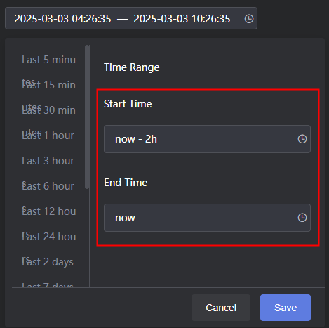
- Value type: Real-time and fixed time. If you select real-time, the shortcut time is in the now format, for example, Figure 6.
- Time font color: Font color of the shortcut time.
- Selected font color: Font color of the selected shortcut time.
- Selected background color: Background color of the shortcut time when the shortcut time is selected.
- Text box settings
The text box settings apply to all text boxes in the time selector widget.
- Font: Font, size, and color of the text in the text box.
- Background color: Background color of the text box.
- Border color: Border color of the text box.
- Border focus color: Color of the border when the time selector widget is focused via mouse click or keyboard navigation.
- Hover border color: Color of the border when the mouse pointer hovers over the time selector widget.
- Separator: Separator between the start time and end time.
- Start time placeholder: Text displayed in the start time text box when no specific time is selected.
Figure 7 Display effect when the data in the static data is deleted
- End time placeholder: Text displayed in the end time text box when no specific time is selected.
- Pop-up settings
The pop-up settings apply to all text boxes in the time selector widget.
- Zoom factor: The zoom factor of the time pop-up box when the widget is published on the page. A greater factor is recommended for better display on large screens.
- Background color: Background color of the time pop-up box.
- Font color: Color of the time in the time pop-up box.
- Hover font color: Font color when the mouse pointer hovers over the time pop-up box.
- Selected font color: Font color of the selected time in the time pop-up box.
- Selected background color: Background color of the selected time in the time pop-up box.
- Divider color: Color of the divider in the time pop-up box.
Figure 8 Divider color
- Non-current month date color: Color of dates from the previous and next months in the time pop-up box.
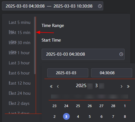
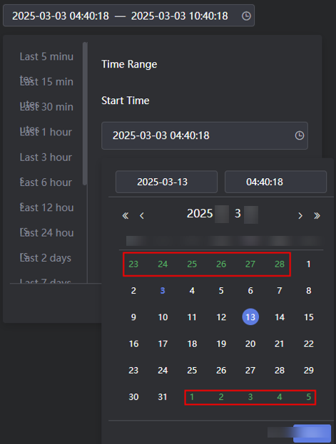
Figure 9 Color of non-current month dates
Data
In the data settings, you can set the data source of the time selector widget. For more information, see Data Access.
Interaction
In the interaction settings, you can configure interactions between the time selector widget and other widgets or pages. For details, see Interaction Configuration.
Feedback
Was this page helpful?
Provide feedbackThank you very much for your feedback. We will continue working to improve the documentation.See the reply and handling status in My Cloud VOC.
For any further questions, feel free to contact us through the chatbot.
Chatbot


