Developing Custom Widgets
Scenario
If the preset advanced widgets cannot meet your development requirements, you can customize a widget package, upload it to Huawei Cloud Astro Zero, and use it on advanced pages. The process of developing a custom component is as follows:
- Downloading a Widget Template
Save the preset template of Huawei Cloud Astro Zero to the local host.
- Developing a Custom Widget
Develop a widget based on the downloaded template.
- Uploading a Custom Widget to the Widget Library and Using the Widget
Upload the custom widget to the widget library and use it on an advanced page.
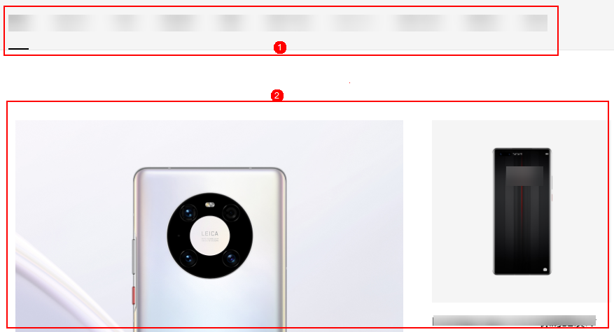
This section describes how to develop a tab widget based on a template. Take a consumer business website (as shown in Figure 1) as an example. The page consists of a tab bar module and a details display module. You can switch tabs to change the content displayed in the details display module.
Two widgets will be used on the advance page. One is TabsWidget, which lists the product categories, such as phones, PCs, and tablets; the other is DisplayWidget, which shows the images of each product category. The two widgets interact with each other by events and actions. Tab switches (event) trigger image switches (action).

The frontend development framework Vue and widget library Element are used in this example. For details about the event-action mechanism, see Adding Events or Macros to Implement Advanced Page Widget Interaction.
Downloading a Widget Template
- Go to the Huawei Cloud Astro Zero console.
- On the homepage, click Access Homepage. The application development page is displayed.
- Click
 and choose Environments > Environment Configuration.
 - Choose Maintenance from the main menu.
- In the navigation pane, choose Global Elements > Page Assets > Widget Templates.
On the displayed page, you can view the preset widget templates.
Table 1 Widget templates Name
Function
widgetVue3Template
Select this template when you use the Vue library to customize a widget.
widgetPropertyTemplate
Select this template when you customize a widget through the property setting area.
widgetActionTemplate
Select this template when you need to configure actions for a custom widget. For details about how to develop this type of widget, see Adding Events or Macros to Implement Advanced Page Widget Interaction.
widgetEventTemplate
Select this template when you add event properties to customize a widget. For details about how to develop this type of widget, see Developing Custom Widgets.
widgetBridgeTemplate
Select this template when you need to use bridges to retrieve backend data. For details about how to develop this type of widget, see Using Bridges to Bind Data to Advanced Page Widgets.
widgetPageMacroTemplate
Select this template when you store variables through the page macro to customize a widget.
- Download a widget template.
Select a template as required. On the details page, click Download. In the Download Widget Template dialog box, enter the widget name and click Save.
In this example, both the tab widget and display widget are developed based on the Vue framework, so widgetVue3Template is recommended. The tab widget is named TabsWidget, and the display widget is named DisplayWidget. The following figure shows how to download a template widget (TabsWidget is used as an example).
Figure 2 Downloading a sample template widget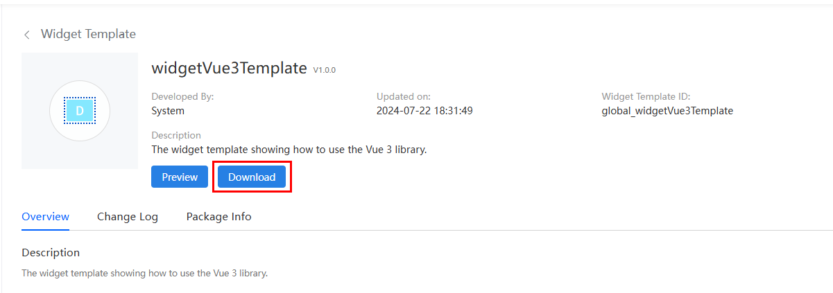 Figure 3 Saving a template
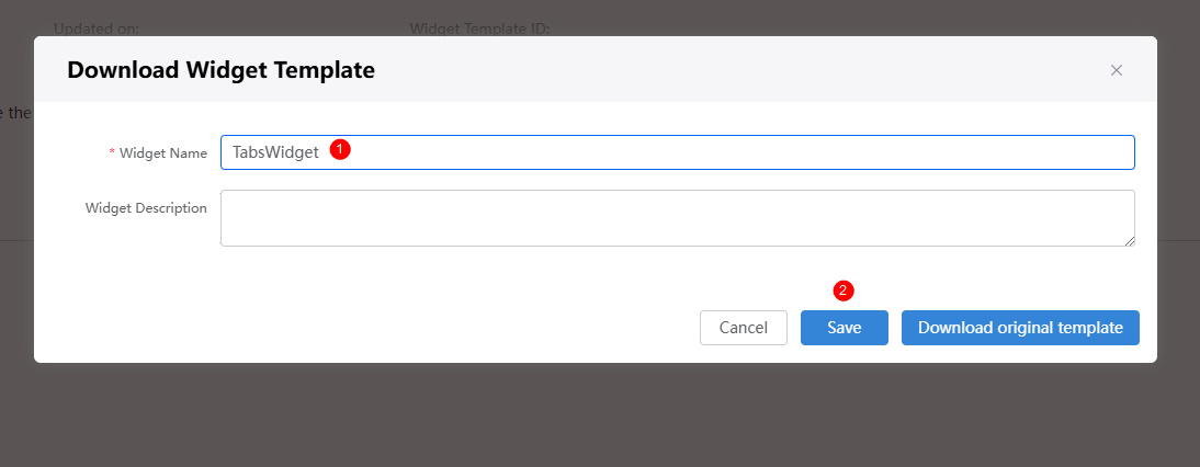
If you choose to download the original template, the widget name in the downloaded widget package will not be changed.
Developing a Custom Widget
- Understand the file structure of a widget.
Decompress the downloaded widget package and use a development tool with which you are familiar to edit it. The following table uses the TabsWidget package downloaded in Downloading a Widget Template as an example to describe the files contained in a widget package.
Table 2 Widget file structure File Name
File Description
TabsWidget.js
JavaScript file of the core rendering logic. It is loaded and executed during widget editing and page publishing and running. For details about preset APIs, see APIs Preset in Advanced Page Widgets.
TabsWidget.editor.js
Widget attribute file, which defines the GUI and logic that needs to be rendered during widget editing. The *.editor.js file is loaded only when the widget is in the editing state. This file includes:
- propertiesConfig: defines the custom configuration on the Widget Property Setting panel.
- The create method is called only once to create a widget.
TabsWidget.css
A CSS file which defines the widget style.
TabsWidget.ftl
Widget DOM file, which includes the content that needs to be rendered in advance on the server. It is equivalent to an HTML file and is used to display the widget style.
packageinfo.json
Widget metadata file, which includes:
- widgetApi name: widget name.
- widgetDescription: widget description.
- authorName: widget author.
- localFileBasePath: local debugging path of the widget.
- (Not included in this example) i18n: internationalization resource file of the specified widget.
- requires: name and version of the dependency library.
- (Not included in this example) width: default widget width when the widget is added to an advance page with an absolute layout. The unit is pixel. If this parameter is not specified, the default value 200 pixels is used.
- (Not included in this example) height: default widget height when the widget is added to an advance page with an absolute layout. The unit is pixel. If this parameter is not specified, the default value 200 pixels is used.
messages-zh/messages-en.json
(Not included in this example) Resource file for internationalization, which is used to configure multiple languages.
- Write the DOM structure and logic of the widget.
- TabsWidget
- Open the TabsWidget.js file in the TabsWidget package, and modify the registered Vue instance in the render function.
render: function() { var thisObj = this; var widgetProperties = thisObj.getProperties(); var elem = thisObj.getContainer(); var items = thisObj.getItems(); var connectorProperties = thisObj.getConnectorProperties(); /* * API to get base path of your uploaded widget API file */ var widgetBasePath = thisObj.getWidgetBasePath(); if (elem) { var containerDiv = $(".scfClientRenderedContainer", elem); if (containerDiv.length) { $(containerDiv).empty(); } else { containerDiv = document.createElement('div'); containerDiv.className = "scfClientRenderedContainer"; $(elem).append(containerDiv); } const app = Vue.createApp({ data() { return { activeName: "phone", //Define the tab items. tabs: [ {label:"Phone",name:"phone"}, {label:"PC",name:"PC"}, {label:"Pad",name:"pad"}, {label:"HiSilicon",name:"HiSilicon"}, {label:"Wearable Device",name:"wearableDevice"} ] } }, methods:{ //This function is triggered when the tabs are switched to trigger the tab switching event of the TabsWidget widget. handleClick: function () { thisObj.triggerEvent("switchingTab", {param: this.activeName}); } } }); app.use(ElementPlus); thisObj.vm = app.mount($("#Tabswidget", elem)[0]); } - Open the TabsWidget.ftl file in the TabsWidget package, and modify the DOM structure.
<div id="TabsWidget">
   <!-- The el-tabs widget provided by Element is used here.  -->
   <el-tabs v-model="activeName" @tab-change="handleClick">
      <el-tab-pane
              v-for="(tab, index) in tabs"
              :key="index"
              :label="tab.label"
              :name="tab.name"
      ></el-tab-pane>
   </el-tabs>
</div>
- Open the TabsWidget.js file in the TabsWidget package, and modify the registered Vue instance in the render function.
- DisplayWidget
- Open the DisplayWidget.js file in the DisplayWidget package, and modify the registered Vue instance in the render function.
render: function() { var thisObj = this; var widgetProperties = thisObj.getProperties(); var elem = thisObj.getContainer(); var items = thisObj.getItems(); var connectorProperties = thisObj.getConnectorProperties(); /* * API to get base path of your uploaded widget API file */ var widgetBasePath = thisObj.getWidgetBasePath(); if (elem) { var containerDiv = $(".scfClientRenderedContainer", elem); if (containerDiv.length) { $(containerDiv).empty(); } else { containerDiv = document.createElement('div'); containerDiv.className = "scfClientRenderedContainer"; $(elem).append(containerDiv); } const app = Vue.createApp({ data() { return { imgSrc: widgetBasePath + "img/phone.jpg", //Define the paths of images to be displayed. sources: { phone: widgetBasePath + "img/phone.jpg", PC: widgetBasePath + "img/PC.jpg", pad: widgetBasePath + "img/pad.jpg", HiSilicon: widgetBasePath + "img/hisilicon.jpg", wearableDevice: widgetBasePath + "img/wearableDevice.jpg" } } }, methods:{ //This method will be called in the image switching action of the DisplayWidget widget. switchPic: function (param) { this.imgSrc = this.sources[param]; } } }); thisObj.vm = app.mount($("#showtabs", elem)[0]); }- The images defined in the preceding code can be replaced. You can place the desired images in the DisplayWidget directory.
- The widgetBasePath variable in the preceding code indicates the path where the widget will be uploaded. You can use this variable because the widget template contains the logic for obtaining the variable value. This example also shows how to import a local image to the widget.
- Open the DisplayWidget.ftl file in the DisplayWidget package, and write the DOM structure
<div id="showTabs">
   <img :src="imgSrc">
</div>
- Open the DisplayWidget.js file in the DisplayWidget package, and modify the registered Vue instance in the render function.
- TabsWidget
- Register and implement events and actions.
- Open the TabsWidget.js file in the TabsWidget package, and register the tab switching event in the init function.
init: function() { var thisObj = this; thisObj._super.apply(thisObj, arguments); thisObj.render(); if ((typeof(Studio) != "undefined") && Studio) { var sendEventConfig = [{ "name": "param" }]; Studio.registerEvents( thisObj, "switchingTab", {"zh_CN": "Switch Tag", "en_US": "Switching Tab"}, sendEventConfig ); } }, - Open the DisplayWidget.js file in the DisplayWidget package, and register the image switching action in the init function.
    init: function()
    {
        var thisObj = this;
        thisObj._super.apply(thisObj, arguments);
        thisObj.render();
        if ((typeof(Studio) != "undefined") && Studio)
        {
            Studio.registerAction(
                thisObj,
                "switchingPicture",
                "switchingPicture",
                [],
                $.proxy(thisObj.switchingPicture, thisObj),
                []
            );
        }
    },
In the DisplayWidget.js file, implement the registered action (the action will have the same scope as the init and render methods) as shown in the following example:
switchingPicture: function (event) {
    if (event && event.eventParam) {
        this.vm.switchPic(event.eventParam.param);
    }
}
In the DisplayWidget.js file, var DisplayWidget =StudioWidgetWrapper.extend() on the first line indicates that the custom widget inherits the StudioWidgetWrapper class defined by Huawei Cloud Astro Zero. In this way, the custom widget can use the following methods provided by Astro Zero:
- var widgetProperties =thisObj.getProperties();: Obtains the widget custom properties.
- var elem =thisObj.getContainer();: Obtains the widget DOM elements.
- var connectorProperties =thisObj.getConnectorProperties();: Obtains the widget bridge properties.
- Open the TabsWidget.js file in the TabsWidget package, and register the tab switching event in the init function.
- Define the dependency library and the default size in the absolute layout.
The TabsWidget widget depends on the Vue and Element libraries, and the DisplayWidget widget depends on the Vue library. The Vue library has been defined in the widgetVueTemplate template. You only need to define the Element library in the packageinfo.json file of the TabsWidget package.
- In the Huawei Cloud Astro Zero environment configuration page, view the library ID and version number.
The following uses the Element library as an example. In Astro Zero, choose Maintenance > Global Elements > Page Assets > Libraries, search for the Element Plus library, and view the library ID and version number.
Figure 4 Querying the library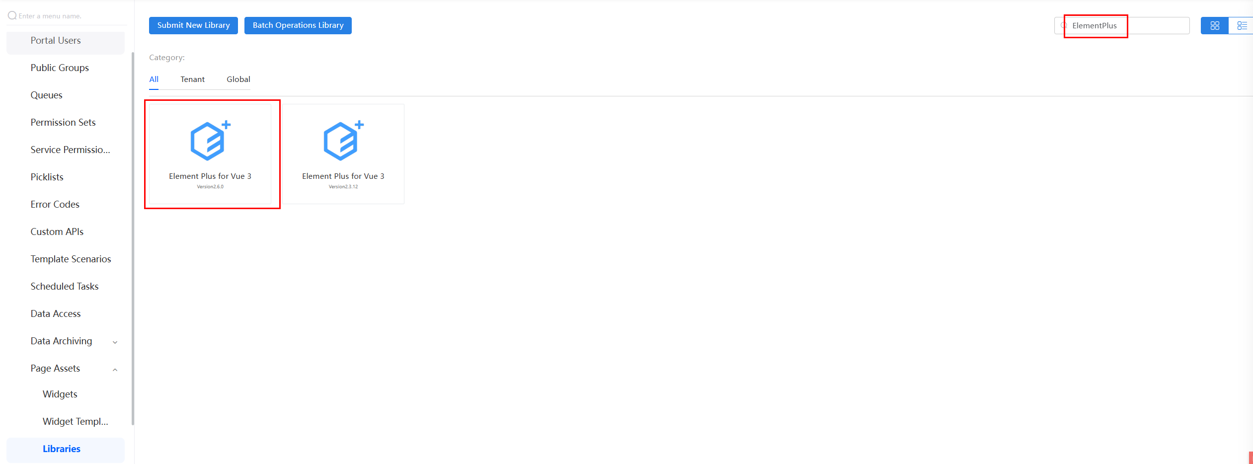 Figure 5 Viewing the library version and ID
In this example, the ID of the Element Plus library is global_ElementPlus, and the latest library version is 2.6.0.
- In the packageinfo.json file of the TabsWidget package, modify the requires, width, and height properties. Sample code:
{ "widgetApi": [ { "name": "TabsWidget" } ], "widgetDescription": "", "authorName": "", "localFileBasePath": "", "requires": [ { "name": "global_Vue3", "version": "3.3.4" }, { "name": "global_ElementPlus", "version": "2.6.0" } ], "width": "900", "height": "55" } - The DisplayWidget widget depends only on the Vue library, which has been defined in the widgetVue3Template template selected during download. In this example, you only need to modify the width and height properties. Sample code:
"width": "900",
"height": "560",
- In the Huawei Cloud Astro Zero environment configuration page, view the library ID and version number.
- Compress the custom widgets to two ZIP packages: TabsWidget.zip and DisplayWidget.zip.
Uploading a Custom Widget to the Widget Library and Using the Widget
- Upload a custom widget.
- Compress the custom widgets to two ZIP packages: TabsWidget.zip and DisplayWidget.zip.
- Return to the Huawei Cloud Astro Zero environment configuration page, choose Maintenance > Global Elements > Page Assets > Widgets, and click the button to submit a new widget.
- On the page for submitting a new widget, complete the configuration, upload the compressed file, and click Submit. Figure 6 Uploading a custom widget
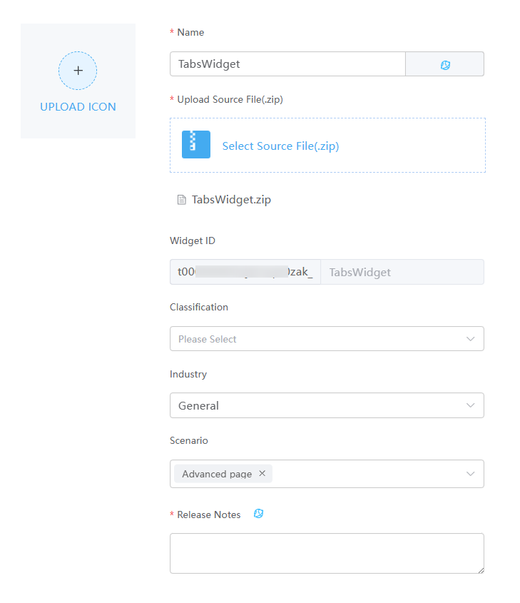
Table 3 Parameters for uploading a widget Parameter
Description
Example
Name
Widget name. The system automatically sets this parameter based on the widget package name.
TabsWidget
Upload Source File(.zip)
Widget source file package. You can click Select Source File(.zip) to select a source file in 5.
TabsWidget.zip
Widget ID
Asset ID. The prefix is not editable and is automatically populated when the widget package is uploaded.
t0000******i3m (automatically generated) _TabsWidget
Classification
Category to which a widget belongs. After a widget is uploaded, the widget is displayed in the category on the page.
Others
Industry
Industry in which the widget package is used. Retain the default value General.
General
Scenario
Application scenario of a widget package. You can select multiple application scenarios. The widget can be used in the development page of the selected scenarios.
Advanced page
Release Notes
Widget description. You need to configure the description in different languages.
The information configured here will be displayed on the overview tab page of the widget details page.
Custom widget
- Test widget functions.
- Drag the uploaded widgets TabsWidget and DisplayWidget to the advanced page and adjust the layout.
- Select the TabsWidget widget. On the Event tab page on the right, click
 next to Switching Tab.
 - In the displayed dialog box, click Create Action, choose DisplayWidget > Switch Picture.
- Click the confirm button to complete the widget interaction settings.
- In the upper part of the page, click
 to save the advanced page.
 - Click
 to publish the page. Access the page URL.
 Switch between the tabs to check whether the images are switched accordingly.
Related Documents
- When customizing a widget, you can reference third-party libraries to enhance its functionality. For details, see Referencing Third-Party Libraries to Develop Advanced Pages.
- You can customize properties for the widget. For details, see Customizing Widget Properties on Pages.
- You can configure the widget's multi-language property to ensure proper display in different languages. For details, see Configuring Chinese and English Language Properties for Widgets.
Feedback
Was this page helpful?
Provide feedbackThank you very much for your feedback. We will continue working to improve the documentation.See the reply and handling status in My Cloud VOC.
For any further questions, feel free to contact us through the chatbot.
Chatbot

