Viewing Expenditure Statistics
The expenditure page displays expenditure statistics of a customer in three categories: overview, trend, and distribution.
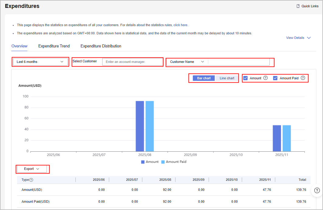
- Overview: displays the amount and amount paid of a customer by expenditure period, customer, and customer manager.
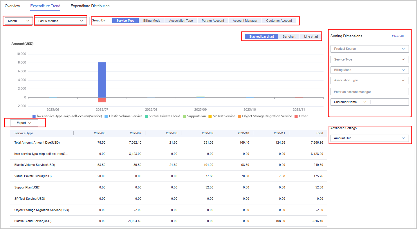
- Expenditure Trend: displays the expenditure trend chart and list of a customer by time (month and day), expenditure period, grouping basis (service type, billing mode, association type, account manager, and customer account), and amount type.
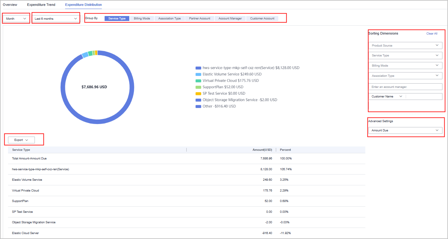
- Expenditure Distribution: displays the expenditure distribution chart and list of a customer by time (month and day), expenditure period, grouping basis (service type, billing mode, association type, account manager, and customer account), and amount type.

Amount types include Amount and Amount Paid.
- Amount: The amount that you need to pay based on the list price.
- Amount Paid: The total after the value of any cash coupons is deducted from Amount.
- Amount Paid = Amount – Cash Coupons Used
Precautions
A customer's expenditures generated since the day when the customer is assigned to the account manager will belong to its account manager.
For details about the expenditure statistics rules, click here.
Viewing the Expenditure Overview
- Go to the Expenditures page.
a) Sign in to Huawei Cloud as a partner.
b) Click Partner Center in the drop-down list of your account name in the upper right corner.
c) On the top navigation bar, choose Sales > Operations Statistics > Expenditures.
- Click the Overview tab.
- By default, the system displays the amount and amount paid of all customers in the last six months in a bar chart.

- If you enter the name of a customer manager, the system displays the amount and amount paid of the customers managed by the customer manager.
- If you enter the customer name or account name, the system displays the amount and amount paid of the customer.
- If you click the Bar chart or Line chart button, the system displays the amount and amount paid in different forms.
- If you deselect the Amount or Amount Paid check box, the bar chart or line chart displays only the data that you have selected.
- You can filter the expenditure data as required. After confirming the filter criteria, click Export > Export Selected to export the filtered customer expenditure data. Click Export > View Export, and click Download in the Operation column to download the exported expenditure data that is in the Completed state.
Viewing the Expenditure Trend
- Go to the Expenditures page.
a) Sign in to Huawei Cloud as a partner.
b) Click Partner Center in the drop-down list of your account name in the upper right corner.
c) On the top navigation bar, choose Sales > Operations Statistics > Expenditures.
- Click the Expenditure Trend tab.
- By default, you can view the amount of all customers in the last six months by month and service type in a stacked bar chart.

- If you select Day, you can query the amount of a customer in a specified period by day.
- You can select the last three months, last six months, last year, or a custom time period (up to 18 months) to query the expenditure trend.
- If you select other grouping criteria, the expenditure trend of the customer is displayed based on the selected criteria.
- If you filter the expenditure trend data by product source (including KooGallery and Huawei Cloud), service type, billing mode, association type, account manager, customer name, and customer account, the filtered data is displayed in the trend chart and list.
- If you select Amount Paid in the Advanced Settings area, the expenditure trend chart and list display the filtered amount paid data.
- You can filter the expenditure trend data as required. After confirming the filter criteria, click Export > Export Selected to export the filtered expenditure trend data. Click Export > View Export, and click Download in the Operation column to download the exported expenditure trend data that is in the Completed state.
Viewing Expenditure Distribution
- Go to the Expenditures page.
a) Sign in to Huawei Cloud as a partner.
b) Click Partner Center in the drop-down list of your account name in the upper right corner.
c) On the top navigation bar, choose Sales > Operations Statistics > Expenditures.
- Click the Expenditure Distribution tab.
- By default, you can view the amount of all customers in the last six months by month and service type in a pie chart.

- If you select Day, you can query the amount of a customer in a specified period by day.
- You can select the last three months, last six months, last year, or a custom time period (up to 18 months) to query the expenditure distribution.
- If you select other grouping criteria, the expenditure distribution of the customer is displayed based on the selected criteria.
- If you filter the expenditure trend data by product source (including KooGallery and Huawei Cloud), service type, billing mode, association type, account manager, customer name, and customer account, the filtered data is displayed in the distribution chart and list.
- If you select Amount Paid in the Advanced Settings area, the expenditure distribution chart and list display the filtered amount paid data.
- You can filter the expenditure distribution data as required. After confirming the filter criteria, click Export > Export Selected to export the filtered expenditure distribution data. Click Export > View Export, and click Download in the Operation column to download the exported expenditure distribution data that is in the Completed state.
Feedback
Was this page helpful?
Provide feedbackThank you very much for your feedback. We will continue working to improve the documentation.See the reply and handling status in My Cloud VOC.
For any further questions, feel free to contact us through the chatbot.
Chatbot


