
Setting the Properties of the User Widget
This widget gets people's information from a company contact list. You can use it to set the travel applicant, asset owner, maintenance personnel, and approver for a process form.

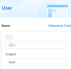
Name
Set the field name shown to users. Click  to set Chinese and English names. Click Reference Field to copy another field's value to this field name.

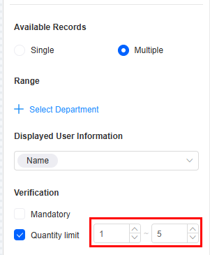
Selected Records
The number of records that can be selected at a time. Single and Multiple are supported.
Range
Set the widget's user source option. You can add users by member, role, or department.
- By member: Add options by member. In the search box, enter the name or username of the member to be added and click
 . Choose the searched member and confirm the operation. The members added here must be queryable in the configuration center. Figure 4 Adding option by member
- By role: Add options using custom roles or system roles. Custom roles are roles created by a developer in the configuration center. For details, see Customizing a System-Level Role. Figure 5 Adding options by role

For example, when creating a form, you can set the available options of the user widget to enterprise user under the system role. Users who belong to the enterprise member role can be selected.
Figure 6 Effect
- By department: Add options by department. The department must be created in the configuration center in advance. For example, create "Department A" in the configuration center and add user "Zhang San". Figure 7 Creating department A
 When developing a form, set the user widget range to Department and select the "Department A" created in the configuration center. When filling in the form, you can select "Zhang San" in "Department A". If additional users are added to "Department A", they will also be available for selection.Figure 8 Selecting department A
 Figure 9 Selecting a user from department A when filling in a form
Displayed User Information
Choose which user details to show, like Name and Account. When you search for a username on the data filling page, the user's department shows up. This helps tell apart users with the same name by their department.
Verification
- Mandatory: If checked, the field is required and shows a * next to it.
- Quantity limit: If Available Records is set to Multiple, you can set a minimum and maximum quantity. For example, when creating a group for different types of users, you can set the quantity limit to 1 to 5. This means at least one user must be selected, and up to five users can be selected. Figure 10 Limiting the number of selected items
Conditions
- Read-only: If checked, the field is read-only.
- Disable: If checked, the field shows but cannot be edited.
- Hide: If checked, the field is hidden on the page.
Width
Width: Widget width as a ratio of the page width. Set the widget width to make the page look better and more professional.

- 1/4: Widget is 1/4 of the page width.
- 1/3: Widget is 1/3 of the page width.
- 1/2: Widget is 1/2 of the page width.
- 2/3: Widget is 2/3 of the page width.
- 3/4: Widget is 3/4 of the page width.
- 1: Widget is full page width (default).
Default Value
Set a default value for the widget. This reduces user input, speeds up processes, and ensures data integrity and consistency.
- Current login user: You can use the current user as the default value.
- Other field: Fields from other widgets, such as user widgets and associated record widgets.
- Relate data: Link to existing data. The latest record is used as the default.
Guide Prompt
If a user does not set this parameter, the text displayed on the GUI guides the user to perform correct operations.

Pop-up Message
If a field is unclear, add a Pop-up Message to explain it. This helps users and makes things easier.
After setting, a question mark icon appears next to the field. When filling in the form, click the question mark icon to see the message.

Description
Set the widget description. Include its functions, use cases, and tips. This helps users understand it better and makes the form clearer.

Feedback
Was this page helpful?
Provide feedbackThank you very much for your feedback. We will continue working to improve the documentation.See the reply and handling status in My Cloud VOC.
For any further questions, feel free to contact us through the chatbot.
Chatbot


