
Setting the Properties of the Associated Record Widget
This widget links forms in an application and shows them in single or multi-answer mode.
When you export or clone an application, the form links break. You need to set them up again afterward.

Name
Set the field name shown to users. Click  to set Chinese and English names. Click Reference Field to copy another field's value to this field name.


Associated Object
Choose a view page. After setting it up, the view permission is assigned to all enterprise member roles. You can set the viewing scope and rules as required.
Set the view page to the form view of the current application or a form view of another application. After the setting, the enterprise member role is granted the view visibility and data operation permissions by default, as shown in Figure 4. Widgets linked to other applications cannot be cloned. After cloning, set up the links again.

After setting the associated object, click the add button to filter the records that meet the filter criteria as candidate values.

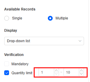
Available Records
Set the number of records to select from the associated object as either Single or Multiple.
Display
Set the display mode of the option values for the associated record widget as either Drop-down list or Option list.


Verification
Limit the field's length and format to keep data accurate and valid.
- Mandatory: If checked, the field is required and shows a * next to it.
- Quantity limit: If Available Records is set to Multiple, you can set a minimum and maximum quantity. For example, if order A is associated with product B and the quantity limit is set to 1 to 10, a user must select 1 to 10 products when creating an order. Figure 8 Limiting the number of selected items
Conditions
- Read-only: If checked, the field is read-only.
- Disable: If checked, the field shows but cannot be edited.
- Hide: If checked, the field is hidden on the page.
Width
Width: Widget width as a ratio of the page width. Set the widget width to make the page look better and more professional.

- 1/4: Widget is 1/4 of the page width.
- 1/3: Widget is 1/3 of the page width.
- 1/2: Widget is 1/2 of the page width.
- 2/3: Widget is 2/3 of the page width.
- 3/4: Widget is 3/4 of the page width.
- 1: Widget is full page width (default).
Default Value
Set a default value for the widget. This reduces user input, speeds up processes, and ensures data integrity and consistency.

Guide Prompt
If a user does not set this parameter, the text displayed on the GUI guides the user to perform correct operations.

Pop-up Message
If a field is unclear, add a Pop-up Message to explain it. This helps users and makes things easier.
After setting, a question mark icon appears next to the field. When filling in the form, click the question mark icon to see the message.

Description
Set the widget description. Include its functions, use cases, and tips. This helps users understand it better and makes the form clearer.

Feedback
Was this page helpful?
Provide feedbackThank you very much for your feedback. We will continue working to improve the documentation.See the reply and handling status in My Cloud VOC.
For any further questions, feel free to contact us through the chatbot.
Chatbot


