
Setting the Properties of the Multi-Choice Widget
This widget lets you pick one or more options (up to 12) from a list, like choosing hobbies.

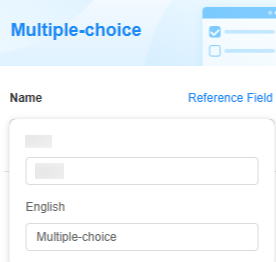
Name
Set the field name shown to users. Click  to set Chinese and English names. Click Reference Field to copy another field's value to this field name.

Arrangement
Choose how the options are arranged: drop-down list, vertical, or horizontal. The default is horizontal.


Options
Add options for the widget. By default, different options show in different colors.
Click Add to add an option. Click the option name (like "Option 1") to rename it. Click  to make it the default choice. Drag
  to move an option to the top.

Click Batch Add to add multiple options. Each row is an option. An option name can be up to 85 characters long. You can add as many as options as possible. But for a form, you can add up to 12 options.


Click Survey Settings to set whether to enable the following functions: random option display sequence, assign scores, and option associations.
| Parameter | Description |
|---|---|
| Enable random order | When enabled, the options will show up in a different random order each time you access the field. |
| Enable option scoring | Give each option a score. Options with scores can be used in calculations. Choose a scoring method. If enabled, set the scores or select items.
|
| Enable option association | By default, multiple options are hidden. These options show up based on whether you select options in a previous field. For details, see Setting Option Associations. |
Verification
Mandatory: If checked, the field is required and shows a * next to it.

Conditions
- Read-only: If checked, the field is read-only.
- Disable: If checked, the field shows but cannot be edited.
- Hide: If checked, the field is hidden on the page.
Width
Width: Widget width as a ratio of the page width. Set the widget width to make the page look better and more professional.

- 1/4: Widget is 1/4 of the page width.
- 1/3: Widget is 1/3 of the page width.
- 1/2: Widget is 1/2 of the page width.
- 2/3: Widget is 2/3 of the page width.
- 3/4: Widget is 3/4 of the page width.
- 1: Widget is full page width (default).
Pop-up Message
If a field is unclear, add a Pop-up Message to explain it. This helps users and makes things easier.
After setting, a question mark icon appears next to the field. When filling in the form, click the question mark icon to see the message.

Description
Set the widget description. Include its functions, use cases, and tips. This helps users understand it better and makes the form clearer.

Feedback
Was this page helpful?
Provide feedbackThank you very much for your feedback. We will continue working to improve the documentation.See the reply and handling status in My Cloud VOC.
For any further questions, feel free to contact us through the chatbot.
Chatbot


