
Setting Properties of the Button Widget
A button is used to trigger business logic when a user clicks it. The button component provides the capability of triggering an event upon click.

Data Binding
- Value binding: Value binding is similar to the v-model of the Vue. Bidirectional data binding is created on the widget. Value binding automatically selects the correct method to update the element based on the widget type. In addition, it checks events that cause binding data changes to update data.
- In the Data Binding area, click
 in the value binding area. The Select Model dialog box is displayed.
 - Click New.
- Set Model Name and Source, and click Next. Figure 2 Defining a model

There are four types of models: Custom, Objects, Services, and Events. Each type of model contains parameter definitions and method definitions. Methods are APIs defined on models. In general, these APIs are called in event scripts (such as page loading events and mouse click events) associated with frontend widgets to implement certain logic.
Table 1 Model types Type
Model Description
Model Parameter Description
Model Method Description
API Calling Method
Custom
Models defined by developers.
Defined by developers. Subnodes can be added.
Developer-defined method.
$model.ref("modelName").actionName();
Objects
Object models are generated based on the mapping of the object table. For details about the object model, see Objects.
The system automatically obtains all fields of an object. Developers can select some fields as parameters.
The system automatically generates four methods: query, save, delete, and count.
- Query: $model.ref("modelName").query(param);
- Save: $model.ref("modelName").save();
- Delete: $model.ref("modelName").delete();
- Statistics: $model.ref("modelName").count();
Services
Service models are generated by mapping backend services. Currently, service models can only be mapped to flows or scripts. For details about the service model, see Flows and Scripts.
The parameters are mapped to the inputParam and outputParam sections based on the input and output parameters of backend services.
The run method is automatically generated to execute a flow or a script associated with the model.
$model.ref("modelName").run();
Events
For event models, data binding is created based on fields of a backend event. Model data can be updated based on the web socket.
Parameters are generated by mapping fields of backend events.
Directly use.
Directly use.
In addition to the methods defined in models, the platform provides the following standard APIs for all models:
- Obtaining model data: $model.ref("modelName").getData();
- Setting model data: $model.ref("modelName").setData();
- Setting model field values: $model.ref("modelName").setValue(key,value);
- On the Settings page of the new model, perform the following operations:
- If Source is set to Custom in the previous step, you need to add customized parameters and types of subnodes.
- If Source is set to Objects in the previous step, you need to configure the object and fields associated with the model.
- If Source is set to Services in the previous step, you need to configure the backend service associated with the model. The backend service can be a script, flow, or public API.
- If Source is set to Events in the previous step, you need to configure the event and event fields associated with the model.
- Click Next.
Generally, you do not need to add a method. If you need to add or modify a method, refer to the method generated by the object and service by default.
- Click OK.
- In the Data Binding area, click
- Property Binding: Binds a property of a container widget, such as hiding, style, and elastic layout, to a specific model field. Once bound, these properties automatically update in sync with the model field's value, functioning in a manner akin to Vue's v-bind directive.
- In the Data Binding area, click + next to Property Binding.
- Select a property of the container from the Properties drop-down list.
- Under Field, click
 . The model selection page is displayed.
 - Click New.
- Set Model Name and Source, and click Next. There are four types of models: Custom, Objects, Services, and Events. Each type of model contains parameter definitions and method definitions. Methods are APIs defined on models. In general, these APIs are called in event scripts (such as page loading events and mouse click events) associated with frontend widgets to implement certain logic. For details, see Table 1.Figure 3 Defining a model

- On the Settings page of the new model, perform the following operations:
- If Source is set to Custom in the previous step, you need to add customized parameters and types of subnodes.
- If Source is set to Objects in the previous step, you need to configure the object and fields associated with the model.
- If Source is set to Services in the previous step, you need to configure the backend service associated with the model. The backend service can be a script, flow, or public API.
- If Source is set to Events in the previous step, you need to configure the event and event fields associated with the model.
- Click Next.
Generally, you do not need to add a method. If you need to add or modify a method, refer to the method generated by the object and service by default.
- Click OK.
Basic Properties
- Display Name: name of the button.
- Type: type of the button.
- Size: size of the button.
- Hover Display: text displayed when the mouse pointer is hovered.
- Shape: shape of the button.
- Select Icon: button icon preset in the system.
- Icon Position: position where the button icon is displayed.
- Loading Status: indicates whether the button is in the loading state.
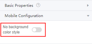
Mobile Configuration
No background color style: Whether to enable the no-background-color style on the mobile device.
Common
- Name: name of the current widget.
- Hid: indicates whether to hide the widget. In this mode, the widget is statically hidden. You can also set the attribute value of the widget to a model field of the Boolean type. In this way, you can control the value of the model field in the customized JavaScript code to determine whether to hide the widget. This dynamic setting has the highest priority.
- Disable: indicates whether to disable the widget.
Style
For users with rich frontend development experience, you can use the style panel to customize the page layout.
- Layout: Set the width and height of the widget.
- Font: Set the font size, style, and color.
- Background: Set the background color and transparency.
- Border: Set the border color and width. The supported units are px, em, and %.
- Shadow: Set the shadow color and style. The units px, em, and % are supported.
- Advance: Directly write CSS code to apply to the current element.
- Style Code: Style code of the widget. After the widget style is set, the style code is automatically displayed in this area. You can also customize the style code to configure the widget in detail. The customized code can be entered in multiple lines and the style parameters are highlighted.
- Style Class: name of the CSS style class of the widget, which can be referenced in the CSS code.
Feedback
Was this page helpful?
Provide feedbackThank you very much for your feedback. We will continue working to improve the documentation.See the reply and handling status in My Cloud VOC.
For any further questions, feel free to contact us through the chatbot.
Chatbot


