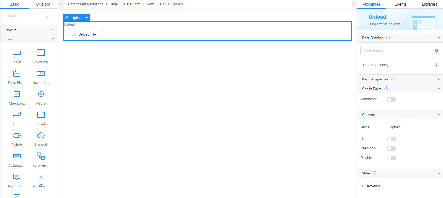
Setting Properties of the Upload Widget
On the standard page, you can set the upload widget to upload files.

Data Binding
- Value binding: Value binding is similar to the v-model of the Vue. Bidirectional data binding is created on the widget. Value binding automatically selects the correct method to update the element based on the widget type. In addition, it checks events that cause binding data changes to update data.
- In the Data Binding area, click
 in the value binding area. The Select Model dialog box is displayed.
 - Click New.
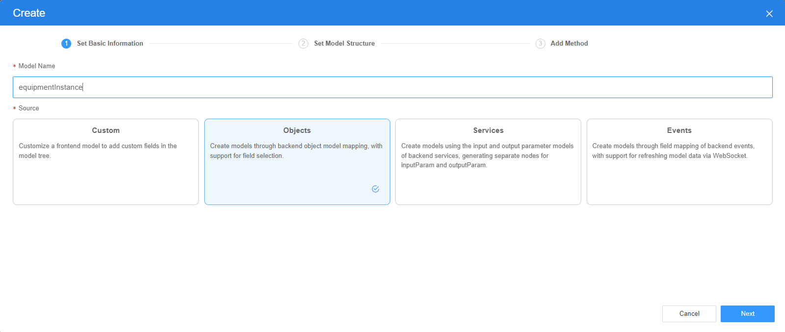
- Set Model Name and Source, and click Next. Figure 2 Defining a model

There are four types of models: Custom, Objects, Services, and Events. Each type of model contains parameter definitions and method definitions. Methods are APIs defined on models. In general, these APIs are called in event scripts (such as page loading events and mouse click events) associated with frontend widgets to implement certain logic.
Table 1 Model types Type
Model Description
Model Parameter Description
Model Method Description
API Calling Method
Custom
Models defined by developers.
Defined by developers. Subnodes can be added.
Developer-defined method.
$model.ref("modelName").actionName();
Objects
Object models are generated based on the mapping of the object table. For details about the object model, see Objects.
The system automatically obtains all fields of an object. Developers can select some fields as parameters.
The system automatically generates four methods: query, save, delete, and count.
- Query: $model.ref("modelName").query(param);
- Save: $model.ref("modelName").save();
- Delete: $model.ref("modelName").delete();
- Statistics: $model.ref("modelName").count();
Services
Service models are generated by mapping backend services. Currently, service models can only be mapped to flows or scripts. For details about the service model, see Flows and Scripts.
The parameters are mapped to the inputParam and outputParam sections based on the input and output parameters of backend services.
The run method is automatically generated to execute a flow or a script associated with the model.
$model.ref("modelName").run();
Events
For event models, data binding is created based on fields of a backend event. Model data can be updated based on the web socket.
Parameters are generated by mapping fields of backend events.
Directly use.
Directly use.
In addition to the methods defined in models, the platform provides the following standard APIs for all models:
- Obtaining model data: $model.ref("modelName").getData();
- Setting model data: $model.ref("modelName").setData();
- Setting model field values: $model.ref("modelName").setValue(key,value);
- On the Settings page of the new model, perform the following operations:
- If Source is set to Custom in the previous step, you need to add customized parameters and types of subnodes.
- If Source is set to Objects in the previous step, you need to configure the object and fields associated with the model.
- If Source is set to Services in the previous step, you need to configure the backend service associated with the model. The backend service can be a script, flow, or public API.
- If Source is set to Events in the previous step, you need to configure the event and event fields associated with the model.
- Click Next.
Generally, you do not need to add a method. If you need to add or modify a method, refer to the method generated by the object and service by default.
- Click OK.
- In the Data Binding area, click
- Property Binding: Binds a property of a container widget, such as hiding, style, and elastic layout, to a specific model field. Once bound, these properties automatically update in sync with the model field's value, functioning in a manner akin to Vue's v-bind directive.
- In the Data Binding area, click + next to Property Binding.
- Select a property of the container from the Properties drop-down list.
- Under Field, click
 . The model selection page is displayed.
 - Click New.
- Set Model Name and Source, and click Next. There are four types of models: Custom, Objects, Services, and Events. Each type of model contains parameter definitions and method definitions. Methods are APIs defined on models. In general, these APIs are called in event scripts (such as page loading events and mouse click events) associated with frontend widgets to implement certain logic. For details, see Table 1.Figure 3 Defining a model

- On the Settings page of the new model, perform the following operations:
- If Source is set to Custom in the previous step, you need to add customized parameters and types of subnodes.
- If Source is set to Objects in the previous step, you need to configure the object and fields associated with the model.
- If Source is set to Services in the previous step, you need to configure the backend service associated with the model. The backend service can be a script, flow, or public API.
- If Source is set to Events in the previous step, you need to configure the event and event fields associated with the model.
- Click Next.
Generally, you do not need to add a method. If you need to add or modify a method, refer to the method generated by the object and service by default.
- Click OK.
Basic Properties
After basic attributes are bound through data, the values of the bound data are used during running.
- Label: label of the widget, which is displayed on the page.
- Text: text displayed on the upload button. Figure 4 Effect

- Default File List: lists the files that have been uploaded by default.
- Storage: storage type of the uploaded file. You can click
 to set the storage type.
 - Storage: storage type.
- OBS: stores data to OBS through an OBS connector.
- MINIO: stores data to MINIO through a MINIO connector.
- OBJECTSTORAGEPROXY: stores data to a server through the OBJECTSTORAGEPROXY connector.
- CUSTOMAPI: uploads and displays files through custom APIs.
- Connector: indicates a specific connector. This parameter is displayed only when Storage is set to OBS, MINIO, or OBJECTSTORAGEPROXY.
- Bucket: This parameter is only displayed when Storage is set to OBS, MINIO, or OBJECTSTORAGEPROXY. It indicates the specific bucket.
- Upload Service: This parameter is only displayed when Storage is set to CUSTOMAPI. You can select a custom API to upload files.
- View Service: This parameter is only displayed when Storage is set to CUSTOMAPI. You can select a custom API to display files.
- Storage: storage type.
- Filter File Type: Type of the file to be uploaded. This is a native property of the file and is used to filter files by file type during file selection. Multiple file types are separated by commas (,), for example, image/jpeg,application/msword,text/plain.
- Supported File Type: Supported file type. Different from Filter File Type, this parameter identifies the file name extension. Filter File Type is a native property and is filtered when you select a file. You can use both parameters.
- Support Multiple Files: indicates whether multiple files can be selected.
- Custom Name: When uploading a single file, you can customize the file name.
- Duplicate Handling: To prevent files with the same name from being overwritten, a random number is automatically added to the end of the file name. You can also customize the file name in the on-before-upload event.
- Upload Path: Indicates the upload path on the server. The default value is uistudio/upload. The upload path cannot be a relative path starting with ./ or ../.
- File Count: Maximum number of files that can be uploaded at a time. If the number of files exceeds the maximum, the files cannot be uploaded.
- File Size: Maximum size of each file, in KB.
- Size Error Message: Error message displayed when the file size exceeds the maximum limit.
- Preview: Whether to enable the preview function. This property is valid only for images.
- Image Compression: Whether to enable the image compression function. Currently, only JPG, JPEG, and PNG images are supported.
- Compression Size: This property is displayed only when Image Compression is enabled. Image compression size, which can be the original size or a customized size.
- Retain original dimensions: If the width is set but the height is not set or both the height and width are set, the configured width is used, and the height is generated based on the original aspect ratio. If the height is set but the width is not set, the configured height is used, and the width is generated based on the original aspect ratio. If the width and height are not set, the width and height of the original image are used.
- Custom Size: The width and height attributes are not set or only one of them is set. For attributes that are not set, the same attribute value of the original image is used.
- Compression width (px): width of the image to be compressed. This property is displayed only when Image Compression is enabled.
- Compression Height (px): height of the image to be compressed. This property is displayed only when Image Compression is enabled.
- The image is compressed to the specified size (kb): Compress the image to a size less than the specified size. This property is displayed only when Image Compression is enabled.
- Public Read: Indicates the access control permission on the file. The default value is private. Otherwise, the value is public-read.
- Selectable: Whether the file list can be selected. This property is valid only for images.
- Grid Layout: The image list is displayed in nine-grid mode. The effect is good only when all images are uploaded. On the mobile device, four images are displayed in each line and the size is adaptive.
- Multiple selection: It specifies whether multiple files can be selected in the file list. This property is displayed only when Selectable is enabled.
- Selection type: Mask selection and Selection box selection are available. This property is displayed only when Selectable is enabled.
- Selection box content: content of the selection box. This property is displayed only when Selection type is set to Selection box selection.
- Display content selected: content displayed in the selection box when selected. This property is displayed only when Selection type is set to Selection box selection.
- List display position: position where the upload list is displayed compared with the upload button. On the mobile client, the upload list is displayed only in the lower part.
- List Shows Progress Bar Only: Only a progress bar is displayed in the upload list. After the file is uploaded, the progress bar disappears. This mode applies to documents and compressed packages.
- Image width: Width and height of a single image in the upload list, in pixels. This property does not take effect on the mobile client.
- Max Width: maximum width.
Common
- Name: name of the current widget.
- Hid: indicates whether to hide the widget. In this mode, the widget is statically hidden. You can also set the attribute value of the widget to a model field of the Boolean type. In this way, you can control the value of the model field in the customized JavaScript code to determine whether to hide the widget. This dynamic setting has the highest priority.
- Disable: indicates whether to disable the widget.
- Read-only: indicates whether the widget is read-only.
Style
Set the CSS style class name used by the widget in Style > Advance > Style Class. The class name can be referenced in CSS code.
Feedback
Was this page helpful?
Provide feedbackThank you very much for your feedback. We will continue working to improve the documentation.See the reply and handling status in My Cloud VOC.
For any further questions, feel free to contact us through the chatbot.
Chatbot


