
Calendar
The calendar is a type of text widget. Users can record to-do items or important content of a specific date.
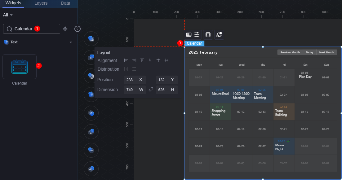
On the large screen design page, drag the calendar widget from All > Text to the blank area of the canvas, as shown in Figure 1.

Card
A card wraps a chart widget. A widget consists of card elements (card title, chart, card background, and card border) and chart elements.
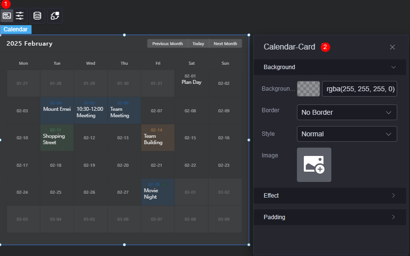
- Background
- Background color: Background color of the widget card.
- Border: Border of the widget card. Options: no border, full border, and corner border. For full border and corner border, you can set the line type and rounded corners of the outer border of the widget.
- Style: Image display style. The options are normal, center, stretch, and tiled.
- Choose image: Use a local image as the widget background. Directories and subdirectories can be added to facilitate image management by category. JPG, JPEG, PNG, or GIF images are recommended. The size of each image cannot exceed 50 MB.
- Special effect: Widget highlighted status. Displayed by default or on page load.
- Padding: distance between the chart in the widget and the four sides (top, bottom, left, and right) of the widget (see Figure 2). The default value is 0, indicating that the chart spreads across the widget.
Configuration
On the configuration page, set the default and selected status of the current month, calendar card and head.
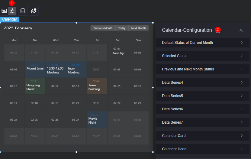
- Default status of the current month/Selected status/Status of the previous month and next month/Data series 4......
- By default, the system has the following statuses. Each status is identified by a status code.
- Default status of the current month: The status code is "0".
- Selected status: The status code is "1".
- Status of the previous and next month: The status code is "2".
- Status 4/5/6/7: Others. Each status corresponds to a to-do item or important content in the calendar.
- Background color of the date block in this status: Background color of the date block in the current state.
- Date font: Date font, text size, and date text color in this status.
- Row height of the date: Row height of the date in this status.
- Content font: Font, text size, and color of the remarks on the date in this status.
- By default, the system has the following statuses. Each status is identified by a status code.
- Calendar card
- Background color: Background color of the calendar card.
- Border color: Color of the calendar card border.
- Height of the date block: Height of each date block.
- Date block alignment mode: Alignment mode of the date block, such as left, right, and center.
- Calendar header
- Year and month font: Calendar header font, text size, and color for year and month.
- Shortcut button font: Shortcut button font, font size, and color on the right of the calendar header.
- Background color of shortcut buttons: Background color of shortcut buttons on the right of the calendar header.
- Week font: Calendar header week font, text size, and text color.
Data
In the data settings, you can set the data source of the calendar widget. For more information, see Data Access.
Interaction
In the interaction settings, you can configure interactions between the calendar widget and other widgets or pages. For details, see Interaction Configuration.
Feedback
Was this page helpful?
Provide feedbackThank you very much for your feedback. We will continue working to improve the documentation.See the reply and handling status in My Cloud VOC.
For any further questions, feel free to contact us through the chatbot.
Chatbot


