
Word Cloud
The word cloud is a type of text widget. It displays the occurrences of words based on their frequency and font.
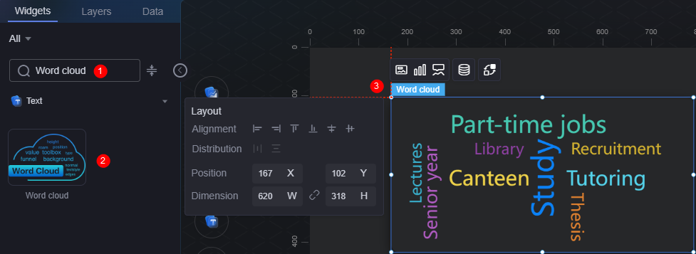
On the large screen design page, drag the word cloud widget from All > Text to the blank area of the canvas, for example, Figure 1.

Card
A card wraps a chart widget. A widget consists of card elements (card title, chart, card background, and card border) and chart elements.
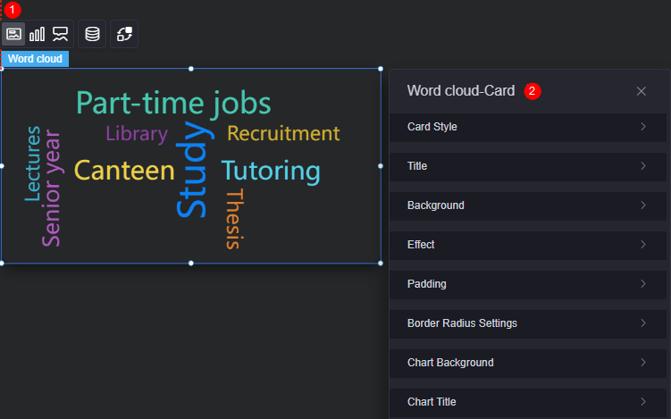
- Card style: You can select a card style based on your service requirements. You can click the clear style button to clear the configured style.
- Title
- Title: Whether to display the widget title.
- Content: Widget title.
- Font: Font, size, and color of the text.
- Alignment: Title alignment relative to the widget (left, right, center).
- Background color: Background color of the title.
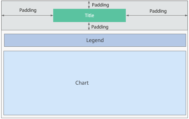
- Padding: distance between the title and the top, left, and right sides of the widget box, and between the title and the chart, in pixels by default.
Figure 4 Word cloud padding
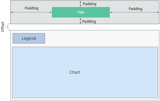
- Title offset: Distance between the widget title and the word cloud chart.
Figure 5 Word cloud title offset
- Background
- Background color: Background color of the widget card.
- Border: Border of the widget card. Options: no border, full border, and corner border. For full border and corner border, you can set the line type and rounded corners of the outer border of the widget.
- Style: Image display style. The options are normal, center, stretch, and tiled.
- Choose image: Use a local image as the widget background. Directories and subdirectories can be added to facilitate image management by category. JPG, JPEG, PNG, or GIF images are recommended. The size of each image cannot exceed 50 MB.
- Special effect: Widget highlighted status. Displayed by default or on page load.
- Padding: Distance between the chart in the widget and the four sides (top, bottom, left, and right) of the widget (see Figure 2). The default value is 0, indicating that the chart is stretched across the widget.
- Round corner: Round corners of the border. The radian of the four corners ranges from 0 to 500, in pixels.
- Chart background: Background color of the chart.
- Chart title
- Show chart title: Whether to display the chart title. The default option is hidden.
- Title acquisition: Set the title acquisition. You can customize the title or acquire it from the series name.
- Title content: If the title is customizable, you can customize the title content.
- Legend location (top %): Distance between the title and the upper border of the widget.
- Legend location (left %): If the title is customizable, you can set the distance between the title and the left border of the widget.
- Font: Font, size, and color of the title.
Graphic
A graphic is a specific graphical expression element that visualizes data in a widget, for example, a slice in a pie chart, a bar in a bar chart, a line or a kink point in a line chart.
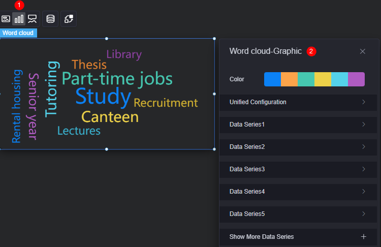
- Color: Color of the graphic.
- Unified configuration
- Display: Whether to display the word cloud (displayed by default).
- Word cloud shape: Set the word cloud shape, such as circle, heart, and triangle.
- Font: Font of the word cloud.
- Font size range: Font size range of the word cloud.
- Spacing: Spacing of the word cloud.
- Tilt angle and range: Rotation range of the word cloud. The value ranges from –90 to 90.
- Angle gradient: Angle gradient of the word cloud.
- Data series: Content display with color change option for users.
- Show more data series: Click
 to add a data series.
Tooltip
Tooltip (floating prompt) displays metrics of specific dimension nodes in a visualized chart widget.
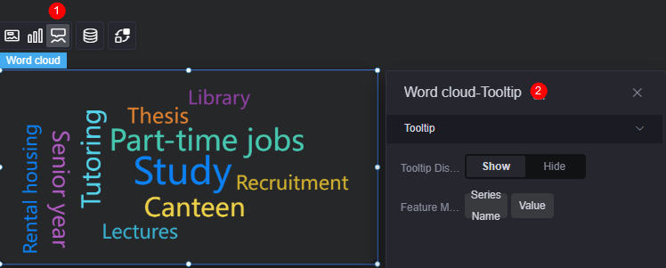
- Display tip: Once enabled, prompt information is displayed when you place the cursor on a sequence during preview.
- Feature marker: Set the content displayed in the dialog box. The content can be either a series name or a data value, or both.
Data
In the data settings, you can set the data source of the word cloud. For more information, see Data Access.
Interaction
In the interaction settings, you can configure interactions between the word cloud widget and other widgets or pages. For details, see Interaction Configuration.
Feedback
Was this page helpful?
Provide feedbackThank you very much for your feedback. We will continue working to improve the documentation.See the reply and handling status in My Cloud VOC.
For any further questions, feel free to contact us through the chatbot.
Chatbot


