
Router Navigation (Demo)
Router navigation (demo) is a type of navigation widget. You can configure different route pages to quickly switch to and locate other pages, providing more interaction modes for the large screen.
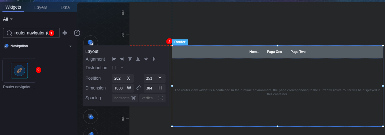
On the screen design page, drag the router navigation (demo) widget from the All > Menu area to the blank area of the canvas, as shown in Figure 1. For details about the router view, see Router View.

Card
A card wraps a chart widget. A widget consists of card elements (card title, chart, card background, and card border) and chart elements.
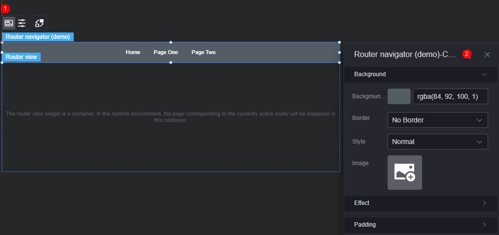
- Background
- Background color: Background color of the widget card.
- Border: Border of the widget card. Options: no border, full border, and corner border. For full border and corner border, you can set the line type and rounded corners of the outer border of the widget.
- Style: Image display style. The options are normal, center, stretch, and tiled.
- Choose image: Use a local image as the widget background. Directories and subdirectories can be added to facilitate image management by category. JPG, JPEG, PNG, or GIF images are recommended. The size of each image cannot exceed 50 MB.
- Special effect: Widget highlighted status. Displayed by default or on page load.
- Padding: distance between the chart and the four sides (top, bottom, left, and right as shown in Figure 2) of the widget. The default value is 0, indicating that the chart stretches to fill the entire widget.
Configuration
Set the tab style, navigation tab, and default route of the widget.
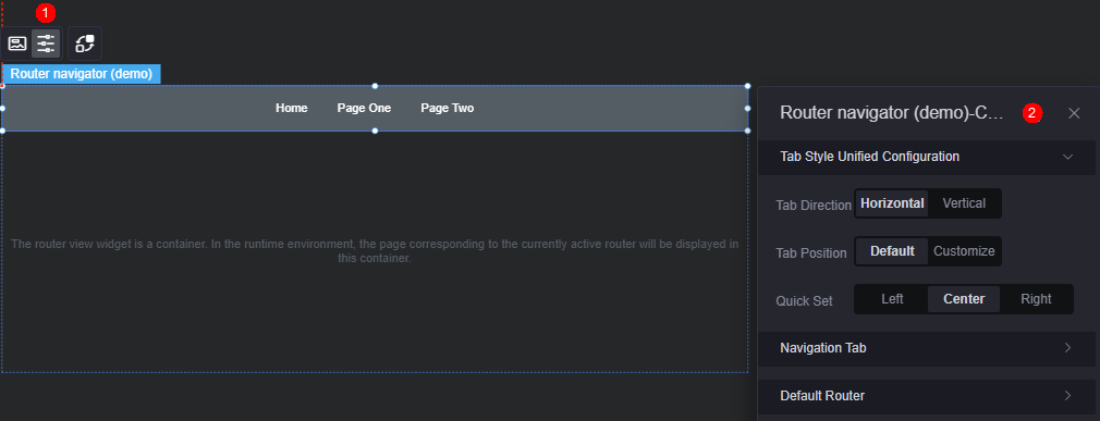
- Unified tab style configuration
- Tab direction: Set the display direction of the tab, such as horizontal and vertical.
- Position: Set the position of the tab page. You can use the default or customize the position.
- Shortcut settings: Set the display position of a tab, for example, left, right, or center. This configuration is displayed only when the position is set to Default.
- Upper spacing (%): distance between the tab and the upper boundary of the widget. This parameter is displayed only when the position is set to Custom.
- Left spacing (%): distance between the tab and the left boundary of the widget. This parameter is displayed only when the position is set to Custom.
- Navigation tab: On the navigation tab page, you can delete or add a route, or set the route as follows:
- Text content: Set the text to be displayed on the current route tab page.
- Tab route: Select the page associated with the current route tab. Only published pages can be selected.
- Default font: Font, color, and size of the default text on the route tab page.
- Default style: Default style of a route including color and custom styles.
- Hover text: Font, size, and color of the tab content when the cursor hovers over the route.
- Hover style: The appearance of the route when the cursor hovers over it, including color and custom styles.
- Click text: Font, size, and color of the tab content when the route is clicked.
- Click style: The visual style applied to a route when clicked, with options for predefined colors or custom styling.
- Default route: The page that is displayed automatically when you first access the route navigation page.
Interaction
In the interaction settings, you can configure interactions between the router navigation (demo) widget and other widgets or pages. For details, see Interaction Configuration.
Feedback
Was this page helpful?
Provide feedbackThank you very much for your feedback. We will continue working to improve the documentation.See the reply and handling status in My Cloud VOC.
For any further questions, feel free to contact us through the chatbot.
Chatbot


