
Indicator
The indicator is a type of text widget that displays indicator data on a visualized page.
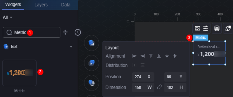
On the large screen design page, drag the indicator widget from the All > Text area to the blank area of the canvas, as shown in Figure 1.

Card
A card wraps a chart widget. A widget consists of card elements (card title, chart, card background, and card border) and chart elements.
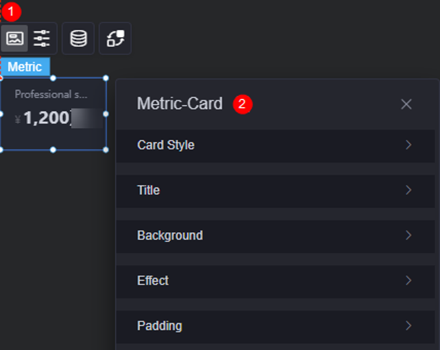
- Card style: You can select a card style based on your service requirements. You can click the clear style button to clear the configured style.
- Title: Whether to display the title. If you set it to display, you can customize the following properties.
- Content: Content of the custom title.
- Font: Font style, size, and color of the title.
- Alignment: Alignment mode of the title, for example, left, center, or right.
- Background color: Background color of the title.
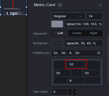
- Inner margin: Spacing between the title and the widget's top, bottom, left, and right borders.
Figure 4 Setting the top margin
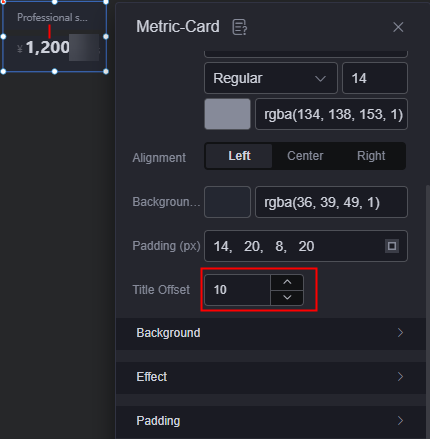
- Title offset: Distance between the title and the indicator.
Figure 5 Title offset
- Background
- Background color: Background color of the widget card.
- Border: Border of the widget card. Options: no border, full border, and corner border. For full border and corner border, you can set the line type and rounded corners of the outer border of the widget.
- Style: Image display style. The options are normal, center, stretch, and tiled.
- Choose image: Use a local image as the widget background. Directories and subdirectories can be added to facilitate image management by category. JPG, JPEG, PNG, or GIF images are recommended. The size of each image cannot exceed 50 MB.
- Special effect: Widget highlighted status. Displayed by default or on page load.
- Padding: Distance between the chart and the four sides (top, bottom, left, and right as shown in Figure 2) of the widget. The default value is 0, indicating that the chart stretches to fill the entire widget.
Configuration
You can set the alignment mode, value, prefix, and suffix of the indicator widget.
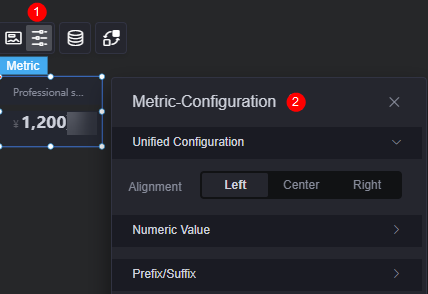
- Unified configuration > alignment: Set the alignment mode of indicators, such as left alignment, center alignment, and right alignment.
- Value: Whether to display values for indicators. If values are displayed, you can set the following properties.
- Thousand comma: Once enabled, a comma (,) is added after the thousands place of a value.
- Keep decimal: Set the number of decimal places to be displayed.
- Rounding: Whether to round off if the value contains decimal places.
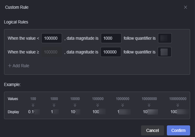
- Dynamic quantifier: Whether to enable the dynamic quantifier. If this function is enabled, you can set the following properties.
- Quantifier type: Auto or custom quantifier.
- Quantifier selection: Dynamic quantifiers to use. The options include ‰, %, 10,000, million, and 100 million. This parameter is displayed only when the quantifier type is set to auto.
- Customized planning: Customize quantifier rules of the dynamic magnitude. This parameter is displayed only when you customize the quantifier type.
Figure 7 Custom rules
- Font: Font, size, and color of the dynamic quantifier.
- Kerning: Spacing between dynamic quantifiers, in pixels.
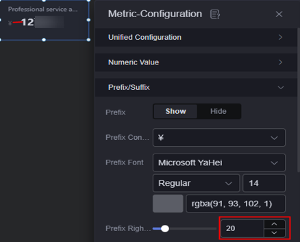
- Prefix and suffix: Set the prefix and suffix of the indicator.
- Prefix: Whether to display the prefix. If this parameter is set to display, you can set the following properties.
- Prefix content: Select a value from the drop-down list box.
- Prefix font: Set the font, size, and color of the prefix.
- Prefix right spacing: Space between the prefix and the indicator.
Figure 8 Prefix right spacing
- Suffix: Whether to display the suffix. If this parameter is set to display, you can set the following properties.
- Suffix content: Select a value from the drop-down list box.
- Suffix font: Font, size, and color of the suffix.
- Suffix left spacing: Spacing between the suffix and the indicator.
- Prefix: Whether to display the prefix. If this parameter is set to display, you can set the following properties.
Data
In the data settings, you can set the data source of the indicator widget. For more information, see Data Access.
Interaction
In the interaction settings, you can configure interactions between the indicator widget and other widgets or pages. For details, see Interaction Configuration.
Feedback
Was this page helpful?
Provide feedbackThank you very much for your feedback. We will continue working to improve the documentation.See the reply and handling status in My Cloud VOC.
For any further questions, feel free to contact us through the chatbot.
Chatbot


