
input
Configuration Item Description
|
Parameter |
Type |
Mandatory |
Example |
Description |
|---|---|---|---|---|
|
type |
String |
Yes |
type: "input" |
Configuration item type. |
|
subType |
String |
No |
subType: "password" |
Subtype. The supported types are number and password. |
|
value |
String |
No |
value: "defaultValue" |
Default value. |
|
name |
String |
Yes |
name: "commProps.myString" |
The value of this field is bidirectionally bound to the value of commProps.myString in advanceEditvm. |
|
label |
Object |
No |
label: {"zh_CN": "Chinese label", "en_US": "En label"} |
Label of a configuration item, which needs to be internationalized. |
|
tip |
Object |
No |
tip: {zh_CN: "Chinese tip," en_US: "English tip"} |
Tip icon. When a configuration item is complex, you can add some tip content. |
|
noToolTip |
Boolean |
No |
noToolTip: false |
Whether the tag has el-tooltip. The default value is false. |
|
disabled |
Function | Boolean |
No |
disabled: true or (data, field, vm) => boolean |
Whether to disable the function. You can customize the function to determine whether to disable the function based on the values of other options. If true is returned, the function is disabled. |
|
showFunc |
Function |
No |
showFunc: function(vm) { return vm.commProps.showTitle; } |
Whether to display the configuration item. You can customize the function to determine whether to display the configuration item based on the values of other options. If true is returned, the function definition is displayed. |
|
placeholder |
String |
No |
placeholder: {"zh_CN": "Please enter," "en_US": "Please input"} |
Placeholder text in the text box. |
|
showpassword |
Boolean |
No |
showpassword: false |
Indicates whether to display the password. The default value is false. This parameter is required when type is set to password. |
|
min |
Number |
No |
min: 0 |
Minimum value. |
|
max |
Number |
No |
max: 100 |
Maximum value. |
|
prefix |
String |
No |
"prefix": "↑" |
Content in the text box header, for example, prefix. |
|
suffix |
String |
No |
"suffix": "%" |
Content at the end of the text box, for example, the suffix. |
Event
|
Event Name |
Method In Configuration Item |
Description |
Callback Parameter |
|---|---|---|---|
|
input |
blur |
Triggered when the input value changes. |
(event, data, field) |
|
change |
change |
Triggered only when the input box loses the focus or the user presses Enter. |
(data, field) |
|
blur |
blur |
Triggered when the input box obtains the focus. |
(value, data, field) |
|
focus |
focus |
Triggered when the input box loses the focus. |
(value, data, field) |
Configuration Example
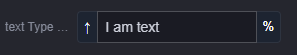
The following is an example of the input configuration. The configuration effect is shown in Figure 1.
{
	type: 'text',
	name: 'commProps.myText',
	value: 'text type',
	label: {
		zh_CN: 'text type',
		en_US: 'text Type Example'
	},
	placeholder: {
		zh_CN: 'Enter the title content',
		en_US: 'Enter the title content.'
	},
	prefix: '↑',
	suffix: '%'
}
Feedback
Was this page helpful?
Provide feedbackThank you very much for your feedback. We will continue working to improve the documentation.See the reply and handling status in My Cloud VOC.
For any further questions, feel free to contact us through the chatbot.
Chatbot


