
Dashboard
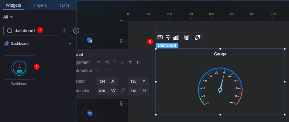
A dashboard is a specialized display format that presents data using gauges or meters.
On the large screen design page, choose All > Dashboard and drag the dashboard widget to the blank area of the canvas, as shown in Figure 1.

Card
A card wraps a chart widget. A widget consists of card elements (card title, chart, card background, and card border) and chart elements.
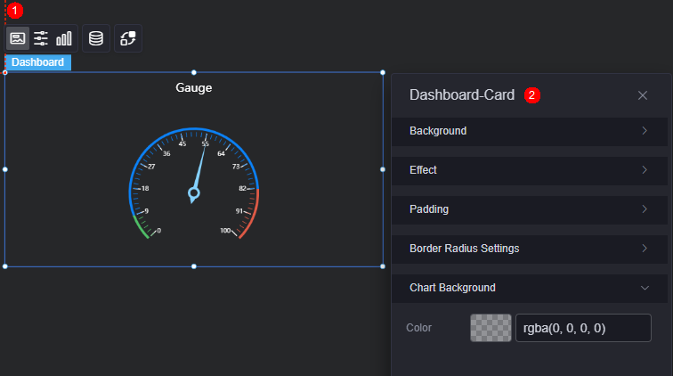
- Background
- Background color: Background color of the widget card.
- Border: Border of the widget card. Options: no border, full border, and corner border. For full border and corner border, you can set the line type and rounded corners of the outer border of the widget.
- Style: Image display style. The options are normal, center, stretch, and tiled.
- Choose image: Use a local image as the widget background. Directories and subdirectories can be added to facilitate image management by category. JPG, JPEG, PNG, or GIF images are recommended. The size of each image cannot exceed 50 MB.
- Special effect: Widget highlighted status. Displayed by default or on page load.
- Padding: distance between the chart and the four sides (top, bottom, left, and right as shown in Figure 2) of the widget. The default value is 0, indicating that the chart stretches to fill the entire widget.
- Round Corner: Round corners of the border. The radian of the four corners ranges from 0 to 500, in pixels.
- Chart background: Background color of the chart.
Configuration
You can set the widget title and prompt box.
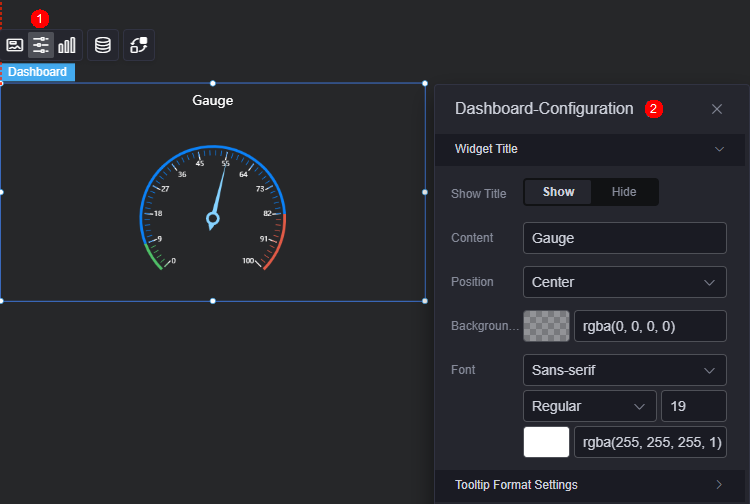
- Widget title
- Title: Whether to display the widget title.
- Content: Set the title content.
- Position: Set the title display position (left, right, or center).
- Background color: Background color of the title.
- Font: Font, color, and size of the title.
- Dialog box format: Format of the dialog box, for example, "Series nameValueDataItemName" and "Series nameDataItemNameValue"
Graphic
A graphic is a specific graphical expression element that visualizes data in a widget, for example, a slice in a pie chart, a bar in a bar chart, a line or a kink point in a line chart.
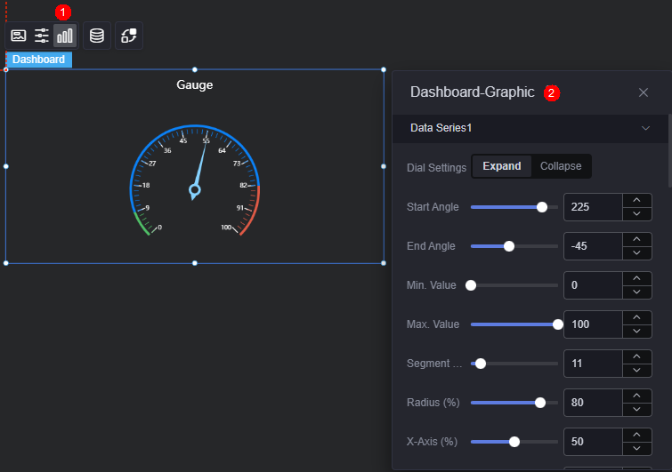
- Gauge chart settings: Expand or collapse the gauge chart. To expand, set the following parameters:
- Start angle: Set the start angle of the gauge chart.
- End angle: End angle of the gauge chart.
- Minimum range value: Set the minimum value for the gauge chart range.
- Maximum range value: Set the maximum value for the gauge chart range.
- Segments: Number of segments on the gauge chart.
- Radius (%): Radius of the gauge chart.
- X-axis (%): The horizontal coordinate of the gauge chart.
- Y-axis (%): The vertical coordinate of the gauge chart.
- Width: Border width of a gauge chart.
- Shadow color: Shadow color of the gauge chart border.
- Shadow size: Size of the shadow of the gauge chart border
- Pointer length (%): Length of the pointer.
- Pointer width: Width of the pointer.
- Pointer color: Color of the pointer.
- Pointer fixed point: Display the fixed point of the pointer. When enabled, you can customize its size and color.
Figure 6 Pointer fixed point
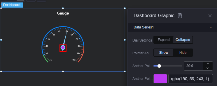
- Fixed point size: Size of the fixed point. Range: 0.0 to 100.0.
- Fixed point color: Color of the fixed point.
- Fixed point border width: Line width of the fixed point's border.
- Fixed point border color: Color of the fixed point's border.
- Unit settings: Display the unit. When enabled, you can customize the unit, its horizontal and vertical position, and the unit font.
- Details: Display details. When enabled, you can customize their horizontal and vertical position, and font style.
- Scale settings: Display the scale. When enabled, you can customize the label-to-scale line distance, scale label font, background color, and inner margin.
- Axis segment color: Click the axis segment color button to add a segment. You can set its position and default color.
Data
In the data settings, you can set the data source of the widget. For more information, see Data Access.
Interaction
In the interaction settings, you can configure interactions between this widget and other widgets or pages. For details, see Interaction Configuration.
Feedback
Was this page helpful?
Provide feedbackThank you very much for your feedback. We will continue working to improve the documentation.See the reply and handling status in My Cloud VOC.
For any further questions, feel free to contact us through the chatbot.
Chatbot


