
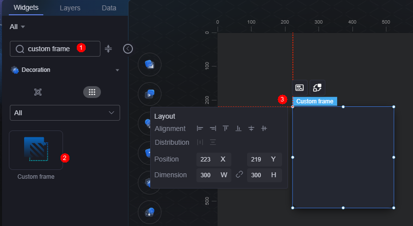
Custom Frame
Custom frame is a type of decorate widget, including backgrounds for large and small titles, pages, and content. You can select different custom frames based on different design requirements for better visual effect.
The following uses the custom frame as an example. On the large screen design page, drag the custom frame widget from the All > Decoration area to the blank area of the canvas, as shown in Figure 1.
Card
A card wraps a chart widget. A widget consists of card elements (card title, chart, card background, and card border) and chart elements.
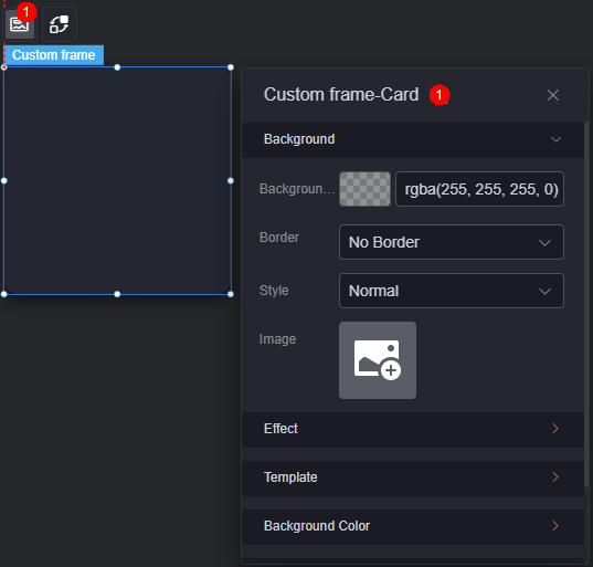
- Background
- Background color: Background color of the widget card.
- Border: Border of the widget card. Options: no border, full border, and corner border. For full border and corner border, you can set the line type and rounded corners of the outer border of the widget.
- Style: Image display style. The options are normal, center, stretch, and tiled.
- Choose image: Use a local image as the widget background. Directories and subdirectories can be added to facilitate image management by category. JPG, JPEG, PNG, or GIF images are recommended. The size of each image cannot exceed 50 MB.
- Special effect: Widget highlighted status. Displayed by default or on page load.
- Reference template: Preset widget style templates.
- Background color
- Show background color: Shows or hides the background color.
- Color type: Background color type. Supports single color and gradient colors. When a single color is used, the background color can be set. When using gradient color, you can set the gradient type and direction.
- Gradient type: Type of gradient, such as linear, radial, or custom.
- Gradient direction: Direction of the gradient, e.g., upward, downward, or rightward. Required only when the gradient type is set to linear.
- Color 1: Custom gradient color 1. Required only when the gradient type is set to linear or radial.
- Color 2: Custom gradient color 2. Required only when the gradient type is set to linear or radial.
- CSS background: Defines the background color using CSS syntax. Required only when the gradient type is set to custom.
- Shadow settings
- Enable shadow: Whether to enable the shadow function.
- Shadow direction: Set the shadow direction. Options include inner shadow, outer shadow, and custom.
- Shadow color: Color of the shadow.
- Horizontal offset: Horizontal offset of the shadow, in pixels.
- Vertical Offset: Vertical offset of the shadow, in pixels.
- Blur radius: Blur radius, in pixels.
- Diffusion radius: Diffusion radius, in pixels.
- Border settings
- Width: Width of the border, in pixels.
- Color: Color of the border.
- Type: Border line type. Options include solid, dotted, and dashed.
- Rounded corner: Whether to enable rounded corners. After this function is enabled, you can set the radius and position of rounded corners.
Interaction
In the interaction settings, you can configure interactions between the custom frame widget and other widgets or pages. For details, see Interaction Configuration.
Feedback
Was this page helpful?
Provide feedbackThank you very much for your feedback. We will continue working to improve the documentation.See the reply and handling status in My Cloud VOC.
For any further questions, feel free to contact us through the chatbot.
Chatbot


