
Weather
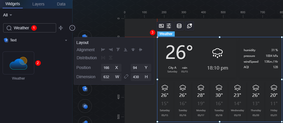
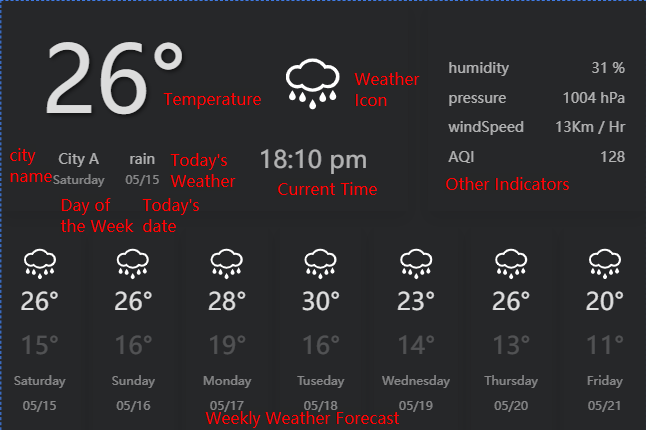
The weather is a type of text widget. It is used to display the 24-hour weather forecast of a city and the weather forecast of the next week.
On the large screen design page, drag the weather widget from the All > Text area to the blank area of the canvas, as shown in Figure 1.

Card
A card wraps a chart widget. A widget consists of card elements (card title, chart, card background, and card border) and chart elements.
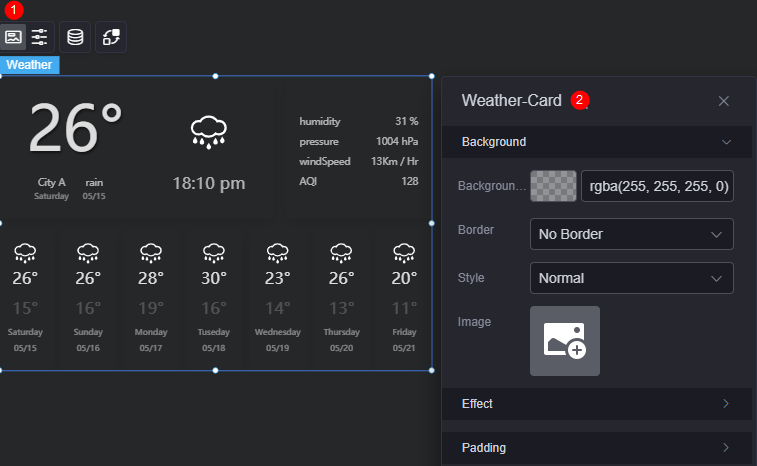
- Background
- Background color: Background color of the widget card.
- Border: Border of the widget card. Options: no border, full border, and corner border. For full border and corner border, you can set the line type and rounded corners of the outer border of the widget.
- Style: Image display style. The options are normal, center, stretch, and tiled.
- Choose image: Use a local image as the widget background. Directories and subdirectories can be added to facilitate image management by category. JPG, JPEG, PNG, or GIF images are recommended. The size of each image cannot exceed 50 MB.
- Special effect: Widget highlighted status. Displayed by default or on page load.
- Padding: Distance between the chart and the four sides (top, bottom, left, and right as shown in Figure 3) of the widget. The default value is 0, indicating that the chart stretches to fill the entire widget.
Configuration
You can set the year, month, date, background color, and time bar color of the widget.
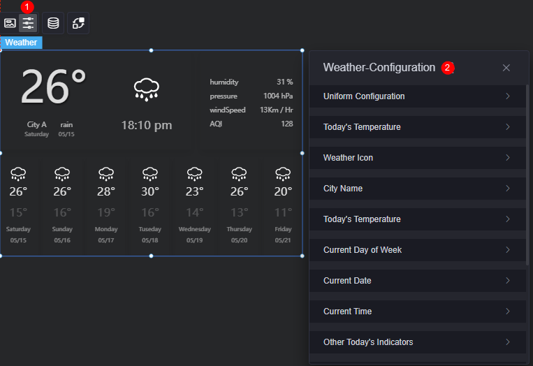
- Unified configuration
- Display future weather forecast: Whether to display the weather forecast of the next week.
- Background color: Background color of the weather forecast.
- Temperature
- Display: Whether to display the temperature of the current day.
- Font: Font, size, and color of today's temperature.
- Weather icon
- Display: Whether to display the weather icon.
- Icon size: Size of the weather icon.
- Icon color: Color of the weather icon.
- City name
- Display: Whether to display the city name.
- Font: Font, size, and color of the city name.
- Today's weather
- Display: Whether to display today's weather.
- Font: Font, size, and color of today's weather.
- Current week
- Display: Whether to display the current week.
- Font: Font, size, and color of today.
- Current date
- Display: Whether to display the current date.
- Font: Font, size, and color of today.
- Current time
- Display: Whether to display the current time.
- Font: Font, size, and color of the current time.
- Today's other metrics
- Display: Whether to display other weather indicators of the current day.
- Font: Font, size, and color of other weather indicators of today.
- Future weather icon
- Display: Whether to display the future weather icon.
- Icon size: Size of the future weather icon.
- Icon color: Color of the future weather icon.
- Highest temperature in the future
- Display: Whether to display the highest temperature in the next few days.
- Font: Font, size, and color settings for the highest temperature in the next few days.
- Lowest temperature in the future
- Display: Whether to display the lowest temperature in the next few days.
- Font: Font, size, and color of the lowest temperature in the next few days.
- Display of future week
- Display: Whether to display the next few weeks.
- Font: Font, size, and color of the next few weeks.
- Future date display
- Display: Whether to display the dates of the next few days.
- Font: Font, size, and color of the dates in the next few days.
Data
In the data settings, you can set the data source of the weather widget. For more information, see Data Access.
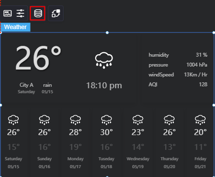
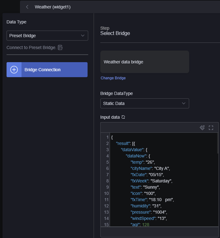
In the static data, dataNow corresponds to the weather of the current day, and dataForecast corresponds to the weather forecast of the next few days.
Huawei Cloud Astro Canvas presets a set of beautiful weather icons, which are used to display weather conditions on the weather widget. The icon field indicates the weather icon of today, and the iconDay field indicates the weather icon of a future date. For example, the value 100 indicates a sunny day, and the weather icon  is displayed. The value 307 indicates heavy rain, and the weather icon
  is displayed. For the mapping between the value and weather, see Table 1.
|
Value of icon/iconDay |
Weather Condition |
|---|---|
|
100 |
Sunny |
|
101 |
Cloudy |
|
102 |
Few Clouds |
|
103 |
Partly Cloudy |
|
104 |
Overcast |
|
150 |
Clear |
|
153 |
Partly Cloudy |
|
154 |
Overcast |
|
300 |
Shower Rain |
|
301 |
Heavy Shower Rain |
|
302 |
Thundershower |
|
303 |
Heavy Thunderstorm |
|
304 |
Thundershower with hail |
|
305 |
Light Rain |
|
306 |
Moderate Rain |
|
307 |
Heavy Rain |
|
308 |
Extreme Rain |
|
309 |
Drizzle Rain |
|
310 |
Storm |
|
311 |
Heavy Storm |
|
312 |
Severe Storm |
|
313 |
Freezing Rain |
|
314 |
Light to moderate rain |
|
315 |
Moderate to heavy rain |
|
316 |
Heavy rain to storm |
|
317 |
Storm to heavy storm |
|
318 |
Heavy to severe storm |
|
399 |
Rain |
|
350 |
Shower Rain |
|
351 |
Heavy Shower Rain |
|
400 |
Light Snow |
|
401 |
Moderate Snow |
|
402 |
Heavy Snow |
|
403 |
Snowstorm |
|
404 |
Sleet |
|
405 |
Rain And Snow |
|
406 |
Shower Snow |
|
407 |
Snow Flurry |
|
408 |
Light to moderate snow |
|
409 |
Moderate to heavy snow |
|
410 |
Heavy snow to snowstorm |
|
499 |
Snow |
|
456 |
Shower Snow |
|
457 |
Snow Flurry |
|
500 |
Mist |
|
501 |
Foggy |
|
502 |
Haze |
|
503 |
Sand |
|
504 |
Dust |
|
507 |
Duststorm |
|
508 |
Sandstorm |
|
509 |
Dense fog |
|
510 |
Strong fog |
|
511 |
Moderate haze |
|
512 |
Heavy haze |
|
513 |
Severe haze |
|
514 |
Heavy fog |
|
515 |
Extra heavy fog |
|
900 |
Hot |
|
901 |
Cold |
|
999 |
Unknown |
Interaction
In the interaction settings, you can configure interactions between the weather widget and other widgets or pages. For details, see Interaction Configuration.
Feedback
Was this page helpful?
Provide feedbackThank you very much for your feedback. We will continue working to improve the documentation.See the reply and handling status in My Cloud VOC.
For any further questions, feel free to contact us through the chatbot.
Chatbot


