
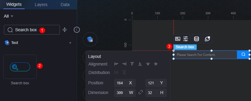
Search Box
The search box is a type of text widget used for search.
On the large screen design page, drag the search box widget from All > Text to the blank area of the canvas, as shown in Figure 1.

Card
A card wraps a chart widget. A widget consists of card elements (card title, chart, card background, and card border) and chart elements.
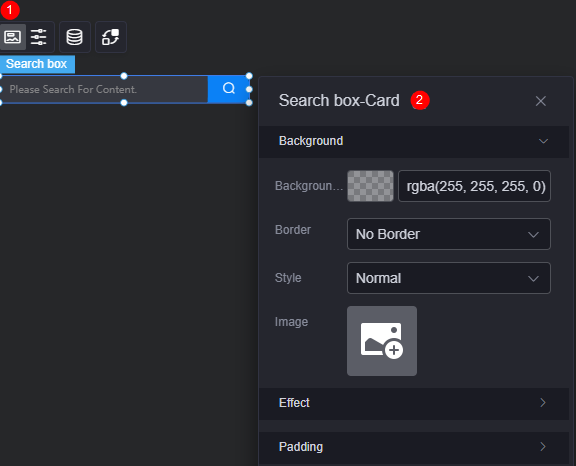
- Background
- Background color: Background color of the widget card.
- Border: Border of the widget card. Options: no border, full border, and corner border. For full border and corner border, you can set the line type and rounded corners of the outer border of the widget.
- Style: Image display style. The options are normal, center, stretch, and tiled.
- Choose image: Use a local image as the widget background. Directories and subdirectories can be added to facilitate image management by category. JPG, JPEG, PNG, or GIF images are recommended. The size of each image cannot exceed 50 MB.
- Special effect: Widget highlighted status. Displayed by default or on page load.
- Padding: Distance between the chart and the four sides (top, bottom, left, and right as shown in Figure 2) of the widget. The default value is 0, indicating that the chart stretches to fill the entire widget.
Configuration
On the configuration page, you can set the search box and button.
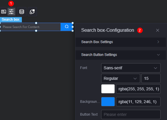
- Search box settings
- Font: Font size and color of the search content.
- Background color: Background color of the search box.
- Border color: Default border color of the search box.
- Border focus color: Color of the search box border when you select it.
- Border floating color: Color of the search box border when you hover over it.
- Placeholder: Text shown when no input is entered.
- Search button settings
- Font: Size and color of the search button.
- Background color: Background color of the search button area.
- Button text: Text displayed after the search button icon.
Data
In the data settings, you can set the data source of the search box widget. For more information, see Data Access.
Interaction
In the interaction settings, you can configure interactions between the search box widget and other widgets or pages. For details, see Interaction Configuration.
Feedback
Was this page helpful?
Provide feedbackThank you very much for your feedback. We will continue working to improve the documentation.See the reply and handling status in My Cloud VOC.
For any further questions, feel free to contact us through the chatbot.
Chatbot


