
Title
The title is a type of text widget that displays a large, medium, or small title of any kind on a large screen. Multiple titles can be combined if necessary.
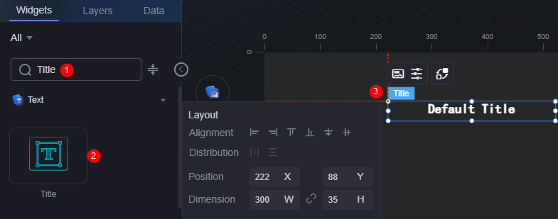
On the large screen design page, drag the title widget from the All > Text area to the blank area of the canvas, as shown in Figure 1.

Card
A card wraps a chart widget. A widget consists of card elements (card title, chart, card background, and card border) and chart elements.
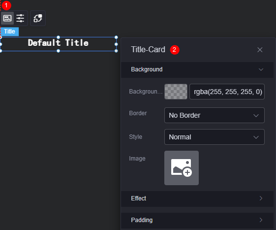
- Background
- Background color: Background color of the widget card.
- Border: Border of the widget card. Options: no border, full border, and corner border. For full border and corner border, you can set the line type and rounded corners of the outer border of the widget.
- Style: Image display style. The options are normal, center, stretch, and tiled.
- Choose image: Use a local image as the widget background. Directories and subdirectories can be added to facilitate image management by category. JPG, JPEG, PNG, or GIF images are recommended. The size of each image cannot exceed 50 MB.
- Special effect: Widget highlighted status. Displayed by default or on page load.
- Padding: Distance between the chart and the four sides (top, bottom, left, and right as shown in Figure 2) of the widget. The default value is 0, indicating that the chart stretches to fill the entire widget.
Configuration
You can set the text content, font, size, and color.
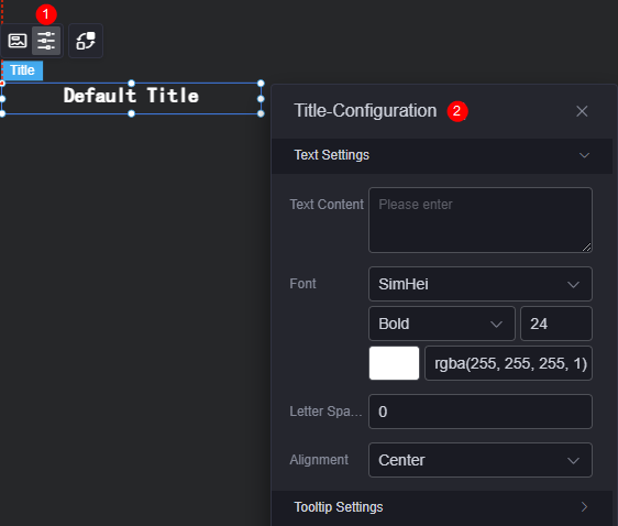
- Text settings
- Text content: Set the text content.
- Font: Font, size, and color of the text.
- Text spacing: Distance between texts.
- Alignment: Alignment mode of the text, for example, left, center, and right.
- Question mark prompt
- Question mark prompt: Whether to display the question mark.
- Prompt text: Enter the text content of the question mark.
- Question mark size: Size of the question mark.
- Question mark color: Background color of the question mark.
- Bubble position: Position of the question mark bubble, for example, left, right, or right above.
Figure 5 Bubble position
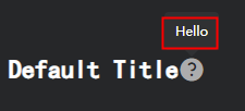
- Tip background: Background color of the question mark prompt bubble, for example, dark and light.
Interaction
In the interaction settings, you can configure interactions between the title widget and other widgets or pages. For details, see Interaction Configuration.
Feedback
Was this page helpful?
Provide feedbackThank you very much for your feedback. We will continue working to improve the documentation.See the reply and handling status in My Cloud VOC.
For any further questions, feel free to contact us through the chatbot.
Chatbot


