
Banner Page
Banner page refers to the display of page ads through a carousel.
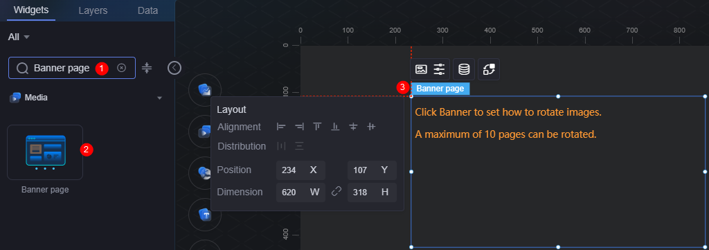
On the large screen design page, drag the banner page widget from All > Media to the blank area of the canvas, as shown in Figure 1.

Card
A card wraps a chart widget. A widget consists of card elements (card title, chart, card background, and card border) and chart elements.
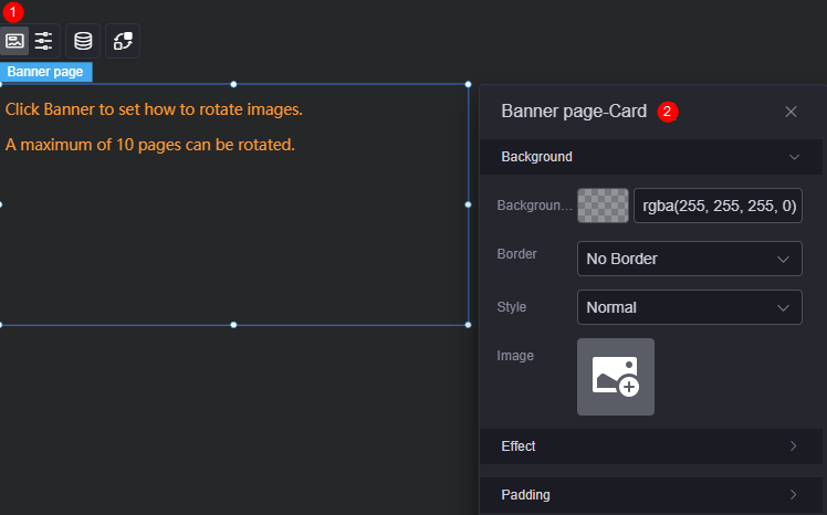
- Background
- Background color: Background color of the widget card.
- Border: Border of the widget. Options: no border, full border, and corner border. For full border and corner border, you can set the line type and rounded corners of the outer border of the widget.
- Style: Image display style. The options are normal, center, stretch, and tiled.
- Choose image: Use a local image as the widget background. Directories and subdirectories can be added to facilitate image management by category. JPG, JPEG, PNG, or GIF images are recommended. The size of each image cannot exceed 50 MB.
- Special effect: Widget highlighted status. Displayed by default or on page load.
- Padding: Distance between the chart in the widget and the four sides (top, bottom, left, and right) of the widget (see Figure 2). The default value is 0, indicating that the chart is stretched across the widget.
Banner Page Configuration
In the configuration, set the banner page switch, autoplay, and pagination.
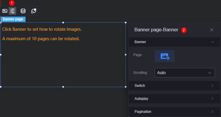
- Banner settings
- Page: Pages to be added. You can select a page in the current project or an external page. A maximum of 10 pages can be added.
- Scrolling: Whether to auto display or hide the scroll bar.
- Switch settings
- Switch arrow: Whether to display the switch arrow.
- Switch direction: Page switching direction, for example, horizontal or vertical.
- Switch mode: Page switching mode, such as fade out, push, and uncover.
- Autoplay
- Automatic rotation: Rotation mode, which can be manual or automatic.
- Interval: Banner interval. The value cannot be greater than 24 seconds.
- Pagination configuration
- Pagination flag: Whether to display a pagination marker.
- Logo selection: Pagination marker style, such as dot and line.
Data
In the data settings, you can set the data source of the banner page widget. For more information, see Data Access.
Interaction
In the interaction settings, you can configure interactions between the banner page widget and other widgets or pages. For details, see Interaction Configuration.
Feedback
Was this page helpful?
Provide feedbackThank you very much for your feedback. We will continue working to improve the documentation.See the reply and handling status in My Cloud VOC.
For any further questions, feel free to contact us through the chatbot.
Chatbot


