
Tabs
Tab is a type of menu widget. It is a single-line element above the associated content used to quickly switch between different content in an area of a page.
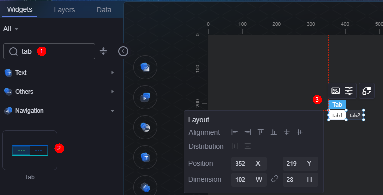
On the large screen design page, drag the tab widget from the All > Menu area to the blank area of the canvas, as shown in Figure 1.

Card
A card wraps a chart widget. A widget consists of card elements (card title, chart, card background, and card border) and chart elements.
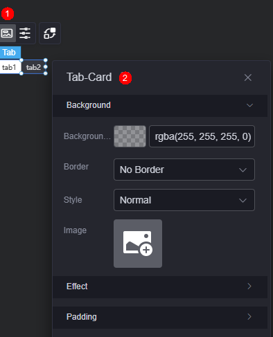
- Background
- Background color: Background color of the widget card.
- Border: Border of the widget card. Options: no border, full border, and corner border. For full border and corner border, you can set the line type and rounded corners of the outer border of the widget.
- Style: Image display style. The options are normal, center, stretch, and tiled.
- Choose image: Use a local image as the widget background. Directories and subdirectories can be added to facilitate image management by category. JPG, JPEG, PNG, or GIF images are recommended. The size of each image cannot exceed 50 MB.
- Special effect: Widget highlighted status. Displayed by default or on page load.
- Padding: distance between the chart in the widget and the four sides (top, bottom, left, and right) of the widget (see Figure 2). The default value is 0, indicating that the chart spreads across the widget.
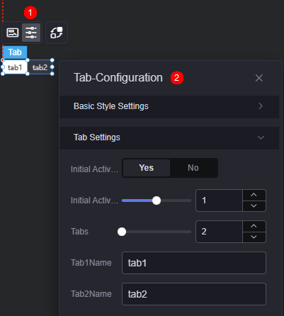
Configuration
You can configure the tab basic style and tab settings.
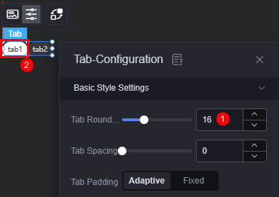
- Basic style settings
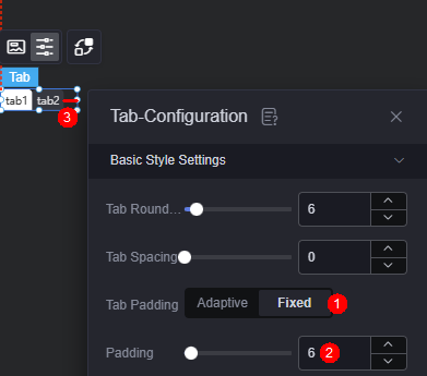
- Label round corner: size of the label round corner. The value 0 indicates a right corner.
Figure 5 Round corner of the label
- Label spacing: distance between labels. The default value is 0.
- Label margin: distance between the label and the component border. The default value is auto. If this parameter is set to a fixed value, you can customize the margin.
Figure 6 Label margin
- Default text: font, width, size, and color of the default text when the tab is not enabled.
- Activated text color: the text color when the current tab is selected.
- Hover text color: color of the text when the cursor is hovered over the current tab.
- Default background style: default background style of the tab that is not enabled. The color and image styles are supported.
- Default background color: default background color when the tab is not enabled. This parameter is displayed only when the default background style is set to color.
- Default background style > filling mode: filling mode of the background image when the tab is not enabled, such as stretching and centering. This parameter is displayed only when the default background style is set to image.
- Default background image: default background image when the tab is not enabled. JPG, JPEG, PNG, and GIF images are recommended. The size of each image cannot exceed 50 MB.
- Activated background style: background style of the selected tab. The color and image styles are supported.
- Activated background color: background color when the current tab is selected. This parameter is displayed only when the activated background style is set to color.
- Activate background style> fill mode: filling mode of the background image when a tab is selected, such as stretching and centering. This parameter is displayed only when the activated background style is set to image.
- Activated background image: displayed background image when the tab is enabled. JPG, JPEG, PNG, and GIF images are recommended. The size of each image cannot exceed 50 MB.
- Label round corner: size of the label round corner. The value 0 indicates a right corner.
- Tab Setting
- Initial activation: indicates whether to trigger an event when a tab is activated for the first time.
- Initial activation tab: number of tabs in the activated state after the page is loaded.
- Tabs: number of tabs.
- Tab 1/2 name: name displayed on the tab.
Interaction
In the interaction settings, you can configure interactions between the tab widget and other widgets or pages. For details, see Interaction Configuration.
Feedback
Was this page helpful?
Provide feedbackThank you very much for your feedback. We will continue working to improve the documentation.See the reply and handling status in My Cloud VOC.
For any further questions, feel free to contact us through the chatbot.
Chatbot


