
Setting the Properties of the Location Widget
This widget obtains geographical location information. It works only on mobile devices.

Name
Set the field name shown to users. Click  to set Chinese and English names. Click Reference Field to copy another field's value to this field name.


Verification
- Mandatory: If checked, the field is required and shows a * next to it.
- Range: Set the location range. You can set the longitude and latitude coordinates of a fixed location or set the location radius with a fixed location as the center.
- Coordinates > Longitude: Set the east-west position of a location. Range: -180 to 180. West longitude: -180 to 0. East longitude: 0 to 180.
- Coordinates > Latitude: Set the north-south position of a location. Range: -90 to 90. South latitude: -90 to 0. North latitude: 0 to 90.
- Location Range > Radius: Set the radius of the circle centered at a fixed location. Example: Center at 45°E, 45°N; Radius: 50 meters. Figure 4 Setting the location range

Conditions
- Read-only: If checked, the field is read-only.
- Disable: If checked, the field shows but cannot be edited.
- Hide: If checked, the field is hidden on the page.
Width
The width is the ratio of the widget's width to the page width. Set it to control each widget's layout and display, improving the page's appearance and usability.

- 1/4: Widget is 1/4 of the page width.
- 1/3: Widget is 1/3 of the page width.
- 1/2: Widget is 1/2 of the page width.
- 2/3: Widget is 2/3 of the page width.
- 3/4: Widget is 3/4 of the page width.
- 1: Widget is full page width (default).
Default Value
Set a default value for the widget (defaults to "Please enter" if not set). This reduces user input, speeds up processes, and prevents invalid entries.
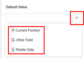
- Current position: Obtain the current location as the default value.
- Other field: Fields from other widgets, such as location widgets and associated record widgets.
- Relate data: Link to existing data. The latest record is used as the default.
Pop-up Message
If a field is unclear, add a Pop-up Message to explain it. This helps users and makes things easier.
After setting, a question mark icon appears next to the field. When filling in the form, click the question mark icon to see the message.

Description
Set the widget description. Include its functions, use cases, and tips. This helps users understand it better and makes the form clearer.

Feedback
Was this page helpful?
Provide feedbackThank you very much for your feedback. We will continue working to improve the documentation.See the reply and handling status in My Cloud VOC.
For any further questions, feel free to contact us through the chatbot.
Chatbot


