
Multi-Trend
The multi-trend widget displays multiple trend values of data changes.
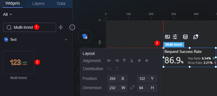
On the large screen design page, drag the multi-trend widget from the All > Text area to the blank area of the canvas, as shown in Figure 1.

Card
A card wraps a chart widget. A widget consists of card elements (card title, chart, card background, and card border) and chart elements.
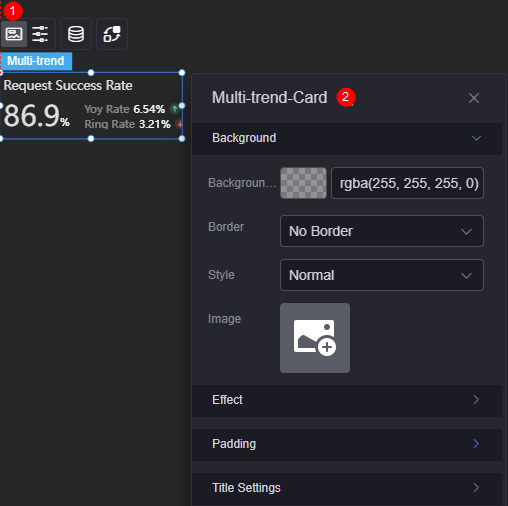
- Background
- Background color: Background color of the widget card.
- Border: Border of the widget card. Options: no border, full border, and corner border. For full border and corner border, you can set the line type and rounded corners of the outer border of the widget.
- Style: Image display style. The options are normal, center, stretch, and tiled.
- Choose image: Use a local image as the widget background. Directories and subdirectories can be added to facilitate image management by category. JPG, JPEG, PNG, or GIF images are recommended. The size of each image cannot exceed 50 MB.
- Special effect: Widget highlighted status. Displayed by default or on page load.
- Padding: Distance between the chart and the four sides (top, bottom, left, and right as shown in Figure 2) of the widget. The default value is 0, indicating that the chart stretches to fill the entire widget.
- Title: Whether to display the title. If you set it to display, set the following properties:
- Title content: Content of the title.
- Title font: Font, color, and size of the title.
Configuration
You can set the value, primary trend, and secondary trend of the widget.
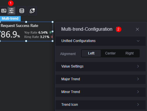
- To set the alignment mode of widgets to left, center, or right alignment, you can click the unified configuration button and then click the alignment mode button.
- Value: Whether to display the chart value. If you set it to display, set the following properties:
- Font: Font, size, and color of the value.
- Spacing: Spacing between digits in a value.
- Numeric quantifier: Whether to display numeric quantifiers. If you set it to display, set the following properties:
- Thousand comma: Whether to use the thousand comma for the value.
- Keep decimal: Whether to display a specified number of decimal places for the value.
- Rounding: Whether to use rounding.
- Dynamic quantifiers: Whether to use dynamic quantifiers.
- Quantifier type: Set the quantifier type. Auto and custom quantifier are supported. Required only when dynamic quantifiers are used.
- Quantifier selection: Select the required quantifier, such as %, 10,000, million, and 100 million.
- Prefix: Whether to display the prefix. If you set it to display, set the following properties:
- Prefix content: Enter the content of the value prefix.
- Prefix font: Set the font, size, and color of the value prefix.
- Right spacing: Spacing between the prefix and the value.
- Suffix: Whether to display the suffix. If you set it to display, set the following properties:
- Suffix content: Enter the content of the value suffix.
- Suffix font: Set the font, size, and color of the value suffix.
- Left spacing: Spacing between the suffix and the value.
- Main trend: Whether to display the main trend. If you set it to display, you can set the trend position and the following properties:
- Trend name: Set the name of the main trend.
- Trend name font: Font, size, and color of the main trend name.
- Number font: Font, size, and color of the number.
- Trend position: Set the position of the main trend.
- Prefix: Whether to display the prefix. If you set it to display, set the following properties:
- Prefix content: Enter the content of the main trend prefix.
- Prefix font: Set the font, size, and color of the main trend prefix.
- Right spacing: Spacing between the main trend prefix and the trend number.
- Suffix: Whether to display the suffix. If you set it to display, set the following properties:
- Suffix content: Enter the content of the main trend suffix.
- Suffix font: Font, size, and color of the main trend suffix.
- Left spacing: Spacing between the main trend suffix and the trend number.
- Minor trend: Whether to display the minor trend. If you set it to display, set the following properties:
- Trend name: Set the name of the minor trend.
- Trend name font: Font, size, and color of the minor trend name.
- Number font: Font, size, and color of the number.
- Minor trend layout: Layout mode, which can be horizontal or vertical.
- Prefix: Whether to display the prefix. If you set it to display, set the following properties:
- Prefix content: Enter the content of the minor trend prefix.
- Prefix font: Set the font, size, and color of the minor trend prefix.
- Right spacing: Spacing between the minor trend prefix and the trend number.
- Suffix: Whether to display the suffix. If you set it to display, set the following properties:
- Suffix content: Enter the content of the minor trend suffix.
- Suffix font: Font, size, and color of the minor trend suffix.
- Left spacing: Spacing between the minor trend suffix and the trend number.
- Trend icon: Whether to display the trend icon. If you set it to display, set the following properties:
- Trend icon: Default trend icon and custom trend icon can be used.
- Growth trend style: Style of the growth trend icon. Displayed only when the trend icon is set as a custom one.
- Decreasing trend style: Style of the decreasing trend icon. Displayed only when the trend icon is set as a custom one.
- Flat trend style: Style of the flat trend icon. Displayed only when the trend icon is set as a custom one.
- Icon width: Width of the icon. Displayed only when the trend icon is set as a custom one.
- Icon height: Height of the icon. Displayed only when the trend icon is set as a custom one.
- Icon size: Size of the icon. Displayed only when the trend icon is set as a default one.
- Icon position: Position of the icon, for example, right or left.
- Upward trend icon color: Color of the upward trend icon. Displayed only when the trend icon is set as a default one.
- Flat trend icon color: Color of the flat trend icon. Displayed only when the trend icon is set as a default one.
- Downward trend icon color: Color of the downward trend icon. Displayed only when the trend icon is set as a default one.
Data
In the data settings, you can set the data source of the multi-trend widget. For more information, see Data Access.
Interaction
In the interaction settings, you can configure interactions between this widget and other widgets or pages. For details, see Interaction Configuration.
Feedback
Was this page helpful?
Provide feedbackThank you very much for your feedback. We will continue working to improve the documentation.See the reply and handling status in My Cloud VOC.
For any further questions, feel free to contact us through the chatbot.
Chatbot


