
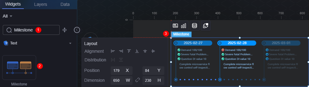
Milestone
The milestone widget can be used to identify the past (selected), present (highlighted or clicked), or future (default) statuses.
On the large screen design page, drag the milestone widget from All > Text to the blank area of the canvas, as shown in Figure 1.

Card
A card wraps a chart widget. A widget consists of card elements (card title, chart, card background, and card border) and chart elements.
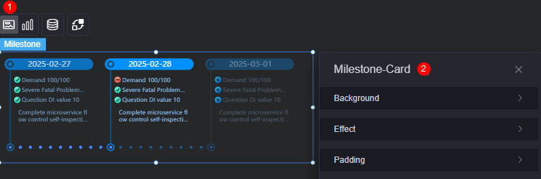
- Background
- Background color: Background color of the widget card.
- Border: Border of the widget card. Options: no border, full border, and corner border. For full border and corner border, you can set the line type and rounded corners of the outer border of the widget.
- Style: Image display style. The options are normal, center, stretch, and tiled.
- Choose image: Use a local image as the widget background. Directories and subdirectories can be added to facilitate image management by category. JPG, JPEG, PNG, or GIF images are recommended. The size of each image cannot exceed 50 MB.
- Special effect: Widget highlighted status. Displayed by default or on page load.
- Padding: Distance between the chart in the widget and the four sides (top, bottom, left, and right) of the widget (see Figure 2). The default value is 0, indicating that the chart is stretched across the widget.
Graphic
A graphic is a specific graphical expression element that visualizes data in a widget, for example, a slice in a pie chart, a bar in a bar chart, a line or a kink point in a line chart.
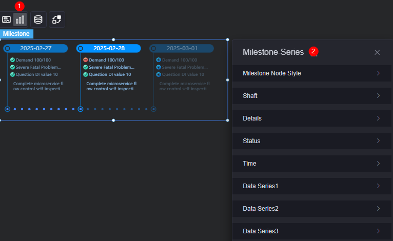
- Stone node style
- Milestone style: Choose either the preset style or upload an image.
- Node style: Select a preset milestone style. Required only when the milestone style is set to the preset mode.
- Select image: Select a locally uploaded image or an image in the connector as the milestone style. Required only when the milestone style is set to the image mode.
- Image width: Width of the selected image. Required only when the milestone style is set to the image mode.
- Image height: Height of the selected image. Required only when the milestone style is set to the image mode.
- Up/Down offset: Adjust the vertical position of the selected image. Unit: pixels. Required only when the milestone style is set to the image mode.
- Left/Right offset: Adjust the horizontal position of the selected image. Unit: pixels. Required only when the milestone style is set to the image mode.
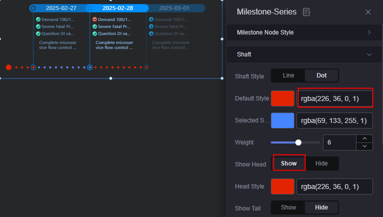
- Axis
- Axis style: Choose the appearance of the axis, such as line or dot.
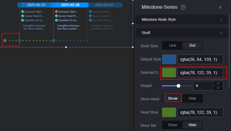
- Default axis style: Default style of the axis. The display tail needs to be set to display.
Figure 5 Axis default style
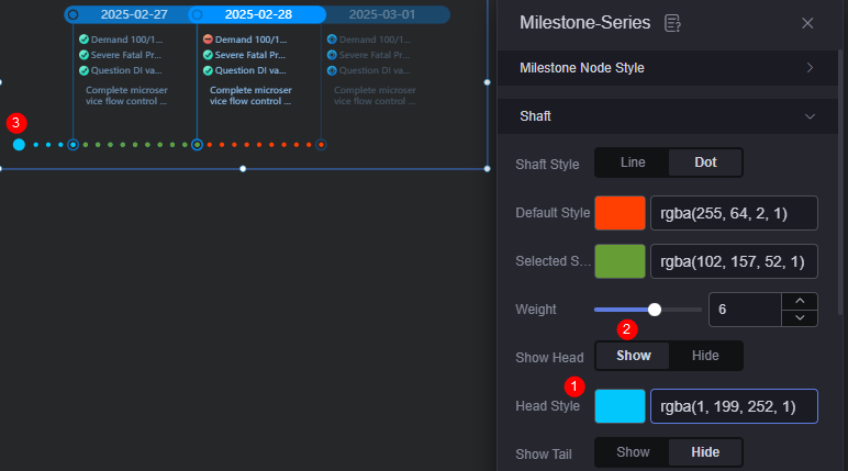
- Axis selection style: Style of the selected axis. The display header needs to be set to display.
Figure 6 Axis selection style
- Axis width: Width of the axis.
- Display header: When setting the selection style of the axis bar, set this parameter to display.
- Headline style: Style of the selected headline. The display header needs to be set to display.
Figure 7 Headline style
- Display tail: When setting the default style of the axis, set this parameter to display.
- Tail style: Style of the selected tail. The display tail needs to be set to display.
- Details
- Upper/Lower offset: Vertical offset of the details, in pixels.
- Left/Right offset: Horizontal offset of the details, in pixels.
- Status
- Up/Down offset: Vertical offset of the status.
- Left/Right offset: Horizontal offset of the status.
- Time
- Up/Down offset: Vertical offset of the time.
- Left/Right offset: Horizontal offset of the time.
- Data series
- Display milestone node style: Whether to display the milestone node style.
- Default status style: Set the default appearance of a milestone node. Two options are available: image color change or image upload.
- Default color: Color used for a milestone node in its default status.
- Selected state style: Set the appearance of a selected milestone node.
- Selected color: Color of a selected milestone node.
- Highlight style: Highlight style of a milestone node.
- Highlight color: Highlight color of a milestone node.
- Focus color: Color of a milestone node when it is in focus.
- Default axis color: Color of the axis for a milestone node. Note: Data series 1 does not support axis settings.
- Selected axis color: Color of the selected axis for a milestone node. Note: Data series 1 does not support axis settings.
- Show details: Whether to display details.
- Default details font: Font, color, and size of the default details.
- Font of selected details: Font, color, and size of the selected details.
- Highlight details font: Font, color, and size of the highlighted details.
- Display time: Whether to display the time. When this parameter is set to display, you can set the color and size of the default, selected, and highlighted time fonts.
- Display status: Whether to display the status. When this parameter is set to display, you can set the color and size of the default, selected, and highlighted status fonts.
Data
In the data settings, you can set the data source of the milestone widget. For more information, see Data Access.
Interaction
In the interaction settings, you can configure interactions between the milestone widget and other widgets or pages. For details, see Interaction Configuration.
Feedback
Was this page helpful?
Provide feedbackThank you very much for your feedback. We will continue working to improve the documentation.See the reply and handling status in My Cloud VOC.
For any further questions, feel free to contact us through the chatbot.
Chatbot


