
Ranking
The ranking is a type of text widget used to describe the sequence of data based on certain conditions.
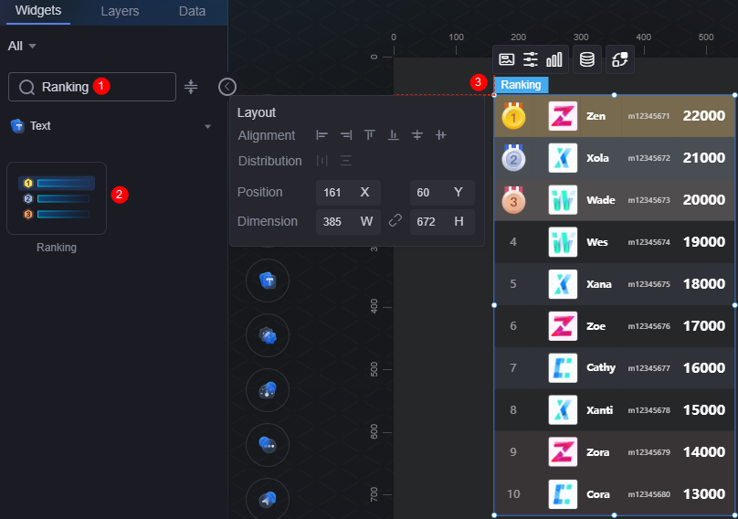
On the screen design page, drag the ranking widget from the All > Text area to the blank area of the canvas, for example, Figure 1.

Card
A card wraps a chart widget. A widget consists of card elements (card title, chart, card background, and card border) and chart elements.
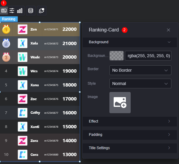
- Background
- Background color: Background color of the widget card.
- Border: Border of the widget card. Options: no border, full border, and corner border. For full border and corner border, you can set the line type and rounded corners of the outer border of the widget.
- Style: Image display style. The options are normal, center, stretch, and tiled.
- Choose image: Use a local image as the widget background. Directories and subdirectories can be added to facilitate image management by category. JPG, JPEG, PNG, or GIF images are recommended. The size of each image cannot exceed 50 MB.
- Special effect: Widget highlighted status. Displayed by default or on page load.
- Padding: Distance between the chart in the widget and the four sides (top, bottom, left, and right) of the widget (see Figure 2). The default value is 0, indicating that the chart is stretched across the widget.
- Title settings
- Display: Whether to display the title.
- Title content: Content to be displayed in the title.
- Title row height: Row height of the title, in pixels.
- Background color: Background color of the title.
- Text position: Position of the title.
- Font: Font, size, and color of the title.
Configuration
In the configuration, set the global style, table header, row, and serial number of the widget.
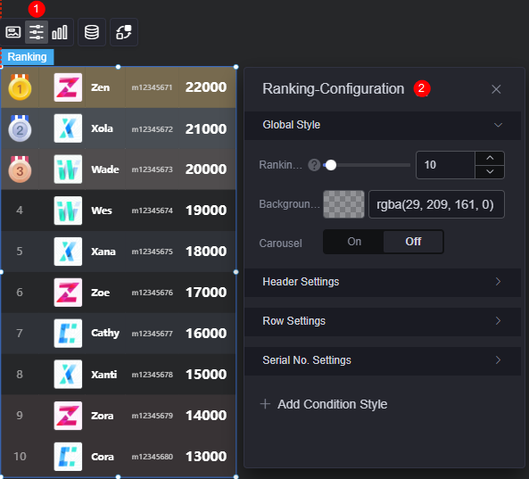
- Global style
- Number of rows: Number of rows displayed in the rank list.
- Background color: Background color of the rank list.
- Automatic rotation: Whether to enable the automatic rotation function. Once enabled, the rotation speed and single-line pause duration can be set.
- Title settings
- Show header: Whether to display the table header.
- Header row height ratio (%): Header row height of the table in percentage.
- Background color: Background color of the table header.
- Alignment: Alignment mode of the table header, such as center, left, and right.
- Table header font: Font, color, and size of the table header.
- Row configuration
- Line feed display: Whether to enable line feed display.
- Row background color: Set the background color for rows. Options include customizing the background color for odd rows, even rows, or individual rows.
If you choose custom mode for row background color, follow these rules for configuring the background color for serial numbers:
- Single line: Enter the specific serial number directly.
- Non-consecutive lines: Separate serial numbers with commas (,).
- Consecutive lines: Use a hyphen (-) to connect the first and last serial numbers.
- Serial number
- Display serial number: Whether to display the serial number.
- Width Ratio (%): Width ratio of the serial number.
- Serial number style: Style of the serial number.
- Alignment mode: Alignment mode of the serial number.
- Font: Font, color, and size of the serial number.
- Background style: Background style of the serial number, including color and image options. Color: Choose from background shapes like circle, ellipse, and rectangle.
- Background color: Color of the custom background. Required only when the background style is set to color.
- Fill mode: Set how the background image fills the space, such as stretching or centering. Required only when the background style is set to image.
- Image: JPG, JPEG, PNG, and GIF images are recommended. The image size cannot exceed 500 MB. Required only when the background style is set to image.
- Background width (%): Width ratio of the serial number background.
- Background height (%): Height ratio of the serial number background.
- Special serial number: Whether to display the special serial number. Required only when displaying special serial numbers. You can set the font, style, and background color for these special serial numbers.
- Font: Font, color, and size of a special serial number.
- Special style: Style of a special serial number, including color and image.
- Fill mode: Set how the image fills the space, such as stretch, center, or common fill. Required only when the special style is set to image.
- Image: Set a background image in a special style. Choose an image from your local device or via a connector. JPG, JPEG, PNG, and GIF images are recommended. Each image cannot exceed 50 MB. Required only when the special style is set to image.
- Round corner: Roundness of the rectangle border. Set to 0 for a rectangle with sharp corners; set to 100 to display as a circle. Required only when the special style is set to color and rectangle is selected.
- Background color: Set the background color for the special style, applicable to both circle and rectangle shapes. Required only when the special style is set to color.
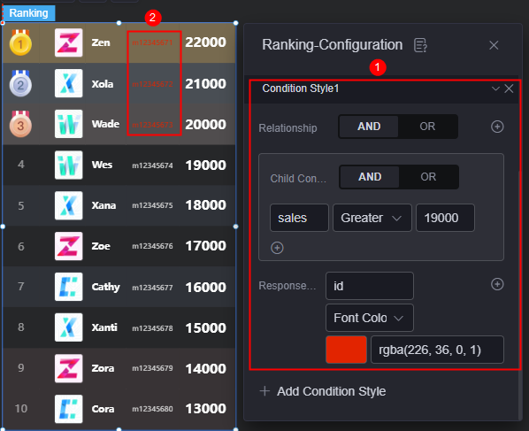
- Condition format: Click the button to add a condition format. Set the condition and style for the response data column. As shown in Figure 5, this setting indicates that when the sales column meets the set condition (greater than 19000), the id column is displayed in red. Otherwise, the id column is displayed in a normal color.
Graphic
A graphic is a specific graphical expression element that visualizes data in a widget. For example, a graphic can be a slice in a pie chart, a bar in a bar chart, or a line or an inflection point in a line chart.
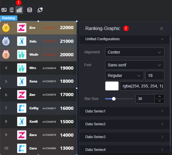
- Unified configuration
- Alignment: Alignment mode of the widget, such as center, left, and right.
- Font: Font, size, and color of the widget.
- Star size: Size of the star to be displayed.
- Data series
- Original data name: Default data name in the original data. The content comes from the value of the data model.
- Width ratio (%): Width ratio of a column name.
- Display mode: Set the data display mode. If the data is an image address, the data can be displayed as an image.
- Alignment: Alignment mode of data.
- Font: Font and color of the text. Required when the display mode is set to text.
- Chart width ratio (%): Required when the display mode is set to image. This parameter specifies the width ratio of the chart.
- Chart height ratio (%): Required when the display mode is set to image. This parameter specifies the height ratio of a chart.
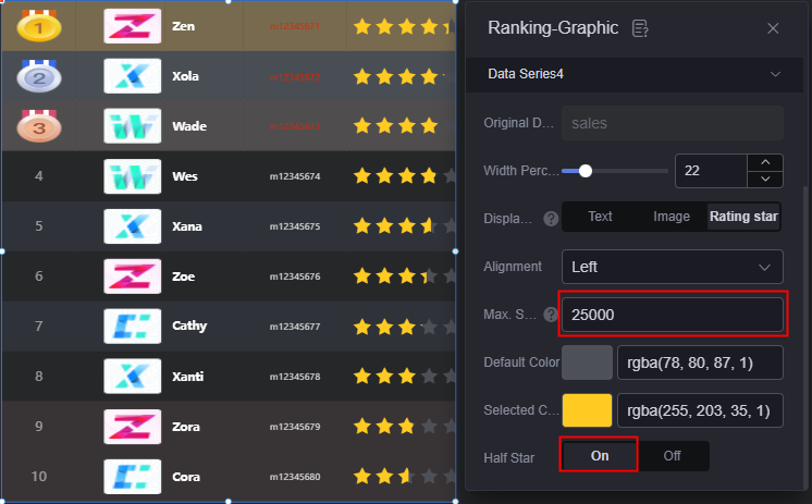
- Maximum score: Required when display mode is set to the star mode. Set this parameter to 5 for a five-star rating.
- The number of stars is fixed at five. If the maximum value is not five, enter the maximum score.
- Number of displayed stars = Actual value/Maximum score x five stars.
- When the data exceeds the maximum value, five stars are displayed.
- Default color: Used for unfilled stars when display mode is set to the star mode.
- Selected color: Color of the five stars. Required only when display mode is set to the star mode.
- Half star: Whether to display half stars. Required only when display mode is set to the star mode.
Figure 7 Half-star rating
Data
In the data settings, you can set the data source of the ranking widget. For details, see Data Access.
Interaction
In the interaction settings, you can configure interactions between the ranking widget and other widgets or pages. For details, see Interaction Configuration.
Feedback
Was this page helpful?
Provide feedbackThank you very much for your feedback. We will continue working to improve the documentation.See the reply and handling status in My Cloud VOC.
For any further questions, feel free to contact us through the chatbot.
Chatbot


