Help Center/
Data Lake Visualization/
User Guide (ME-Abu Dhabi Region)/
Component Guide/
Text/
Treemap
Updated on 2025-01-22 GMT+08:00
Treemap
This section describes parameters of a treemap.
Pattern
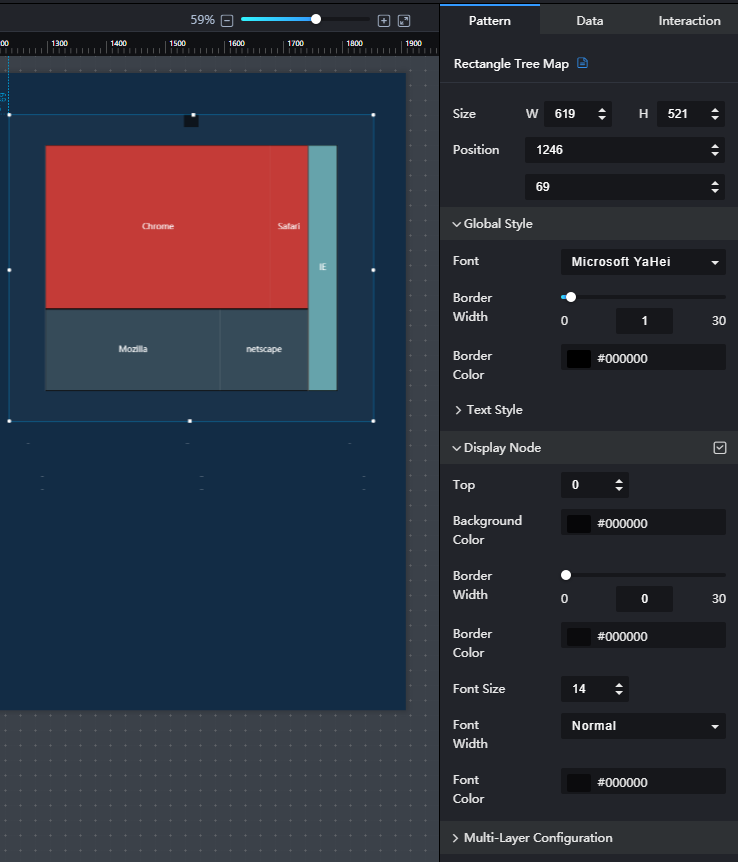
- Size/Position
- Size: width and height of the component. Unit: pixel.
- Position: position where the component is located in the canvas. Unit: pixel.
Figure 1 Treemap
- Global Style
- Font: font of the component text.
- Border Width: to set the border width of the component by entering a value or dragging
 .
. - Border Color: to set the border color of the component by clicking the color editor.
- Text Style: to set the font size, font color, and font width of the component.
- Display Node Path
- Display Node: to show or hide the node by clicking
 or
or  .
. - Top: to set the distance between the node and the top of the component.
- Background Color: to set the background color of the node by clicking the color editor.
- Border Width: to set the border width of the node by entering a value or dragging
 .
. - Border Color: to set the border color of the node by clicking the color editor.
- Font Size: font size of the node text.
- Font Width: font width of the node text.
- Font Color: font color of the node text.
- Display Node: to show or hide the node by clicking
- Multi-Layer Configuration
- Rectangle Border Width: to set the rectangle border width by entering a value or dragging
 .
. - Inter-Subrectangle Clearance: to set the clearance between sub-rectangles by entering a value or dragging
 .
.
- Rectangle Border Width: to set the rectangle border width by entering a value or dragging
Data
- name: name of a node path.
- value: value of a node path. A larger value leads to a larger area occupied by the rectangle.
- children: child node, which contains name and value fields.
- name: name of a child node. A child node name is displayed in the rectangle.
- value: weight of a subnode. A larger value leads to a larger area occupied by the subnode rectangle.
- Data Source Type: to select the data source of the chart. Multiple data sources are provided for you to select. You need to add data sources first. For details, see Data Connection Overview.
- Converter: Select a converter to convert data into the data that meets the display requirements. For details, see Using a Converter.
- Automatic Update: If you select Automatic Update and set Update Interval, the data is automatically updated based on the interval.
- Preview Result: Click Preview Result to view the information about the selected data source. You can click Update Query to manually update the component data when the data source changes.
Interaction
For details about whether the component supports the interaction function and how to use the interaction function, see Configuring Component Interaction.
Parent topic: Text
Feedback
Was this page helpful?
Provide feedbackThank you very much for your feedback. We will continue working to improve the documentation.See the reply and handling status in My Cloud VOC.
The system is busy. Please try again later.
For any further questions, feel free to contact us through the chatbot.
Chatbot


