
Horizontal Bar Chart
This section describes parameters of a horizontal bar chart.
Fields
- In the Data area on the right, select a dataset, and double-click or drag required dimension and metric fields to the corresponding areas on the Fields tab.
Table 1 Parameters on the Fields tab Parameter
Description
Field display content
Click
 in the column and click Field display content to modify the field display content on the displayed page. Click OK.
Aggregation Mode
Select Aggregation Method and click to support setting of no aggregation, sum, count, distinct count, maximum value, minimum value, average value, population standard deviation, sample standard deviation, sample variance, range start value, and range end value.
Drilldown
You can enable drilldown for dimension fields. For example, you can view data at different levels of granularity, ranging from years down to quarters, months, weeks, days, hours, minutes, and even seconds, depending on the time dimension.- Click the field (
 ) in the column and drag the field of the target location to be drilled down to the Drilldown area.
 - Click Update to test whether the drilldown function is set successfully.
NOTE:
- Drill-down is only supported for dimension fields, not for metric fields.
- You can only select one field as the starting point for drill-down.
- When drilling down on time, the system will automatically add the subdivided time periods to the drill-down order list and include them in the sorting field (fields that are already in the sorting field will not be added again).
- Drill-down icons should be highlighted for fields that have already been drilled down. If you remove the drill-down field from the dimension, the entire drill-down function box will disappear.
- Click the field (
- Set the color legend: Drag the desired field into Color Legend (dimensions only) on the Field tab. After setting, the chart will use different colors to distinguish data based on dimensions.
- Set the tooltips and metric: Drag the desired field into Tooltips/Metric (metrics only) on the Field tab. After setting, the field will appear in the chart's tooltip box.
- Set a filter.
- Find the data field you need in the dimension and metric lists within the data column.
- Click
 next to the field you wish to filter and you will be directed to the filter settings page.
 - Click OK.
Table 2 Filter parameters Type
Parameter
Description
string
Condition
Filter Mode: The options are Condition and Enumeration.
Condition Type: The options are And condition and Or condition.
Filter Condition: The options are Exact match, Contain, Start with, End with, Not match, Not contain, Null, and Not null.
Enumeration
Query Mode: The options are Single-select and multi-select.
Filter Condition: The options are >, ≥, <, ≤, =, ≠, Null, and Not null.
Metric
Condition Type
The options are And condition and Or condition.
Filter Condition
The options are >, ≥, <, ≤, =, ≠, Null, and Not null. You can select Before aggregation and After aggregation for data.
NOTE:If you select Before aggregation, data is filtered before aggregation. If you select After aggregation, data is filtered after aggregation. For aggregation concepts, see Creating a Dataset.
You can click Create Filter Condition to set multiple filter criteria.
Date
Range value
Select a time range for filtering.
Single value
Set a single time for filtering.
Condition
You can select And condition or Or condition as the condition type and select filter condition like >, ≥, <, ≤, and =.
You can click Create Filter Condition to set multiple filter criteria.
- Set sorting.
- Drag and drop required data fields from the Dimension and Metric (Indicator) areas under Data to the Sorting area.
- Click
 next to a field in the Sorting area and select a sorting mode. The sorting modes are Ascending, Descending, and Custom.
 - To cancel sorting, click
 next to the sorting field.
- Set the maximum number of query results.
Enter the maximum number of records that can be returned in the text box. The default value is 1000.
- Set automatic refresh.
The auto refresh interval supports the following options: no refresh, 1 minute, 5 minutes, 15 minutes, and 30 minutes.
Style
This part describes the style parameters of a horizontal bar chart.
- Size/Position
- W: width of the target, in pixels.
- H: height of the target, in pixels.
- X: position of the target on the canvas, in pixels.
- Y: position of the target on the canvas, in pixels.
- Opacity: Adjust the transparency of the target on the canvas using a slider or by manually entering a percentage. A higher percentage means lower transparency.
Figure 1 Size/Position
- Global Style
- Font: font of the text in the chart.
Figure 2 Global Style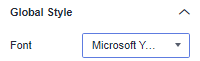
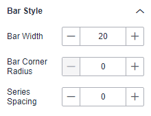
- Bar Style
- Bar Width: bar width, which can be adjusted by entering a numerical value or clicking - or +. Note that the input cannot be empty and must be from 1 to 100.
- Bar Corner Radius: bar corner radius, which can be adjusted by entering a numerical value or clicking - or +. Note that the input cannot be empty and must be from 0 to 100.
- Series Spacing: series spacing, which can be adjusted by entering a numerical value or clicking - or +. Note that the input cannot be empty and must be from –100 to 100.
Figure 3 Bar style
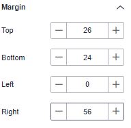
- Margin
- Top: The spacing between the chart and the top of the layer, which can be adjusted by entering a numerical value or clicking - or +.
- Bottom: The spacing between the chart and the bottom of the layer, which can be adjusted by entering a numerical value or clicking - or +.
- Left: The spacing between the chart and the left of the layer, which can be adjusted by entering a numerical value or clicking - or +.
- Right: The spacing between the chart and the right of the layer, which can be adjusted by entering a numerical value or clicking - or +.
Figure 4 Margin
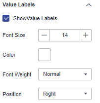
- Value Labels
- Show Value Labels: If the checkbox is selected (
 ), value labels are displayed. If the checkbox is not selected (
 ), value labels are not displayed.
 - Font Size: font size of the value label.
- Color: color of the value label.
- Font Weight: font weight of the value label.
- Position: position of the value label.
Figure 5 Value labels
- Show Value Labels: If the checkbox is selected (
- X Axis
- Show X Axis: If the checkbox is selected (
 ), the X axis is displayed. If the checkbox is not selected (
 ), the X axis is not displayed.
 - Text: You can set the font size, font color, font weight, and angle.
- Axis Label: You can set the display format, minimum value, maximum value, and number of divisions.
- Axis Unit: whether to display the axis unit. The unit color and unit name can be set.
- Coordinate Axis: color of the Y axis.
- Grid Line: If the checkbox is selected (
 ), grid lines are displayed. If the checkbox is not selected (
 ), grid lines are not displayed.
- Show X Axis: If the checkbox is selected (
- Y Axis
- Show Y Axis: If the checkbox is selected (), the Y axis is displayed. If the checkbox is not selected (), the Y axis is not displayed.
- Label: You can set the font size, font color, font weight, and angle.
- Text Overflow: whether to allow text overflow. The overflow width can be set.
- Coordinate Axis: color of the Y axis.
- Grid Line: If the checkbox is selected (), grid lines are displayed. If the checkbox is not selected (), grid lines are not displayed.
- Show Y Axis: If the checkbox is selected (
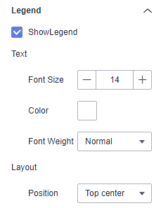
- Legend
- Show Legend: If the checkbox is selected (
 ), legends are displayed. If the checkbox is not selected (
 ), legends are hidden.
 - Text: text style of the legend, including Font Size, Color, and Font Weight.
- Layout: You can set the legend direction, position, left/right spacing, top/bottom spacing, and legend spacing.
Figure 6 Legend
- Show Legend: If the checkbox is selected (
- Tooltips
- Show Tooltips: If the checkbox is selected (
 ), a tooltip is displayed when you preview or view a published component. If the checkbox is not selected (
 ), no tooltip is displayed when you preview or view a published component.
 - Data Name: whether to display the data name.
- Color: font color of the tooltips.
- Font Size: font size of tooltips.
- Font Weight: font weight of tooltips.
Figure 7 Tooltips

- Show Tooltips: If the checkbox is selected (
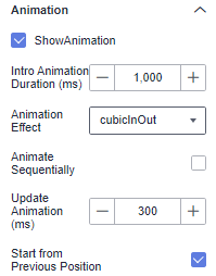
- Animation
- Show Animation: If the checkbox is selected (
 ), animations are displayed. If the checkbox is not selected (
 ), animations are not displayed.
 - Intro Animation Duration (ms): duration of the first rendering of the component, in ms.
- Animation Effect: The system provides multiple common animation slow-moving effects.
- Animate Sequentially: If this option is selected, the series are animated in sequence. If this option is deselected, all series are animated at the same time.
- Update Duration (ms): animation duration when the component data is updated, in ms.
- Start from Previous Position: If this option is selected, the animation is played from the position of the previous data when the component data is updated. If this option is deselected, the animation is played from the initial position when the component data is updated.
Figure 8 Animation
- Show Animation: If the checkbox is selected (
- Series to Category
- Show Series to Category: whether to support the display of series to categories.
- Value Settings: You can set the context, units, scientific notation, use of thousand separators, and decimal places for numerical values.
Interactions
- Link
On the Interactions tab, choose Advanced > Link. In the Chart Linkage Configuration dialog box that appears, set parameters by referring to Table 3. For details, see Example linkage.
- Filter
- Click Filter. The Filter tab is displayed.
- Click
 next to Fields to Bound. The associated field box is displayed.
 - Click
 , select the field to be bound, select the associated chart, and click OK.
- Shown/Hidden
- Click Show/Hidden. The Shown/Hidden tab is displayed.
- Select the associated chart and click OK.
Table 3 Chart linkage configuration parameters Parameter
Description
Filter
- Fields to Bound: Select the fields to be bound.
- Associated Charts: Set linked associated charts. You can select charts from the same dataset or different datasets.
Shown/Hidden
Select the required fields first and then select the charts to be associated with them. You can select all charts on the large screen.
- Click Show/Hidden. The Shown/Hidden tab is displayed.
- Select the associated chart.
- Filter
- Redirect
- On the Interactions tab, click the edit icon next to Redirect under Advanced.
- In the Chart Redirect dialog box that appears, click
 next to Component to Be Bound.
 - Set Redirect Type, Open Mode, Redirect to Reports/Screens, and Associated Parameters, and click OK. For details, see Redirect Example.
- You can redirect with parameters. For specific examples, refer to Example of Redirection with Parameters.
- To set up redirection, drag the desired fields to the Fields tab. Then, navigate to the chart redirection page to configure the bound fields. Failure to do so will result in unsuccessful redirection.
Table 4 Parameters Parameter
Description
Redirect Type
Intra-system redirect: Redirect to the internal screen and dashboard projects.
External redirect: Redirect to a link that is not in the software.
Open Mode
Open in this window: After you click the chart with redirection set, the target chart is opened in the current window.
Open in new window: After you click the chart with redirection set, the target chart is opened in a new window.
Open in popup window: After you click the chart with redirection set, the target chart is opened as a pop-up window. The size of the pop-up window is customizable.
Redirect to Reports/Screens
- Select a project first.
- Select a dashboard/screen.
NOTE:
This step is mandatory when Redirect Type is set to Intra-system redirect.
Associated Parameters
Set Effective Parameters of This Screen.
- Associated Parameters: Carry associated fields to the chart that you are redirecting to.
- Enter a fixed value: The chart that you redirect to only filters the fixed value. For example, if the fixed value is set to city, the chart that you redirect to displays the filtered city field.
- Control Variables: Each value selected in the drop-down box, search, or tab list is a variable value set by the control variable. For example, if you select city in the drop-down box, the variable value of the control variable is city, and the chart that you redirect to filters out the city field.
- Global Parameters: Carry the values in the global variables to the chart that you redirect to.
Carry condition
When Redirect Type is Intra-system redirect, null values can be carried. Carrying null values is mainly used for filtering null values in data tables, making it easier for users to analyze data.
- Prerequisites: Set up two large screens, A and B, with screen A linking to screen B.
- Procedure
- Configure global parameters in screen B and ensure that the same fields exist in screen A.
- Set the redirect parameters in screen A, select screen B as the target, and choose associated fields from the global parameters.
- Select Carry null value and click OK.
- The bound field in screen A will be underlined. Click it to redirect to screen B and filter out rows with null fields. The URL of screen B will display the param parameter.
- Deselect Carry null value and click OK.
- The bound field in screen A will be underlined. Click it to redirect to screen B and display all chart data. The URL of screen B will not display the param parameter.
Chart Display

Feedback
Was this page helpful?
Provide feedbackThank you very much for your feedback. We will continue working to improve the documentation.See the reply and handling status in My Cloud VOC.
For any further questions, feel free to contact us through the chatbot.
Chatbot


