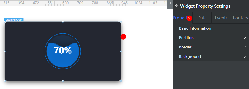
Setting Properties of the Liquid Fill Chart Widget
The liquid fill chart widget is used to collect statistics on liquid fill charts.

Basic
- Widget Label: Label of a widget, which is displayed on the advanced page.
- Widget Name: Name of a widget, which is the unique identifier of the widget on the page.
Position
- Left: Left margin of the widget in the canvas. Unit: px.
- Top: Top margin of the widget in the canvas. Unit: px.
- Layout Width: Width of the widget. Unit: px.
- Layout Height: Height of the widget. Unit: px.
- Stacking Order: Order of the widget among others. The default value is 1. The widget with the largest value is on the top. If you want to move a widget to the bottom of a stack, set the parameter to 0.
- Auto Height: whether the widget height changes with the width.
- open: If this option is selected, the page adaptation function is displayed in the lower part.
- Page Adapter: Select open to enable height adaptation for the widget. This property enables the position of other widgets below the page to be automatically adjusted based on the height of the widget. One page supports only one widget.
Border
Border of the widget. Options: Full and Corner.
- Full border
- Style: Style of the widget border. Options: Solid, Dotted, Dashed, and Double.
- Width: Border width, in pixels.
- Color: color of the widget border.
- Radius: radian of the four corners of the widget border, in pixels.
- Corner
- Width: Border width, in pixels.
- Length: Border length, in pixels.
- Color: color of the widget border.
- Radius: radian of the four corners of the widget border, in pixels.
- Padding: Spacing between the widget border and the chart, in pixels.
Background
- Style: Background style. Options: Normal, Center, and Stretch.
- Image URL: Add images for this widget. The image can be in JPG, JPEG, PNG, or GIF format, and the image size cannot exceed 50 MB. The suggested image size is 800 x 800.
- Color: Background color of the widget.
Advanced Settings
Right-click the widget and choose Setting from the shortcut menu to configure the liquid fill chart.
- Reference Color Template: Preset templates. You can click the template to switch the style. You can select a template to reset or set configuration items to obtain the desired effect.
- Default Template: Common basic liquid fill chart template.
- Blue Title Template: A template with a title in blue.
- Widget Title: Widget title.
- Title Setting: Whether to display the widget title.
- Content: Content of the widget title.
- Location Selection: Position of the widget title.
- Background Color: Background color of the title.
- Text Font Size: Font size of the widget title.
- Font Family: Font series of the widget title.
- Text Color: Text color of the widget title.
- Border Round: Round corner of the widget border.
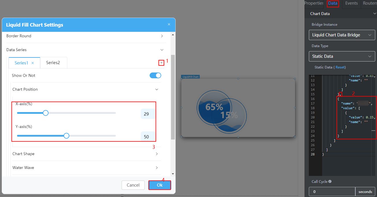
- Data Series: You can configure the liquid fill chart display, position, shape, border, diameter, and water wave. Click + to add a data series.
- Show Or Not: Whether to display the data series. If this switch is turned off, a data series is not displayed.
- Chart Position > X-axis(%): Percentage of the distance from the chart position to the left of the widget to the widget height.
- Chart Position > Y-axis(%): Percentage of the distance from the chart position to the top of the widget to the widget height.
- Chart Shape > Diameter: Diameter of the chart.
- Water Wave > Water Wave Color: Color of the wave.
- Water Wave > Water Wave Background Color: Background color of the water wave.
- Water Wave > Ripple Amplitude: Amplitude of the water wave.
- Water Wave > Show Double Wave: Whether to display double ripples.
- Water Wave > Second Wave Color: If Show Double Wave is enabled, you can set the color of the secondary ripple.
- Label > Show Or Not: Whether to display the label.
- Label > Label Position Left Offset(%): Percentage of the distance between the label position and the left side of the widget to the widget height.
- Label > Label Position Top Offset(%): Percentage of the distance between the label position and the top of the widget to the widget height.
- Label > Label Text Style > Text Color: Color of the text above the wave.
- Label > Label Text Style > Text Color When On Waves: Color of the text under the wave.
- Label > Label Text Style > Font Size: Size of the label text.
- Label > Label Text Style > Font Weight: Font width of the label.
- Label > Label Text Style > Font Family: Font series of the label.
- Outline Style > Show Or Not: Whether to display the outline style. This function is enabled by default.
- Outline Style > Border Width: Width of the outline border. The value ranges from 0 to 50.
- Outline Style > Color: Color of the outline. Options: Monochrome and Gradient.
- Chart Title: Widget title.
- Show Chart Title: Whether to display the widget title.
- Title Acquisition: The title can be customized or obtained from the value of name in the dataValue data model.
- Title Position(top%): Percentage of the distance between the title and the top of the widget to the widget height.
- Title Position(left%): Percentage of the distance from the title to the left of the widget to the widget height.
- Text Style: Includes the text color, size, font, and series.
- Background: Background color of the chart.
Configuring a Data Series
- Right-click the widget and choose Setting from the shortcut menu.
- Expand Data Series and click + to add a data series.
- On the Data tab page on the right, configure data of the data series.
For example, add the following code in bold to the static data preset in the system to configure the data of the new data series. You can also use the dynamic data to call the background API URL to return the following structure model data.
Figure 2 Adding a data series
{ "resCode": "0", "resMsg": "Success", "result": [{ "dataValue": [{ "name": "Alarm handling rate", "value": [{ "value": 0.65, "name": "" }] }, { "name": "Hit rate", "value": [{ "value": 0.15, "name": "" }] } ] }] } - Configure the position and shape of the added data series chart.
- Click Ok.
Feedback
Was this page helpful?
Provide feedbackThank you very much for your feedback. We will continue working to improve the documentation.See the reply and handling status in My Cloud VOC.
For any further questions, feel free to contact us through the chatbot.
Chatbot


