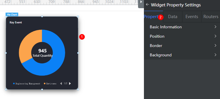
Setting Properties of the Basic Pie Chart Widget
Basic pie chart, which is used to collect statistics on the pie chart.

Basic
- Widget Label: Label of a widget, which is displayed on the advanced page.
- Widget Name: Name of a widget, which is the unique identifier of the widget on the page.
Position
- Left: Left margin of the widget in the canvas. Unit: px.
- Top: Top margin of the widget in the canvas. Unit: px.
- Layout Width: Width of the widget. Unit: px.
- Layout Height: Height of the widget. Unit: px.
- Stacking Order: Order of the widget among others. The default value is 1. The widget with the largest value is on the top. If you want to move a widget to the bottom of a stack, set the parameter to 0.
- Auto Height: whether the widget height changes with the width.
- open: If this option is selected, the page adaptation function is displayed in the lower part.
- Page Adapter: Select open to enable height adaptation for the widget. This property enables the position of other widgets below the page to be automatically adjusted based on the height of the widget. One page supports only one widget.
Border
Border of the widget. Options: Full and Corner.
- Full border
- Style: Style of the widget border. Options: Solid, Dotted, Dashed, and Double.
- Width: Border width, in pixels.
- Color: color of the widget border.
- Radius: radian of the four corners of the widget border, in pixels.
- Corner
- Width: Border width, in pixels.
- Length: Border length, in pixels.
- Color: color of the widget border.
- Radius: radian of the four corners of the widget border, in pixels.
- Padding: Spacing between the widget border and the chart, in pixels.
Background
- Style: Background style. Options: Normal, Center, and Stretch.
- Image URL: Add images for this widget. The image can be in JPG, JPEG, PNG, or GIF format, and the image size cannot exceed 50 MB. The suggested image size is 800 x 800.
- Color: Background color of the widget.
Advanced Settings
Right-click the basic pie chart widget and choose Setting from the shortcut menu to configure the pie chart.
- Reference Color Template: Preset pie chart templates. You can click the template to switch the style. You can select a template to reset or set configuration items to obtain the desired effect.
- Default: Basic pie chart template.
- With Labels: Basic pie chart template with labels.
- Widget Title: Widget title.
- Title Setting: Whether to set the title of the widget. Once enabled, you can set the widget content, location, and background color.
- Content: Content of the widget title.
- Location Selection: Position of the widget title.
- Background Color: Background color of the title.
- Text Font Size: Font size of the widget title.
- Font Family: Font series of the widget title.
- Text Color: Text color of the widget title.
- Round Corner: Round corner of the pie chart border.
- Data Series: Widget property configuration, including whether to display the pie chart, inner and outer radiuses, and center coordinate. Click + to add a data series. For details about how to set the data series, see Configuring a Data Series.
- Show Or Not: Whether to display the data series. If this switch is turned off, a data series is not displayed.
- Radius > Nightingale: Whether to display the Nantingale chart effect.
- Radius > Inner Radius(%): Percentage of the innermost circle radius of the pie chart to half of the widget height.
- Radius > Outer Radius(%): Percentage of the outermost circle radius of the pie chart to half of the widget height.
- Center Coordinates > X-axis(%): Percentage of the distance from the center of the pie chart to the left of the widget to the widget height.
- Center Coordinates > Y-axis(%): Percentage of the distance from the center of the pie chart to the top of the widget to the widget height.
- Sector Display > Arrange Order: Displays sector data in clockwise or counterclockwise direction.
- Sector Display > Starting Angle: The start angle of sector data. The value ranges from 0 to 360.
- Sector Display > Minimum Angle: The start angle of sector data. The value ranges from 0 to 360.
- Mouseover > Sector Enlargement: Whether to display the zoom-in effect of a sector when you place the pointer on the pie chart.
- Label > Ordinary Sector Is Displayed: Whether to display labels for common sectors. By default, labels are not displayed for common sectors.
- Label > Highlighted Sector Is Displayed: Whether to display labels for highlighted sectors. By default, labels are displayed.
- Label > Location Selection: Position of the label. Options: Outside, Inside, and Center.
- Label > Label Visual Guide Line Is Displayed: Whether to display the visual guide line of a label. By default, the guide line is displayed.
- Label > Label Content Format > Series Name: Whether to display the series name in the label. By default, the series name is not displayed.
- Label > Label Content Format > Data Name: Whether to display the data name in the label. By default, the data name is displayed.
- Label > Label Content Format > Data Value: Whether to display the data value in the label. By default, the data value is displayed.
- Label > Label Content Format > Percentage: Whether to display the percentage in the label. By default, the percentage is not displayed.
- Label > Label Text Style > Text Color: Color of the label text.
- Label > Label Text Style > Font Size: Size of the label text.
- Label > Label Text Style > Font Weight: Width of the label text, such as normal and bold.
- Label > Label Text Style > Font Family: Font of the label text.
- Shape Style: You can set the stroke color and stroke line width after the chart is expanded.
- Data Item Display: You can set the display mode of different data items, including whether the data item is selected initially and the chart style. The color style can be monochrome, gradient color, or texture. If the color style is set to texture, you need to upload a texture image, the textures of all data items can be set to duplicate or non-duplicate and labels can be set.
- Series Pie Chart Background: After the pie chart is expanded, you can enable this function to set the inner radius, outer radius, and background color of the data series.
- Legend: Set the legend. The legend text comes from the value of name under value in the dataValue data model.
- Small Icon: Small icon.
- List Layout Orientation: Layout direction of the legend list.
- Intervals: Distance between legends.
- Marker Graphic Width: Width of the legend icon.
- Legend Location(top%): Percentage of the distance from the legend to the top of the pie chart widget to the widget height.
- Legend Location(left%): Percentage of the distance from the legend to the left of the pie chart widget to the widget height.
- Legend Location(left%)/textAlign: Alignment mode of the legend position.
- Legend Page Icon Color: Color of the page up button.
- Legend Page Icon Inactive Color: Color of the page up button in unavailable state.
- Please select a text color: Color of the legend text.
- Text Font Size: Font size of the legend text.
- Chart Title: Set the chart title.
- Display Chart Title: Whether to display the widget title.
- Title Acquisition: The title can be customized or obtained from the series name.
- Legend Location(top%): Percentage of the distance between the title and the top of the widget to the widget height.
- Text Style: Includes the text color, size, font, and series.
- Background: Background color of the chart.
- Dialog Box: You can set whether tooltips are displayed when a cursor is hovered over the pie chart or when the pie chart is clicked, and what content is included in the tooltips.
- Metric: Set chart metrics.
- Display Metrics: Whether to display metrics in the chart. By default, metrics are displayed.
- Title Content: Content to be displayed in metrics, for example, Total Quantity.
- Title Content > Text Color: Text color of the metric content.
- Title Content > Font Size: Font size of the metric content.
- Title Content > Font Weight: Font width of the metric content, such as normal and bold.
- Title Content > Font Family: Font of the metric content.
- Title Content > Automatic sum: Whether to automatically sum up metrics. If Automatic sum is enabled, the value is the sum of the Project management value and Social environment value.
{ "resCode": "0", "resMsg": "Success", "result": [ { "dataValue": [ { "name": "Key event", "value": [ { "value": 635, "name": "Project management" }, { "value": 310, "name": "Social environment" } ] } ] } ] } - Numeric Content: Set the value of the metric.
- Numeric Content > Text Color: Color of metric values.
- Numeric Content > Font Size: Font size of metric values.
- Numeric Content > Font Weight: Font width of the metric values, such as normal and bold.
- Numeric Content > Font Family: Font of metric values.
Configuring a Data Series
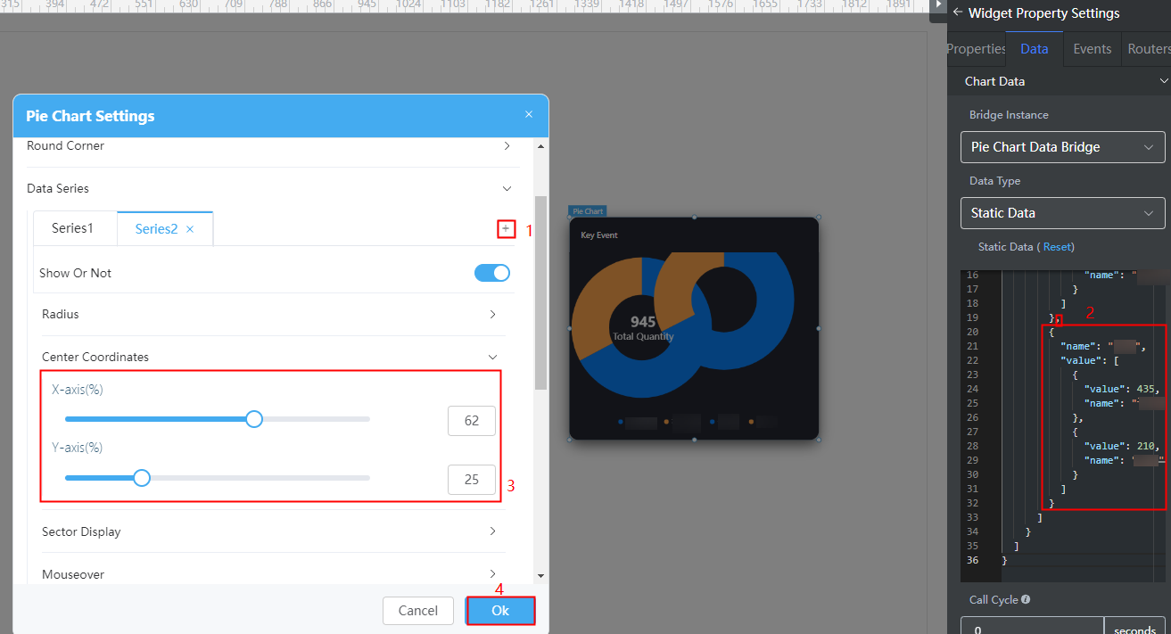
- Right-click the basic pie chart widget and choose Setting from the shortcut menu.
- Expand Data Series and click + to add a data series.
- On the Data tab page on the right, configure data of the data series.
For example, add the following code in bold to the static data preset in the system to configure the data of the new data series. You can also use the dynamic data to call the background API URL to return the following structure model data.
Figure 2 The coordinates of the center of two data series do not need to be set
{ "resCode": "0", "resMsg": "Success", "result": [{ "dataValue": [{ "name": "Key event", "value": [{ "value": 635, "name": "Project management" }, { "value": 310, "name": "Social environment" } ] }, { "name": "Category", "value": [{ "value": 435, "name": "Computer" }, { "value": 210, "name": "Literature" } ] } ] }] } - Coordinates of the circle center of the data series to be added. If the coordinates are not set, the two data series will overlap.
- Click Ok.
Feedback
Was this page helpful?
Provide feedbackThank you very much for your feedback. We will continue working to improve the documentation.See the reply and handling status in My Cloud VOC.
For any further questions, feel free to contact us through the chatbot.
Chatbot


