
General Table
The general table is a type of text widget. It clearly displays data in a table on visualized applications.
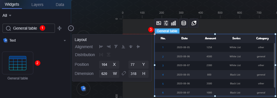
On the large screen design page, drag the general table widget from All > Text to the blank area of the canvas, as shown in Figure 1.

Card
A card wraps a chart widget. A widget consists of card elements (card title, chart, card background, and card border) and chart elements.
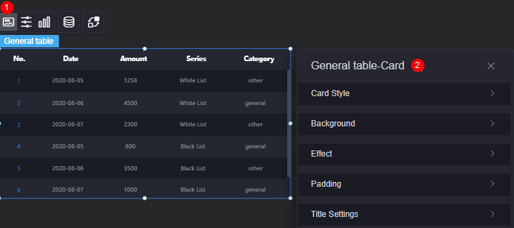
- Card style: You can select a card style based on your service requirements. You can click the clear style button to clear the configured style.
- Background
- Background color: Background color of the widget card.
- Border: Border of the widget card. Options: no border, full border, and corner border. For full border and corner border, you can set the line type and rounded corners of the outer border of the widget.
- Style: Image display style. The options are normal, center, stretch, and tiled.
- Choose image: Use a local image as the widget background. Directories and subdirectories can be added to facilitate image management by category. JPG, JPEG, PNG, or GIF images are recommended. The size of each image cannot exceed 50 MB.
- Special effect: Widget highlighted status. Displayed by default or on page load.
- Padding: Distance between the chart and the four sides (top, bottom, left, and right as shown in Figure 2) of the widget. The default value is 0, indicating that the chart stretches to fill the entire widget.
- Title settings
- Display or not: Whether to display the widget title.
- Title content: Content of the title.
- Header row height: Row height of the title, in pixels.
- Background color: Background color of the title.
- Text position: Position (center, left, right, or custom) of the text in the title.
- Font: Font, size, and color of the title.
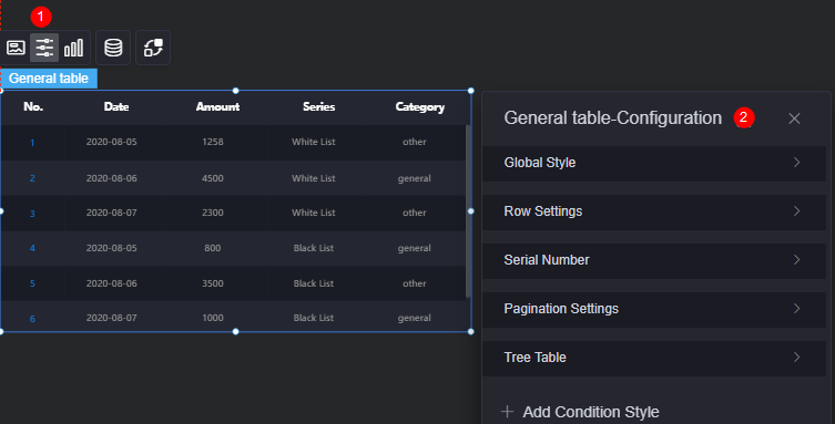
Configuration
You can set the global style, table header, row, and serial number of the widget.
- Global style
- Number of table rows: Number of rows displayed on the current page.
- Background color: Background color of the table.
- Rotation: Whether tables are rotated. When it is set to yes, you can set whether to pause a single line, the rotation speed, and the pause duration of a single line.
- Horizontal scroll: Whether to enable horizontal scrolling.
- Row configuration
- Odd row background color: Background color of odd rows.
- Even row background color: Background color of even rows.
- Overflow text: Display style of extra-long text in the table, for example, ellipsis (...), line break, and scroll.
- Serial number: Set serial number for the table.
- Display or not: Whether to display the serial number in the table.
- Serial number: Name of the serial number.
- Column width ratio (%): Column width ratio of the serial number in the table.
- Alignment: Alignment mode for serial number placement (e.g., horizontal center, left, right).
- Background color: Background color of the serial number.
- Radius: Radius of the serial number.
- Rounded corners: Round corner of the serial number. The value 0 indicates right angle.
- Font: Font, size, and color of the serial number.
- Pagination
- Enable or not: Whether the table is displayed with multiple pages. This mode does not support scrolling.
- Row height: Row height of the pages, in pixels.
- Page size: Number of records displayed on each page. Multiple records are separated with commas (,).
- Text position: Position of text displayed on each page. The text can be displayed on the left, right, or center.
- Background color: Background color of each page.
- Font: Font, size, and color of each page.
- Font color in the selected state: Font color of a selected page.
- Page box width: Width of the page box, in pixels.
- Background color of the drop-down list box: Background color of the drop-down list box.
- Font color of the drop-down list box: Font color of the drop-down list box.
- Background color of the selected state in the drop-down list box: Background color of the drop-down list box when selected.
- Color of the selected font in the drop-down list box: Font color of the drop-down list box when selected.
- Background color of the drop-down list box when the mouse is hovered: Background color of the drop-down list box when you hover over it.
- Font color of the drop-down list box when the mouse is hovered: Font color of the drop-down list box when you hover over it.
- Tree table
- Lazy load: Once is enabled, global variables and interaction events must be configured.
- Expand level: Expansion levels of the tree table.
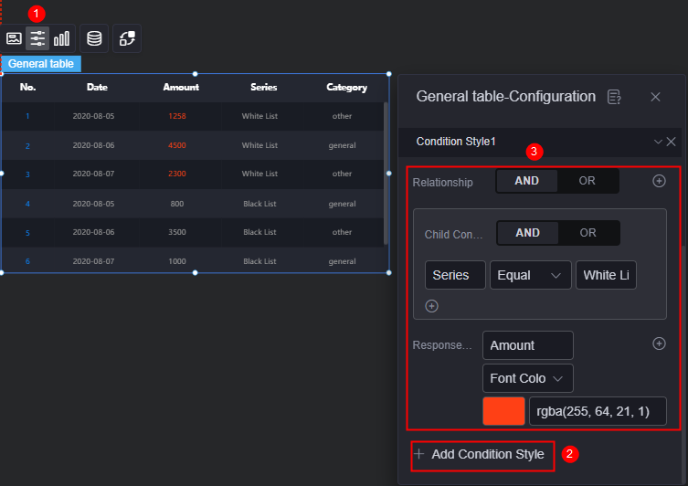
- Add condition style: Add a condition style.
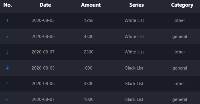
For example, Figure 5 shows the preset static data of the widget. The value of amount whose series is whitelist is expected to be marked in red. For details, see Figure 6. Click
 above the widget, click the add condition style button, and set the condition and response data column style.
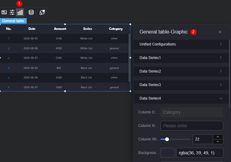
Graphic
A graphic is a specific graphical expression element that visualizes data in a widget, for example, a slice in a pie chart, a bar in a bar chart, a line or a kink point in a line chart.
- Unified configuration
- Header row height ratio (%): Header row height of the table in percentage.
- Background color: Background color of the table header.
- Alignment: Alignment mode of the table header.
- Table header font: Font, size, and color of the table header.
- Content font: Font, size, and color of the table content.
- Header line feed: Whether to enable header line feed.
- Sorting: Whether to enable the table header sorting function. Once enabled, you can click the
 icon to sort the table headers.
- Data Series
- Column data key value: Default series name in the raw data. You can modify the name by setting the column name. The text content comes from the value in the data model.
- Column name: Name of the data series in the chart.
- Column width ratio: Column width ratio of the data series.
- Background color: Background color of the data series.
- Alignment: Alignment mode of the data in the data series, for example, horizontal center or left.
- Font: Font, color, and size of the data in the data series.
- Table header font: Font, color, and size of the table header.
- Sort: Whether to enable the sorting function. If this function is enabled, you can set the background color of the icon, floating background color, and selected background color.
Data
In the data settings, you can set the data source of the general table widget. For more information, see Data Access.
Interaction
In the interaction settings, you can configure interactions between the general table widget and other widgets or pages. For details, see Interaction Configuration.
Feedback
Was this page helpful?
Provide feedbackThank you very much for your feedback. We will continue working to improve the documentation.See the reply and handling status in My Cloud VOC.
For any further questions, feel free to contact us through the chatbot.
Chatbot


