
Scatter Chart
A scatter chart is a type of bubble chart. It describes data correlation using data points.
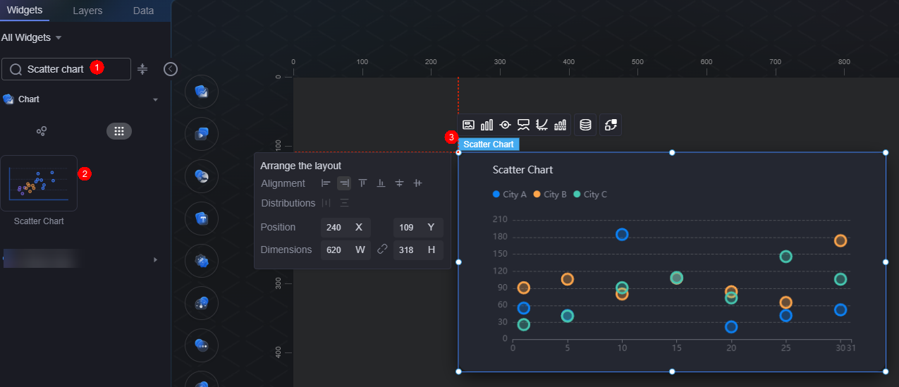
On the large screen design page, drag the scatter chart widget from All > Chart to the blank area of the canvas, as shown in Figure 1.

Card
A card wraps a chart widget. A widget consists of card elements (card title, chart, card background, and card border) and chart elements.
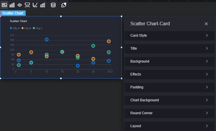
- Card style: You can select a card style based on your service requirements. You can click the clear style button to clear the configured style.
- Title
- Title: Whether to display the widget title.
- Content: Widget title.
- Font: Font, size, and color of the title.
- Align: Alignment mode of the title relative to the widget.
- Background color: Background color of the title.
- Background
- Background color: Background color of the widget card.
- Border: Border of the widget card. Options: no border, full border, and corner border. For full border and corner border, you can set the line type and rounded corners of the outer border of the widget.
- Style: Image display style. The options are normal, center, stretch, and tiled.
- Choose image: Use a local image as the widget background. Directories and subdirectories can be added to facilitate image management by category. JPG, JPEG, PNG, and GIF images are recommended. Each image cannot exceed 50 MB.
- Special effect: Widget highlighted status. Displayed by default or on page load.
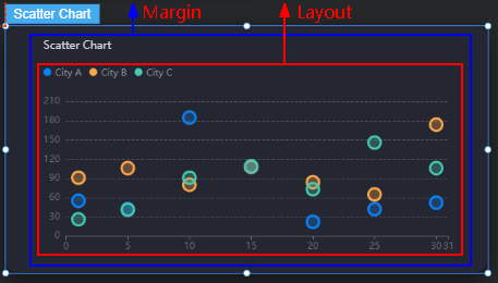
- Padding: Distance between the chart in the widget and the four sides (top, bottom, left, and right) of the widget (see Figure 2). The default value is 0, indicating that the chart is stretched across the widget.
- Chart background: Background color of the chart.
- Round corner: Round corners of the border. The radian of the four corners ranges from 0 to 500, in pixels.
- Layout: Distance between the scatter chart (excluding the widget title) and the four sides (top, bottom, left, and right) of the widget.
Figure 4 Scatter chart layout
- Padding top: Distance from the chart to the top of the widget border.
- Padding right: Distance from the chart to the right of the widget border.
- Padding bottom: Distance from the chart to the bottom of the widget border.
- Padding left: Distance from the chart to the left of the widget border.
Graphic
A graphic is a specific graphical expression element that visualizes data in a widget. For example, a graphic can be a slice in a pie chart, a bar in a bar chart, or a line or an inflection point in a line chart.

- Color: Color of the graphic.
- Unified configuration
- Tagged graphics: Shape of labels, such as circle, rectangle, or triangle.
- Data label: Whether to display data labels. If they are displayed, you can set their color.
- Data label (max, min, avg): maximum, minimum, and average values of data labels.
- Data Series
- Series name: Default series name in the raw data. You can change the series name by configuring the display name.
- Display name: Display name of the series in the chart.
- Tagged graphics: Shape of labels, such as circle, rectangle, or triangle.
- Marker size: Size of labels.
- Color setting: Color styles of labels, such as pure color, linear gradient, and radial gradient.
- Color: Color of labels.
- Border color: Border color of labels.
- Graph transparency: Transparency of scatter points in a scatter chart. The value ranges from 0 to 1.
- Data label: Value labels of corresponding scatter points.
- Maximum value of chart markers and marking lines: Maximum value of scatter data.
- Minimum value of chart markers and marking lines: Minimum value of scatter data.
- Average value of chart markers and marking lines: Average value of scatter data.
Legend
A legend shows the dimensions in a multi-dimensional visualized graphic expression.

- Legend display: Whether to display the legend. The legend text content comes from the value of s in the data model.
- Legend mark: Set the shape of the icon and layout of legends.
- Legend width and height: Width and height of legends.
- Legend interval: Space between legends.
- Font: Font, color, and size of legends.
- Text style: Style of the legend text, which can be normal, italic, and oblique.
- Legend left margin: Percentage of the distance from the legend to the left border of the pie chart widget to the widget height or the alignment mode of the legend.
- Legend left margin: Distance from the legend to the left of the widget.
- Legend top margin: Distance from the legend to the top of the widget.
- Legend type: If there are many legends, you can choose to display them in scrolling or normal mode.
- Custom legend setting: After this function is enabled, you can adjust the display length of the legend name. By default, "Off" is selected, indicating that the entire legend name is displayed.
Tooltip
Tooltip (floating prompt) displays metrics of specific dimension nodes in a visualized chart widget.
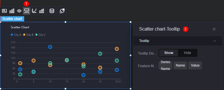
- Tooltip display: After this function is enabled, the information is displayed when you place the cursor on a specific series during chart preview.
- Feature marker: Content in the tooltip box, such as series name, data name, and data value. Only one or two of them can be displayed.
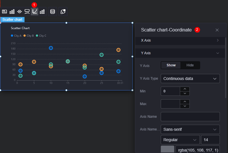
Coordinate
You can set the style, color, position, and behavior of the coordinate system for a chart widget.
- X axis
- X axis: Whether to display the X axis.
- X axis type: Type of the X axis. The options include continuous data, category axis, and timeline.
- Number of axis divisions: Number of segments on the X axis.
- Max. value: Maximum value of the labels on the X axis.
- Minimum value: Minimum value of the labels on the X axis.
- Axis name: Name of the X axis.
- Axis name font: Font, color, and size of the axis.
- Angle of scale label rotate: Rotation angle of scale labels.
- Axis display: Whether to display the axis.
- Axis tick display: Whether to display the scale. If you set it to display, you can customize the line color.
- Scale label font: Font, color, and size of labels.
- Grid line: Whether to display grid lines. When it is set to display, you can customize the type and color of lines.
- Y axis
- Y axis: Whether to display the Y axis.
- Y axis type: Type of the Y axis. The options are continuous data, category axis, and timeline.
- Maximum value: Maximum value of labels on the Y axis.
- Minimum value: Minimum value of labels on the Y axis.
- Axis name: Name of the X axis.
- Axis name font: Font, color, and size of the axis.
- Axis display: Whether to display the axis.
- Axis tick display: Whether to display the scale. If you set it to display, you can customize the line color.
- Scale label font: Font, color, and size of labels.
- Grid line: Whether to display grid lines. When it is set to display, you can customize the type and color of lines.
Reference Line
Reference lines are visual markers to help you compare data on charts.

- Unified configuration: Style of the two ends of the reference line, such as circle, rectangle, and triangle.
- Y axis reference line
- Y axis reference line: Whether to display the Y axis reference line.
- Reference line: Color and type of an existing reference line. To add a reference line, click Add Y Axis Reference Line. To delete a reference line, click x next to it.
- X axis reference line
- X axis reference line: Whether to display the X axis reference line.
- Reference line: Color and type of an existing reference line. To add a reference line, click Add X Axis Reference Line. To delete a reference line, click x next to it.
Data
In the data settings, you can set the data source of a scatter chart widget. For more information, see Data Access.
Interaction
In the interaction settings, you can configure the interaction between the scatter chart and other widgets or pages. For details, see Interaction Configuration.
Feedback
Was this page helpful?
Provide feedbackThank you very much for your feedback. We will continue working to improve the documentation.See the reply and handling status in My Cloud VOC.
For any further questions, feel free to contact us through the chatbot.
Chatbot


