
Progress Bar Chart
The progress bar chart is a type of bar chart that displays the percentage in battery or bar pattern.
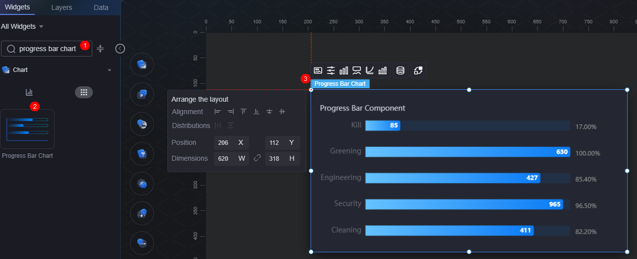
On the large screen design page, drag the progress bar chart widget from All > Chart to the blank area of the canvas, as shown in Figure 1.

Card
A card wraps a chart widget. A widget consists of card elements (card title, chart, card background, and card border) and chart elements.

- Card style: You can select a card style based on your service requirements. You can click the clear style button to clear the configured style.
- Background
- Background color: Background color of the widget.
- Border: Border of the widget card. Options: no border, full border, and corner border. For full border and corner border, you can set the line type and rounded corners of the outer border of the widget.
- Style: Image display style. The options are normal, center, stretch, and tiled.
- Choose image: Use a local image as the widget background. Directories and subdirectories can be added to facilitate image management by category. JPG, JPEG, PNG, and GIF images are recommended. Each image cannot exceed 50 MB.
- Special effect: Widget highlighted status. Displayed by default or on page load.
- Padding: Distance between the chart in the widget and the four sides (top, bottom, left, and right) of the widget (see Figure 2). The default value is 0, indicating that the chart is stretched across the widget.
- Chart background: Background color of the chart.
- Custom labels: Whether to display labels. You can set the label font and horizontal/vertical offsets.
- Layout: Distance between the progress bar (excluding the widget title) and the four sides (top, bottom, left, and right) of the widget.
Figure 4 Progress bar chart layout
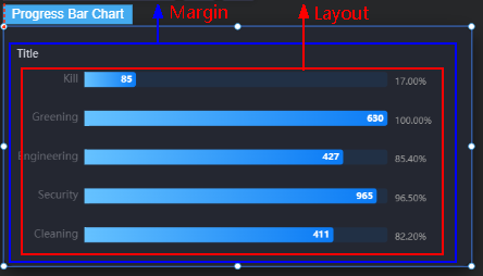
- Padding top: Distance from the progress bar to the widget's top border.
- Padding Right: Distance from the progress bar to the right of the widget border.
- Padding Bottom: Distance from the progress bar to the bottom of the widget border.
- Padding left: Distance from the progress bar to the left of the widget border.
Configuration
In the configuration settings, you can set the widget template and whether to display the title.
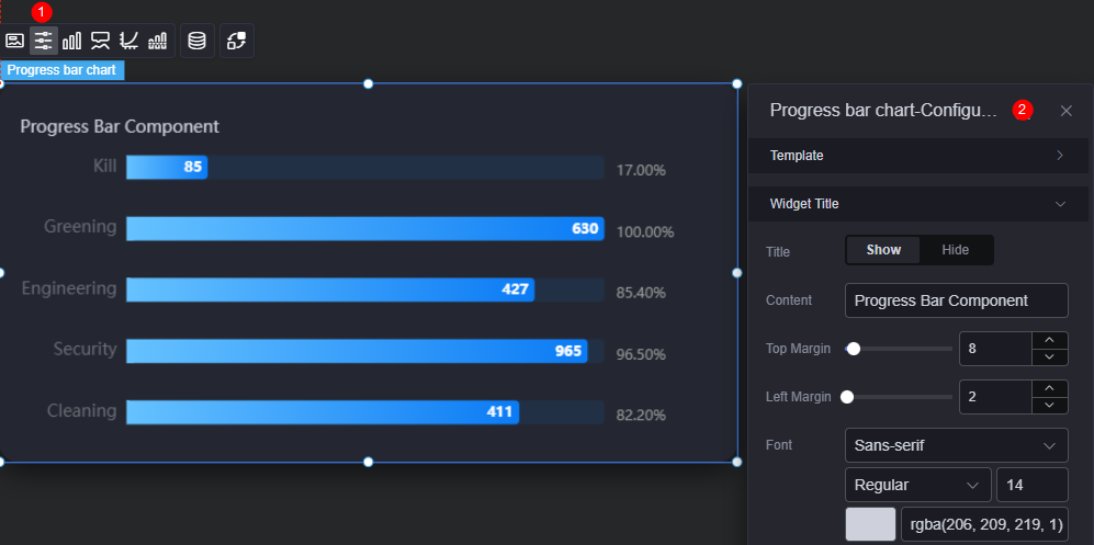
- Reference template: Preset progress bar templates, which can be default or in reference color.
- Widget title
- Title setting: Whether to display the widget title.
- Content: Widget title.
- Title top margin from container: Distance between the title and the top of the widget.
- Title to the left of the container: Distance between the title and the left of the widget.
- Font: Font, color, and size of the title.
Graphic
A graphic is a specific graphical expression element that visualizes data in a widget, for example, a slice in a pie chart, a bar in a bar chart, a line or a kink point in a line chart.
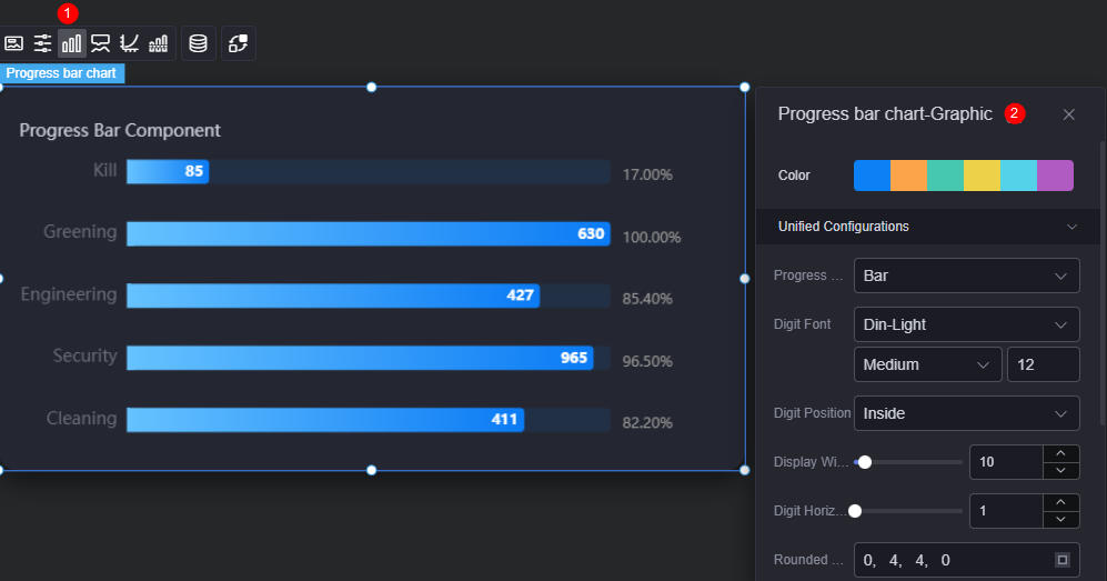
- Color: Color of the graphic.
- Unified configuration
- Progress bar pattern setting: Can be bar or battery.
- Sum font: Font, size, and color of the metric value.
- Numerical display position: Data display position, such as top and bottom.
- Display content width ratio: Width ratio of the displayed content.
- Numeric text horizontal spacing: Horizontal spacing of the values.
- Column rounded borders: Round corner of the bar border.
- Column chart width: Width of the progress bar.
- Numerical display: Whether to display values on the progress bar.
- Percentage display: Whether to display the percentage on the progress bar.
- Text font size: Number of decimal places displayed on the progress bar.
- Data Series
- Color type: Solid or gradient. You can change the color of the bar.
- Column chart width: Width of the progress bar. The default value is 10 px.
- Column rounded borders: Rounded corner of the progress bar border. 0 indicates right angle, and 100 indicates round corner.
- Numerical display: Whether to display values on the progress bar. After this function is enabled, you can set the value color, size, and weight.
- Percentage display: Whether to display the percentage on the progress bar. After this function is enabled, you can set the prefix, suffix, and value display position.
- Display content width ratio: Width ratio of the displayed content on the progress bar.
Tooltip
Tooltip (floating prompt) displays metrics of specific dimension nodes in a visualized chart widget.
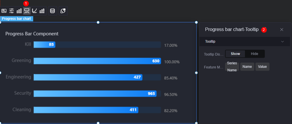
- Tooltip display: After this function is enabled, the information is displayed when you place the cursor on a specific series during chart preview.
- Feature marker: Content in the tooltip box, such as series name, data name, and data value. Only one or two of them can be displayed.
Coordinate
In the coordinate settings, you can set the X axis and Y axis of a chart, for example, whether to display the two axises and scale, and the font and font color.

- X axis
- X axis: Whether to display the X axis.
- Axis display: Whether to display the axis. After this function is enabled, you need to set the axis color.
- Axis tick display: Whether to display the scale.
- Axis label display: Whether to display the scale label. After this function is enabled, you need to set the font color, size, and weight of the scale label.
- Reverse: Whether to invert the axis data.
- Grid lines setting (axis display required): Whether to display the axis grid lines, and their type and color.
- Y axis
- Y axis: Whether to display the Y axis.
- Axis display: Whether to display the axis. If the axis is displayed, you can set its color.
- Axis tick display: Whether to display the scale.
- Axis label display: Whether to display the scale label. After this parameter is enabled, you can set the font color, size, thickness, and rotation angle of the axis label (the rotation angle of the tick label on the Y axis ranges from -90 to 90).
- Y axis unit: Unit of the Y axis.
- Reverse: Whether to invert the axis data.
- Cylindrical shadow: Whether to display the cylindrical shadow. If this parameter is set to "Show", you can set the following parameters:
- Cylindrical shadow color: Background color of the cylindrical shadow.
- Display data: Whether to display data in the cylindrical shadow.
- Percentage display: Whether to display the percentage on the cylindrical shadow. When this parameter is set to "Show", you can set the horizontal offset, vertical offset, and font, size, and color of data.
- Grid lines setting (axis display required): Whether to display the axis grid lines, and their type and color.
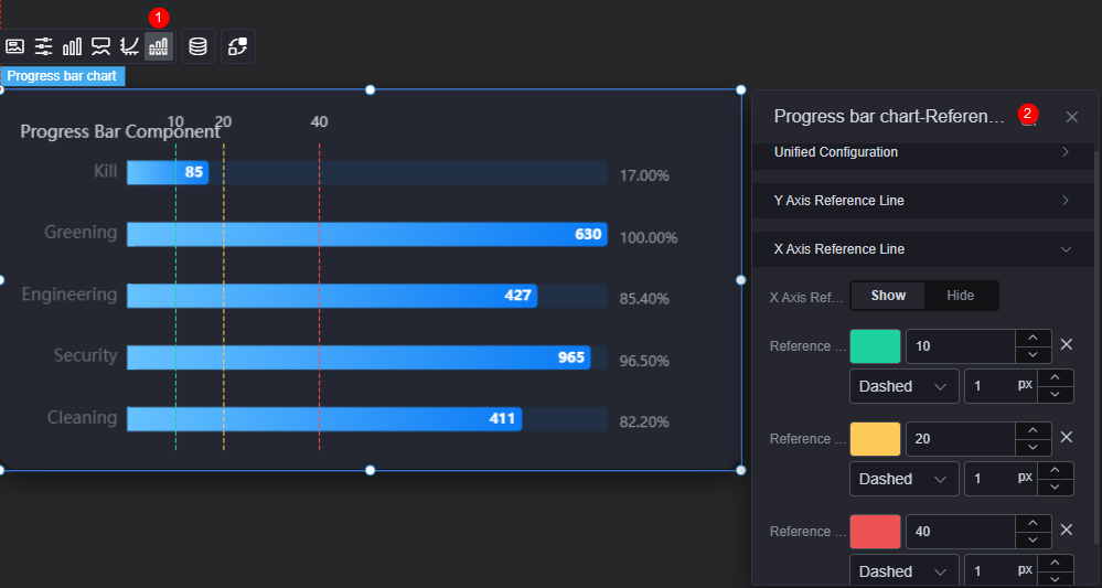
Reference Line
Reference lines are a visualized standard added to a chart widget to provide data reference.
- Unified configuration: Style of the two ends of the reference line, such as circle, rectangle, and triangle.
- Y axis reference line
- Y axis reference line: Whether to display the Y axis reference line.
- Reference line: Color and type of an existing reference line. To add a reference line, click Add Y Axis Reference Line. To delete a reference line, click x next to it.
- X axis reference line
- X axis reference line: Whether to display the X axis reference line.
- Reference line: Color and type of an existing reference line. To add a reference line, click Add X Axis Reference Line. To delete a reference line, click x next to it.
Data
In the data settings, you can set the data source of the progress bar chart widget. For more information, see Data Access.
Interaction
In the interaction settings, you can configure the interaction between the progress bar chart widget and other widgets or pages. For details, see Interaction Configuration.
Feedback
Was this page helpful?
Provide feedbackThank you very much for your feedback. We will continue working to improve the documentation.See the reply and handling status in My Cloud VOC.
For any further questions, feel free to contact us through the chatbot.
Chatbot


