
Water Drop Liquid Fill Chart
The water drop liquid fill chart is a type of liquid fill chart that matches large screens of different styles and scenarios.
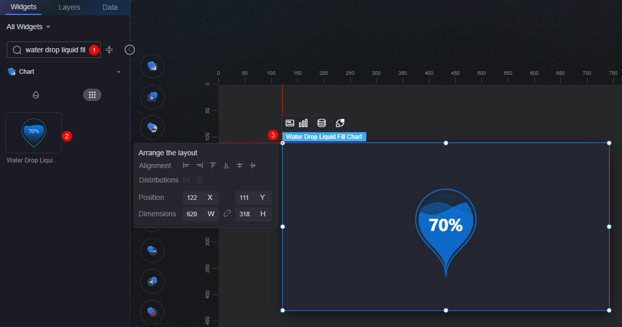
On the large screen design page, drag the water drop liquid fill chart widget from All > Chart to the blank area of the canvas, as shown in Figure 1.

Card
A card wraps a chart widget. A widget consists of card elements (card title, chart, card background, and card border) and chart elements.
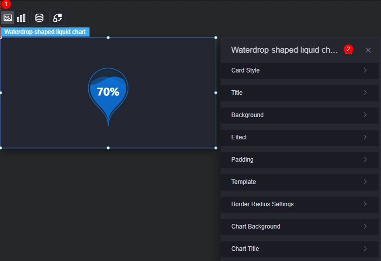
- Card style: You can select a card style based on your service requirements. You can click the clear style button to clear the configured style.
- Title
- Title: Whether to display the widget title.
- Content: Widget title.
- Font: Font, size, and color of the text.
- Align: Alignment mode of the title relative to the widget.
- Background color: Background color of the title.
- Padding: Distance between the title and the four sides of the widget box, in pixels by default.
Figure 4 Padding

- Title margin bottom: Distance between the widget title and the water drop liquid fill chart.
Figure 5 Title offset

- Background
- Background color: Background color of the widget card.
- Border: Border of the widget card. Options: no border, full border, and corner border. For full border and corner border, you can set the line type and rounded corners of the outer border of the widget.
- Style: Image display style. The options are normal, center, stretch, and tiled.
- Choose image: Use a local image as the widget background. Directories and subdirectories can be added to facilitate image management by category. JPG, JPEG, PNG, and GIF images are recommended. Each image cannot exceed 50 MB.
- Special effect: Widget highlighted status. Displayed by default or on page load.
- Padding: Distance between the chart in the widget and the four sides (top, bottom, left, and right) of the widget (see Figure 2). The default value is 0, indicating that the chart is stretched across the widget.
- Reference template: Preset widget templates, which can be default or marked.
- Round corner: Round corners of the border. The radian of the four corners ranges from 0 to 500, in pixels.
- Chart background: Background color of the chart.
- Chart title: Whether to display the chart title. You can customize the chart title or obtain it from the series.
Graphic
A graphic is a specific graphical expression element that visualizes data in a widget, for example, a slice in a pie chart, a bar in a bar chart, a line or a kink point in a line chart.
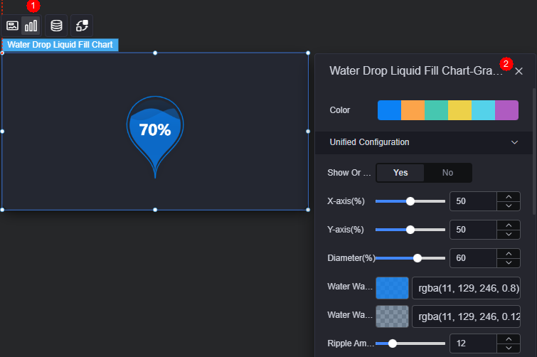
- Color: Color of the graphic.
- Unified configuration
- Show or not: Whether to display the liquid fill chart.
- X-axis(%): Horizontal coordinate of the liquid fill chart in the widget.
- Y-axis(%): Vertical coordinate of the liquid fill chart in the widget.
- Diameter(%): Overall width of the liquid fill chart.
- Water wave color: Color of the water wave.
- Water wave background color: Background color of the water wave.
- Ripple Amplitude: Size of ripples in water wave animation.
- Show double wave: Whether to display double ripples in water wave animation.
- Second wave color: Color of the second ripple when two ripples are displayed.
- Label show or not: Whether to display the label in the center of the liquid fill chart.
- Label position left offset(%): Left offset of the label in the center of the liquid fill chart.
- Label position top offset(%): Top offset of the label in the center of the liquid fill chart.
- Label font: Font settings (font style, weight, size, and color) of the label in the center of the liquid fill chart.
- Text color when on waves: Font color of the label when below the ripple in the liquid fill chart.
- Outline style show or not: Whether to display the outline of the liquid fill chart.
- Border width: Width of the outline of the liquid fill chart.
- Color: Outline color style, which can be solid or gradient.
Data
In the data settings, you can set the data source of the water drop liquid fill widget. For more information, see Data Access.
Interaction
In the interaction settings, you can configure the interaction between the water drop liquid fill chart and other widgets or pages. For details, see Interaction Configuration.
Feedback
Was this page helpful?
Provide feedbackThank you very much for your feedback. We will continue working to improve the documentation.See the reply and handling status in My Cloud VOC.
For any further questions, feel free to contact us through the chatbot.
Chatbot


